parallelplot
parallelplot(cmd0::String="", arg1=nothing; labels|axeslabels=String[], group=Vector{String},
             groupvar="", normalize="range", kwargs...)
Creates a parallel coordinates plot from the table (Matrix or GMTdataset). Each line in the plot represents a row in the table, and each coordinate variable in the plot corresponds to a column in the table. By default, table columns are plotted.
parallelplot(D,y, ...) plots the elements in y at the locations specified by x. The inputs x,y can be vectors or a vector and a matrix, both with the same number of rows.
parallelplot(D::GMTdatset, yvar, ...) plots the specified variable from the GMTdatset against the row indices of the table. To plot one set of y-values, specify one variable for
yvar. This can take the form of column names or column numbers. To plot multiple sets of y-values, specify multiple variables for yvar. Example yvar=:Y or yvar=(2,3), or yvar=[:Y, :Z1, :Z2].
This module is a subset of
plot to make it simpler to draw stair plots. So not all (fine) controlling parameters are not listed here. For the finest control, user should consult the plot module.
Parameters
axeslabels or labels : – axeslabels=["??","??",...] | labels=["??","??",...]
String vector with the names of each variable axis. Plots a default "Label?" if not provided..group : – group=["??","??",...] | group=Int(...)
A string vector or vector of integers used to group the lines in the plot.groupvar : – groupvar="text | groupvar=Int | groupvar=:ColName
Uses the table variable specified bygroupvarto group the lines in the plot.groupvarcan be a column number, or a column name passed in as a Symbol. e.g.groupvar=:Maleif a column with that name exists. Whenarg1is GMTdatset orcmd0is the name of a file with one and it has thetextfield filled, usegroupvar="text"to use that text field as the grouping vector.nomalize : – nomalize="range" | nomalize="none" | nomalize="score" | nomalize="scale"
-range: (Default) Display raw data along coordinate rulers that have independent minimum and maximum limits.noneor"": Display raw data along coordinate rulers that have the same minimum and maximum limits.zscore: Display z-scores (with a mean of 0 and a standard deviation of 1) along each coordinate ruler.scale: Display values scaled by standard deviation along each coordinate ruler.
quantile : – quantile=0.25
Give a quantile in the [0-1] interval to plot the median +-quantileas dashed lines.std : – std=1
Instead of median plus quantile lines, draw the mean +- one standard deviation. This is achieved with bothstd=trueorstd=1. For other number od standard deviations use, e.g.std=2, orstd=1.5.band : – band=true
If used, instead of the dashed lines referred above, plot a band centered in the median. The band colors are assigned automatically but this can be overriden by thefilloption. If set andquantilenot given, set a default ofquantile = 0.25.fill : – fill=true | fill=["color1", "color2", ...]*\ When
bandoption is used and want to control the bands colors, give a list of colors to paint them.fillalpha : – fillalpha=[0.5, 0.7, ...]
Whenfilloption is used, we can set the bands transparency with this option that takes in an array (vec or 1-row matrix) with numeric values between [0-1] or ]1-100], where 100 (or 1) means full transparency.For fine the lines settings use the same options as in the plot module. Nemely
lworltfor controling the line thickness,lcfor line color,lsfor line styles, etc...
B or axes or frame
Set map boundary frame and axes attributes. Default is to draw and annotate left, bottom and vertical axes and just draw left and top axes. More at frame
J or proj or projection : – proj=<parameters>
Select map projection. More at proj
R or region or limits : – limits=(xmin, xmax, ymin, ymax) | limits=(BB=(xmin, xmax, ymin, ymax),) | limits=(LLUR=(xmin, xmax, ymin, ymax),units="unit") | ...more
Specify the region of interest. More at limits. For perspective view view, optionally add zmin,zmax. This option may be used to indicate the range used for the 3-D axes. You may ask for a larger w/e/s/n region to have more room between the image and the axes.
G or markerfacecolor or MarkerFaceColor or markercolor or mc or fill
Select color or pattern for filling of symbols [Default is no fill]. Note that plot will search for fill and pen settings in all the segment headers (when passing a GMTdaset or file of a multi-segment dataset) and let any values thus found over-ride the command line settings (but those must be provided in the terse GMT syntax). See Setting color for extend color selection (including color map generation).
W or pen=
pen
Set pen attributes for the arrow stem [Defaults: width = default, color = black, style = solid]. See Pen attributes and Vector attributes for arrow line terminations.
U or time_stamp : – time_stamp=true | time_stamp=(just="code", pos=(dx,dy), label="label", com=true)
Draw GMT time stamp logo on plot. More at timestamp
V or verbose : – verbose=true | verbose=level
Select verbosity level. More at verbose
X or xshift or x_offset : xshift=true | xshift=x-shift | xshift=(shift=x-shift, mov="a|c|f|r")
Shift plot origin. More at xshift
Y or yshift or y_offset : yshift=true | yshift=y-shift | yshift=(shift=y-shift, mov="a|c|f|r")
Shift plot origin. More at yshift
figname or savefig or name : – figname=
name.png
Save the figure with thefigname=name.extwhereextchooses the figure image format.
Examples
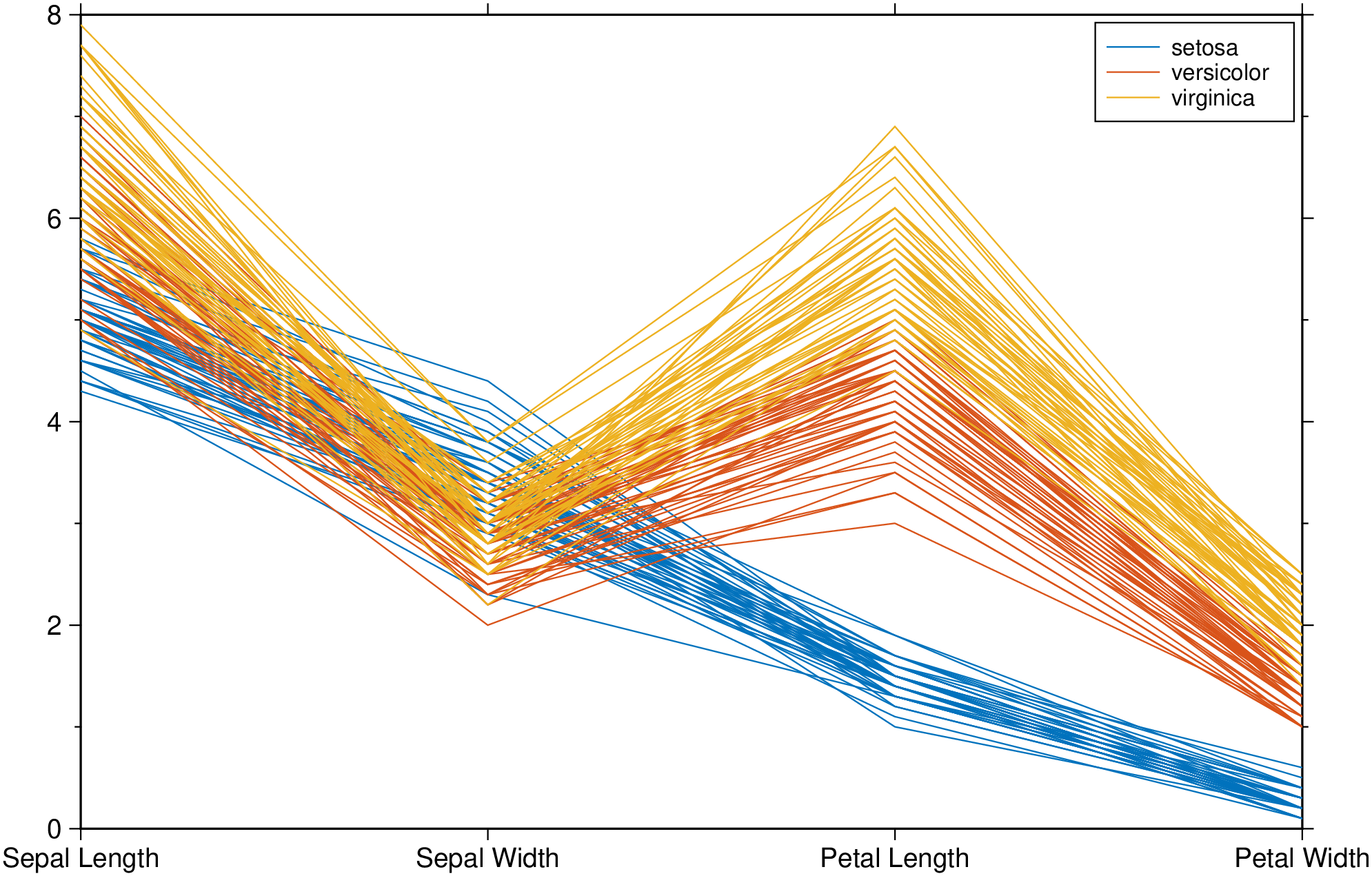
Create a parallel plot using the measurement data in iris.dat. Use a different color for each group as identified in species, and label the horizontal axis using the variable names.
using GMT
parallelplot(GMT.TESTSDIR * "iris.dat", groupvar="text", normalize="none", legend=true, show=true)
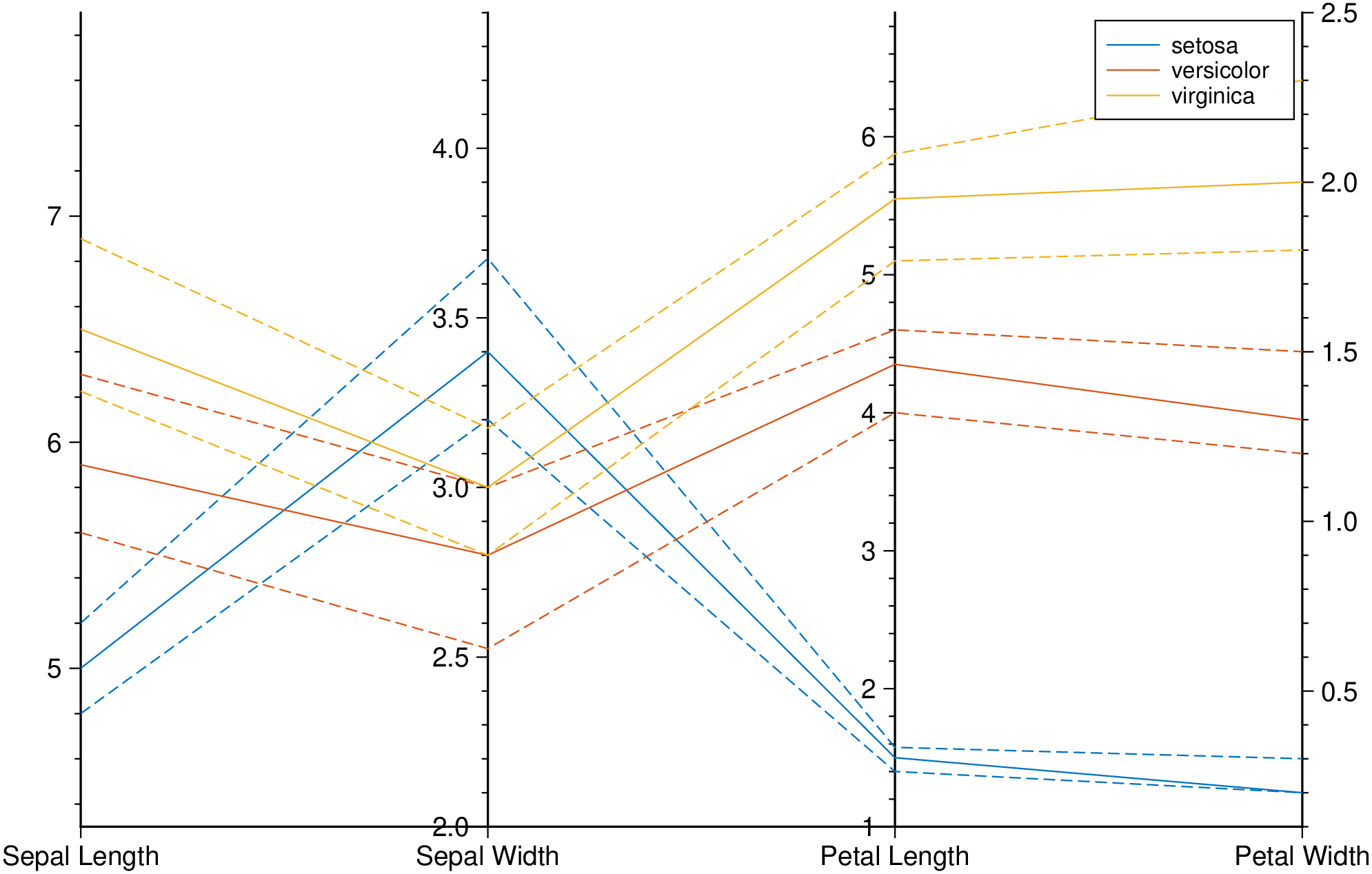
Plot only the median, 25 percent, and 75 percent quartile values for each group identified in species. Label the horizontal axis using the variable names.
using GMT
parallelplot(GMT.TESTSDIR * "iris.dat", groupvar="text", quantile=0.25, legend=true, show=true)
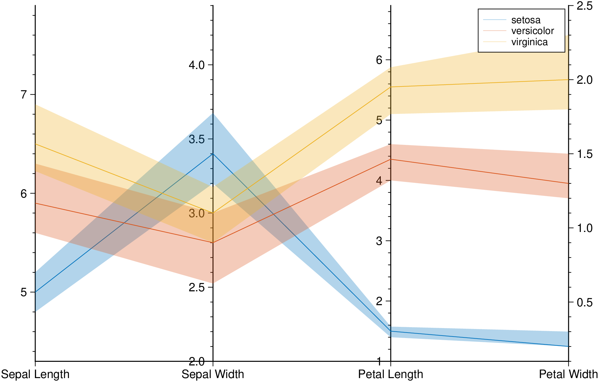
Plot bands enveloping the +- 25% percentil arround the median.
using GMT
parallelplot(GMT.TESTSDIR * "iris.dat", groupvar="text", band=true, legend=true, show=true)
These docs were autogenerated using GMT: v1.33.1