using GMT
x = -10:0.11:10;
band(x, sin.(x)./x, width=0.1, fill="green@80", show=true)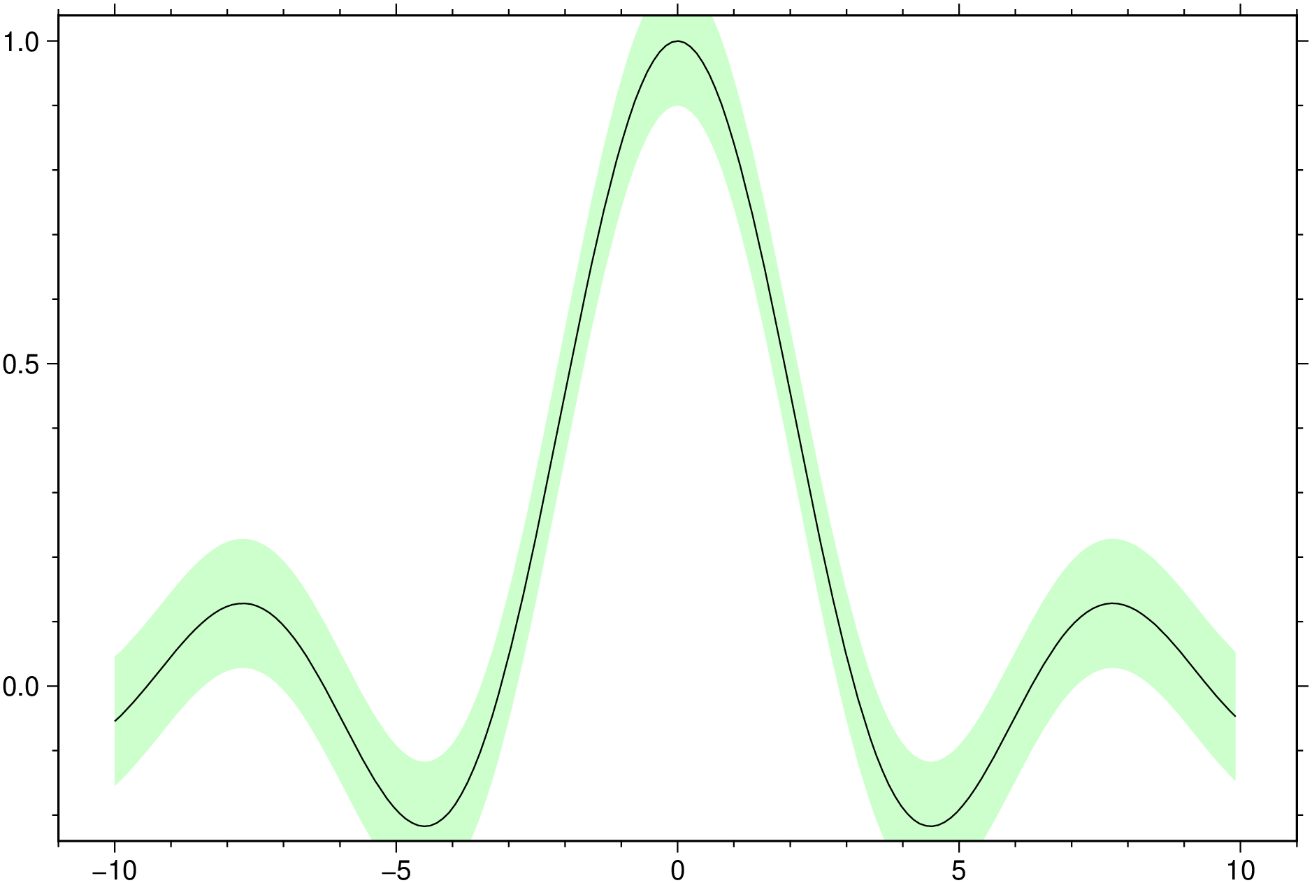
The GMT plot module has a huge number of options. The polygon (-L in original) option in itself is what other packages call band, so we wrapped another avatar around it and with that name too.
using GMT
x = -10:0.11:10;
band(x, sin.(x)./x, width=0.1, fill="green@80", show=true)
We could have obtained the same plot using a function as argument.
band(x->sin(x)/x, 10, width=0.1, fill="green@80", show=true)Next example hides the line and plots only the bands. Since when we ask for a color fill the lines is always plotted, the trick to no see it is to assign it full transparency. We use also a theme to change the default tick orientation and add automatic grid lines.
using GMT
x = -10:0.1:10;
band(x, sin.(x), region=(-10,10,-1.5,1.5), width=0.3, pen=(0,"blue@100"),
     fill="blue@80", theme=("A2atgIT"))
band!(x, cos.(x), width=0.3, pen=(0,"red@100"), fill="red@80", show=true)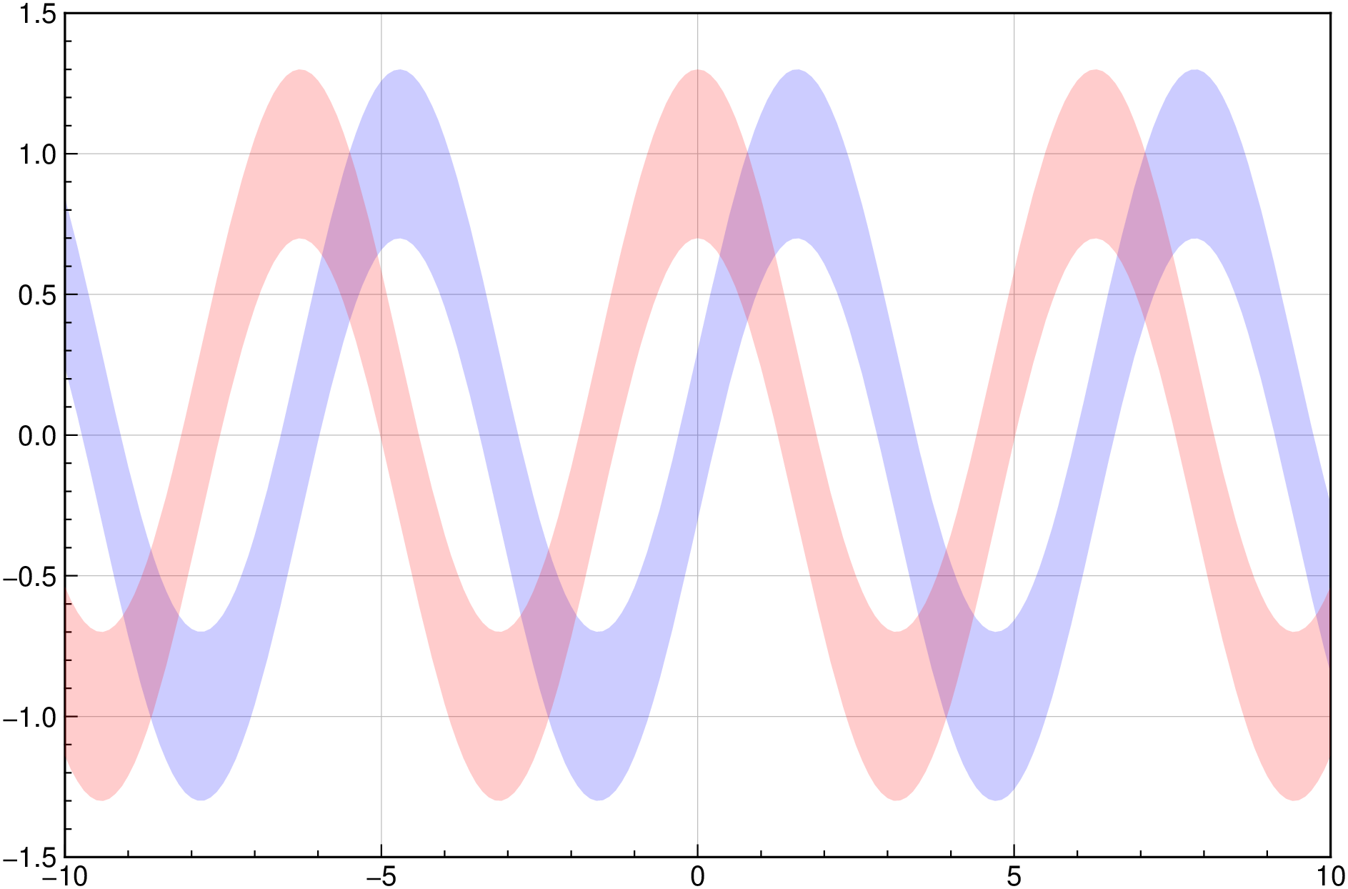
And another example where the band is asymetric and grows in width. We had to add eps() to first x to not have a NaN in first element of y.
using GMT
x = 0+eps():0.05:4π
y =  sin.(3x) ./ (cos.(x) .+ 2)./x
band([x y], y .- 0.1 .- 0.015x, y .+ 0.1 .+ 0.03x, fill="blue@80", show=true)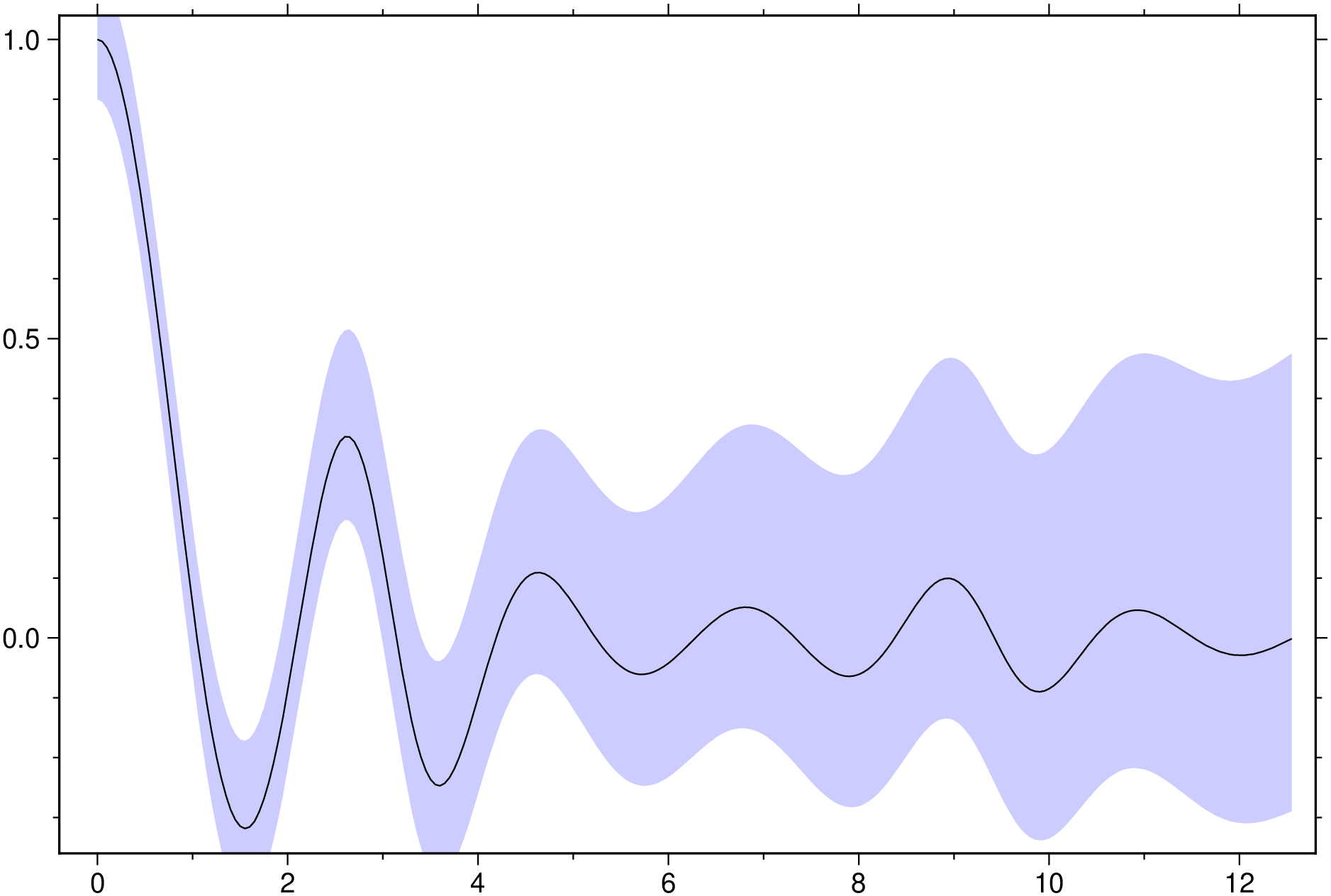
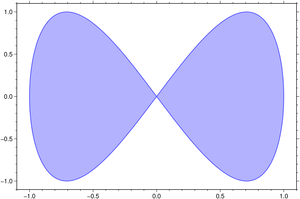
using GMT
plot(sin, x->sin(2x), [0 2pi], fill="blue@70", pen=(1,"blue@40"), show=1)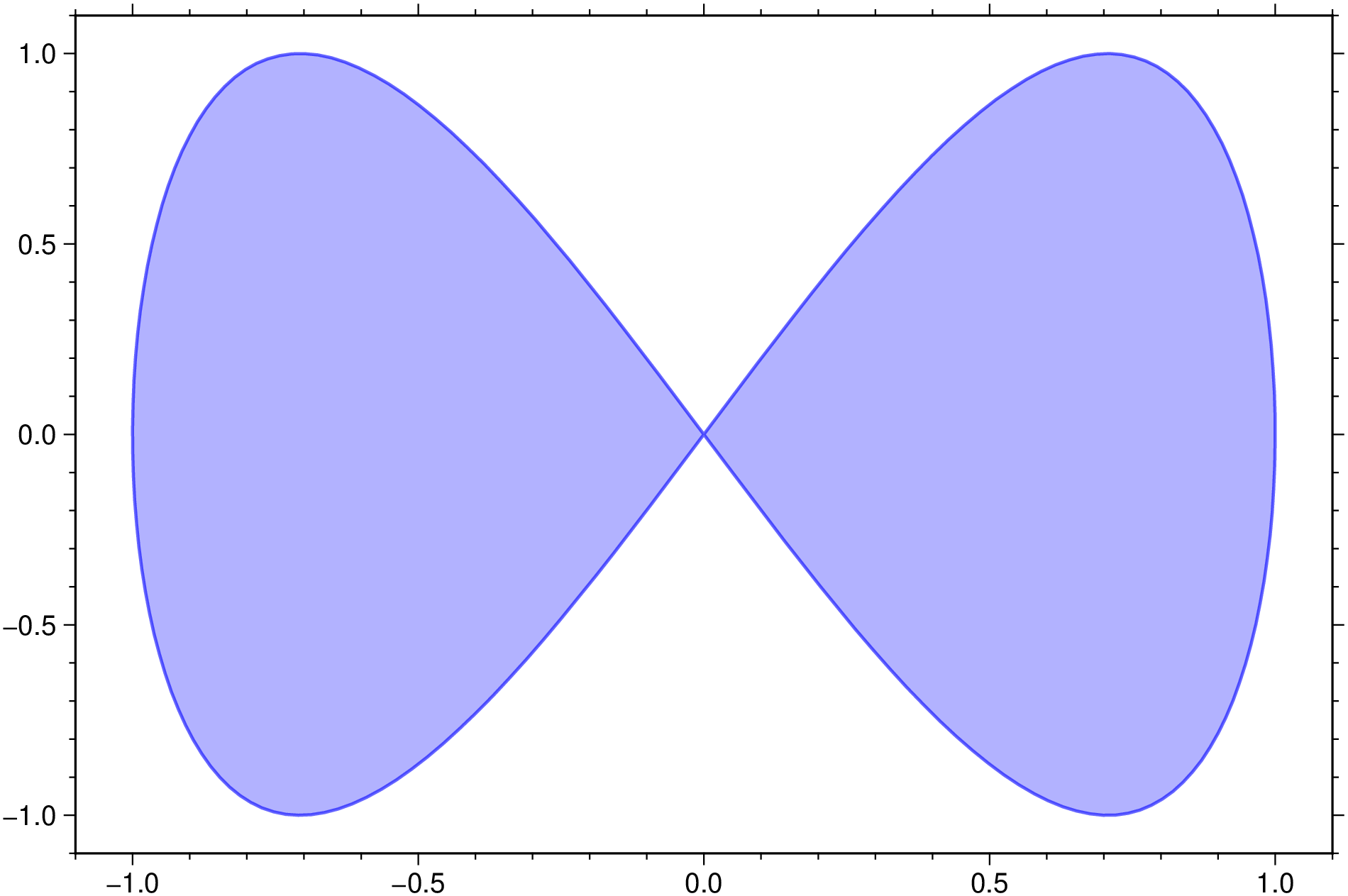
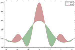
Fill the area between the two sinc functions. Here we use the default values for line thickness and fill color but all of that can be changed. We also add a thin white border arround tke lines.
using GMT
theta = linspace(-2π, 2π, 150);
y1 = sin.(theta) ./ theta;
y2 = sin.(2*theta) ./ theta;
fill_between([theta y1], [theta y2], white=true, legend="Sinc1,Sinc2", show=1)
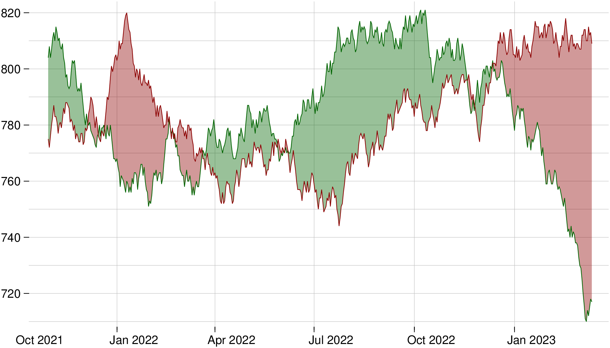
using GMT
D = gmtread(TESTSDIR * "assets/1635541200000.dat");
D.attrib["Timecol"] = "1";         # Inform that first column has Time
fill_between(D, figsize=(16,9), yaxis=(annot=20,), theme="A0XYag", show=true)