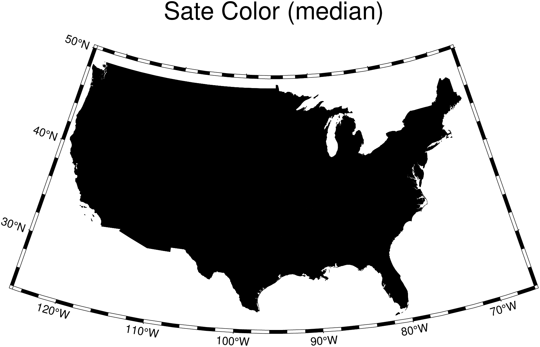
This example shows an adaptation of the Average color of World examples. It differs slightly for the also shown US case likely due to the different data used. Here we retrieve the image data (Sentinel 2) from the EOX WMS server and use the year 2020. And, as a side note, realize how incredibly simpler this example is as comparing to the codes used to generate the figures in that blog.
Note how the sates polygons are read directly from source, without any previous download, uncompressing file format conversions, etc… We will also filter the states polygons to use only those inside the US continental zone and limit them by number of points and with that dropping those polygons of small islands (smaller in area than 10 km^2).
usingGMT# Fetch the state polygons from the US Census Bureau D =gmtread("/vsizip//vsicurl/https://www2.census.gov/geo/tiger/GENZ2024/shp/cb_2024_us_state_500k.zip");# Filter to keep only the continental US states (except Alaska), with an area larger than 10 km^2.Df =filter(D, _region=(-125,-66,24,50), _area=10);# Fetch the Sentinel 2 image that is used to calculate the average color. Restrain to pixel size of 2000 m.wms =wmsinfo("http://tiles.maps.eox.at/wms?");img =wmsread(wms, layer=4, region=(-125,-66,24,50), pixelsize=2000);# Calculate the average color per State.colorzones!(Df, median, img=img)viz(Df, region=img, proj=:guess, plot=(data=Df, lw=0), title="Sate Color (median)")
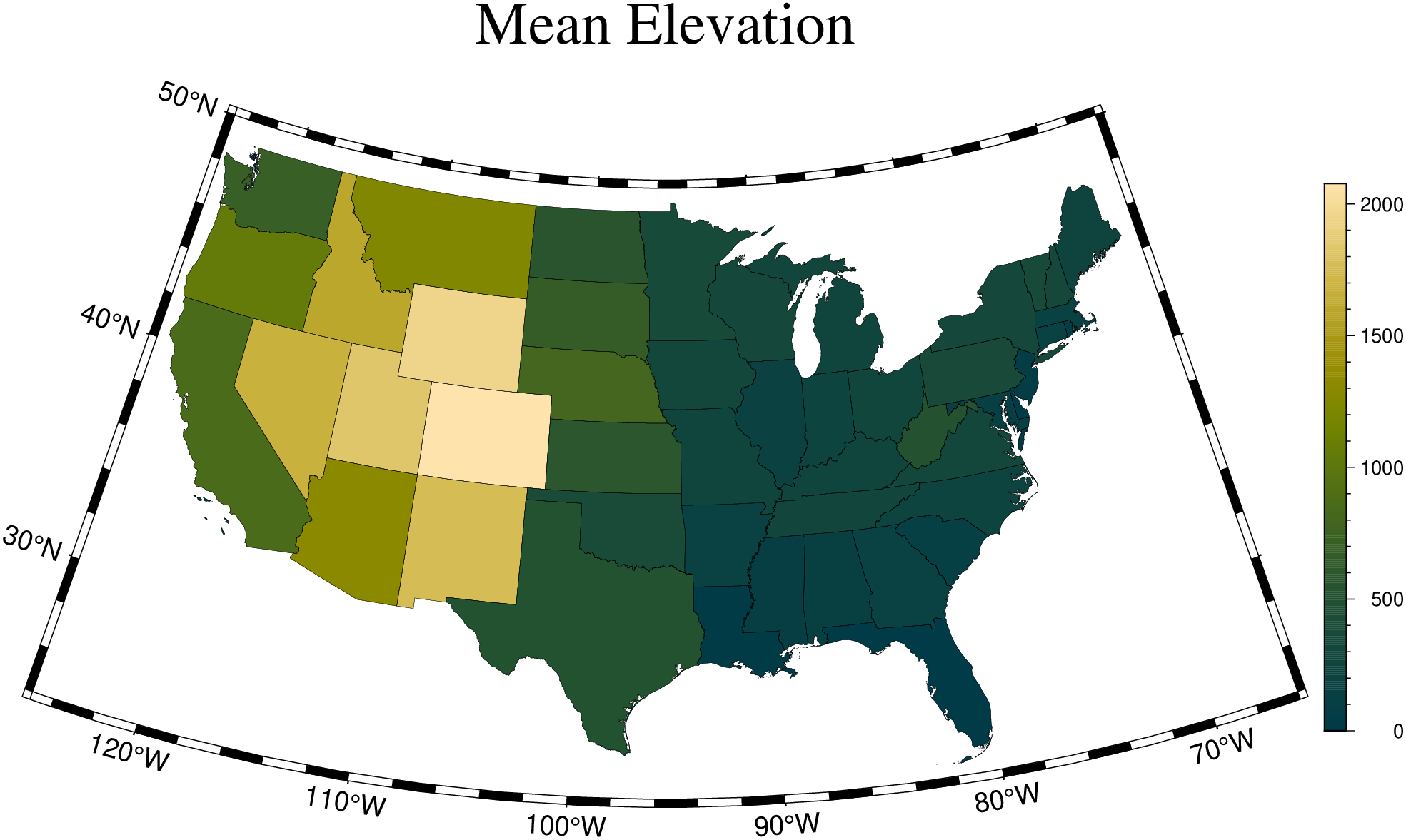
Represent colors by average altitude
We can also use the same polygons to represent some other variable, such as the average altitude of each state. We will use the Earth Relief 06m dataset
usingGMT# HideD =gmtread("/vsizip//vsicurl/https://www2.census.gov/geo/tiger/GENZ2024/shp/cb_2024_us_state_500k.zip"); # HideG =gmtread("@earth_relief_06m");# Calculate the mean elevation per State.Dh =zonal_statistics(G, D, mean);# Create a color table for the mean elevation values.C =makecpt(range=(0, ceil(Dh.ds_bbox[2])), cmap=:bamako);viz(D, region=(-125,-66,24,50), proj=:guess, levels=Dh, cmap=C, plot=(data=D,lw=0), title="Mean Elevation", colorbar=true)
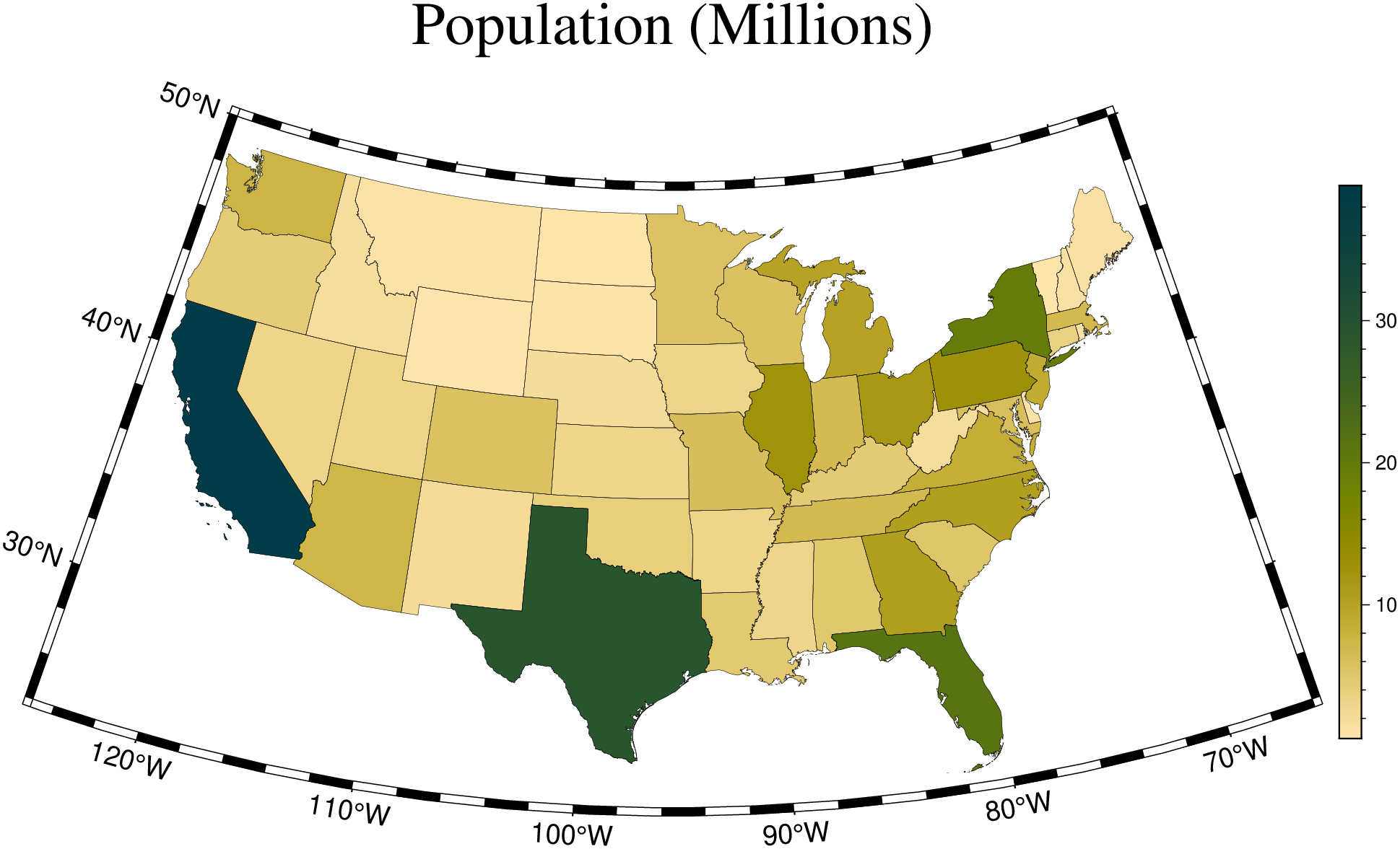
The case above was relatively easy because the data was already prepared in a form that GMT could use. That is, the zvals vector, which together with the colorscale, determines the color of the polygons was already in the same order as the polygons themselves (in the GMTdataset D). However, often that is not the case, and we have the variable that contains the information that we want to colorize in a different source and with a different order than that of the polygons in D. So, we need to do a kind of join operation. That can be done with join functions or use the internal polygonlevels function that links the polygon names provide by a stored attribute in D and the values in a vector or a table that must also have some text information (a name) associated with each value. It is that we will do in the next example.
usingGMT# HideD =gmtread("/vsizip//vsicurl/https://www2.census.gov/geo/tiger/GENZ2024/shp/cb_2024_us_state_500k.zip"); # Hide# Read a simple text file that has population and State name, one per row.pop =gmtread(TESTSDIR *"assets/uspop.csv");# Use the polygonlevels function to get the values in the same order as the polygons in D.zvals =polygonlevels(D, pop, att="NAME") /1e6;# Create a color table for the values in zvals.C =makecpt(zvals, auto=:r, reverse =true, cmap=:bamako);viz(D, region=(-125,-66,24,50), level=zvals, cmap=C, proj=:guess, plot=(data=D,lw=0), title="Population (Millions)", colorbar=true)
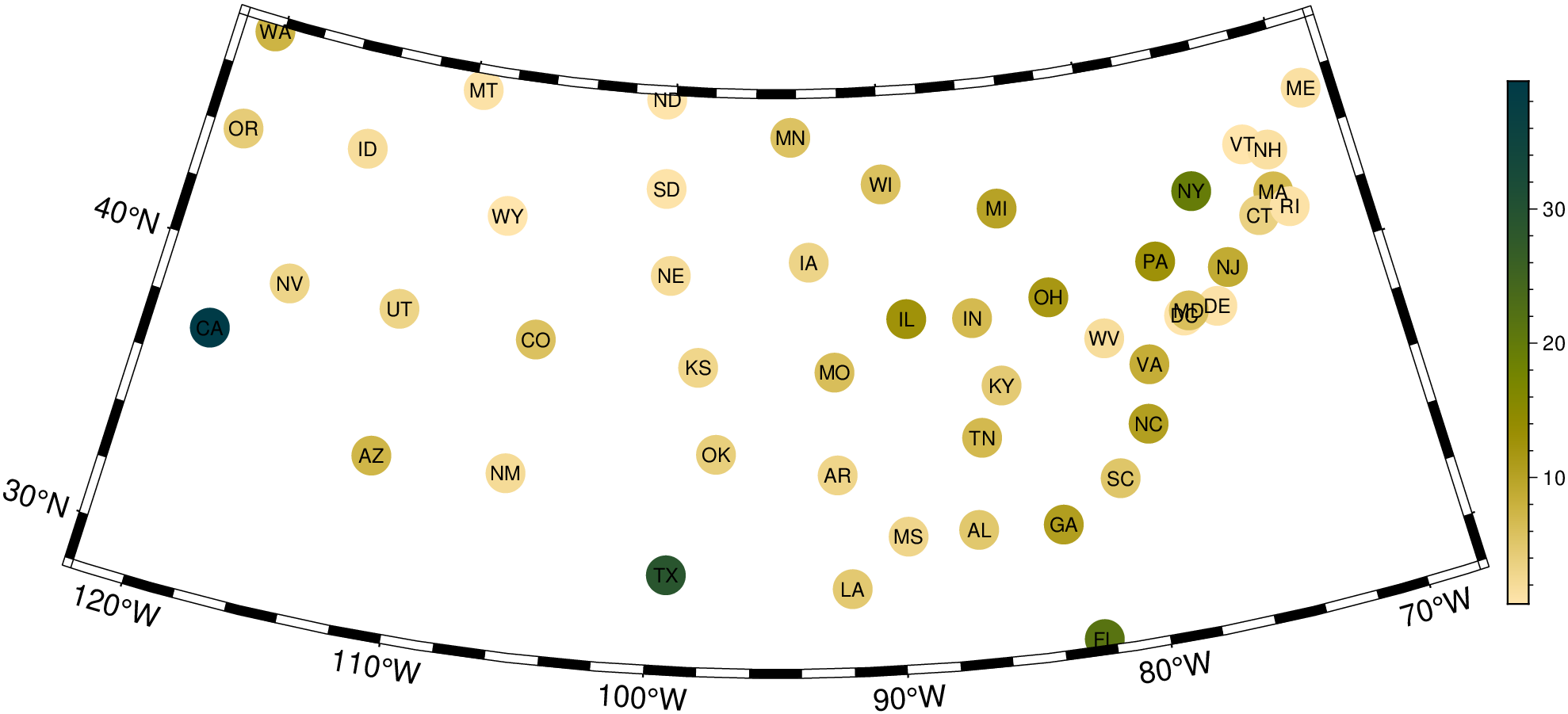
Choropleths by symbol color
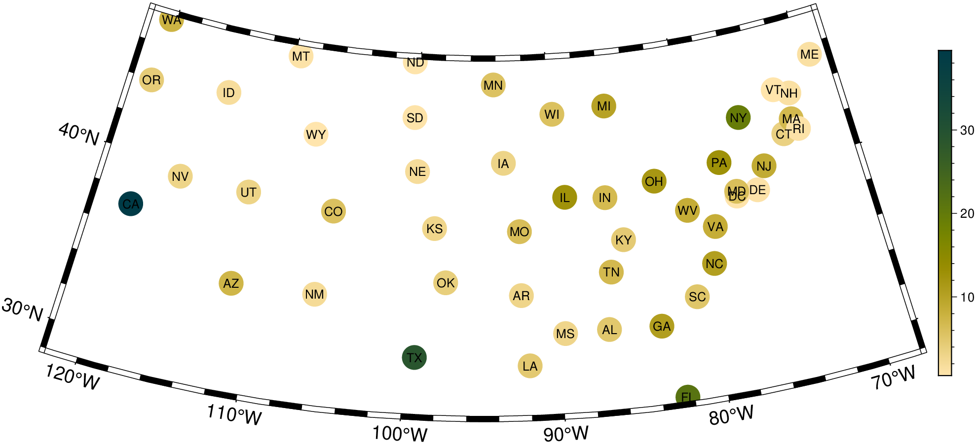
To avoid the perceptual problem of over-enphasize the polygon’s are we can alternatively use colored symbols (or symbols of different sizes). That can be done with the bubblechart program. One issue, though, that we have to deal in this case is that a state can have multiple polygons (for example Hawaii has many islands, and Michigan has two main landmasses). So, we need to calculate the largest polygon of each state and its centroid to place the symbol there.
usingGMT# HideD =gmtread("/vsizip//vsicurl/https://www2.census.gov/geo/tiger/GENZ2024/shp/cb_2024_us_state_500k.zip"); # HideDf =filter(D, _region=(-125,-66,24,50), _unique=true); # Keep only the largest polygon per statepop =gmtread(TESTSDIR *"assets/uspop.csv");zvals =polygonlevels(Df, pop, att="NAME") /1e6;C =makecpt(zvals, auto=:r, reverse =true, cmap=:bamako);bubblechart(Df, labels="attrib=STUSPS", proj=:guess, zcolor=zvals, cmap=C, colorbar=true, show=true)
In all the examples above we have used the US states polygons from a downloaded file, but we actually no not need that as the internal GMT coasts database has the US states polygons. So, we can use the coast function to get extract the states polygons and use them in the same way as above. Here is an example that would produce the exactly same image. But note how attribute names are different now as state names are stored under the “CODE” attribute.
Note the contains=true option in the polygonlevels function call. That is needed because the state names in the Df dataset are like “Alabama (United States)” while in the pop table they are simply “Alabama”. So, to do the joining operation, we had to be more relaxed and not impose an quality comparions (like the cases above) but to satisfy that the name in pop is contained in the name in Df.
Df

Attribute table
┌─────┬──────┬──────────────────────────────────────┐
│ Row │ CODE │ NAME                                 │
├─────┼──────┼──────────────────────────────────────┤
│   1 │ AL   │ Alabama (United States)              │
│   2 │ AR   │ Arkansas (United States)             │