

using GMT
bar(1:5, (20, 35, 30, 35, 27), width=0.5, color=:lightblue,
    limits=(0.5,5.5,0,40), show=true)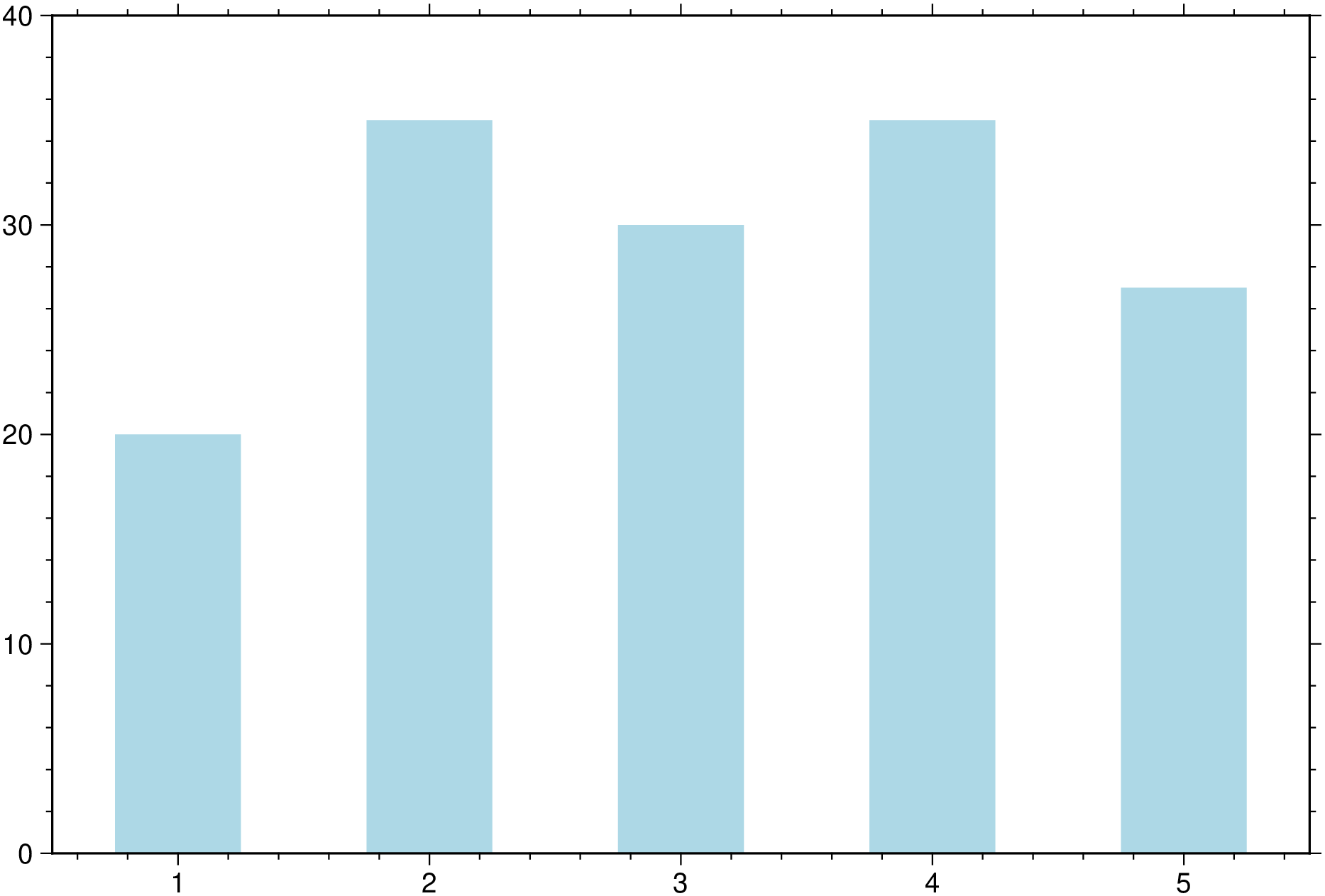
A simple bar plot showing color and bar width (in data units) assignement.
using GMT
bar(1:5, (20, 35, 30, 35, 27), width=0.5, color=:lightblue,
limits=(0.5,5.5,0,40), show=true)
A colored bar plot with colors proportional to bar heights. In this case we let the plot limits be determined from data. We also plot a colorbar by using the colorbar=true option.
using GMT
bar(rand(15), color=:turbo, figsize=(14,8), title="Colored bars",
    colorbar=true, show=true)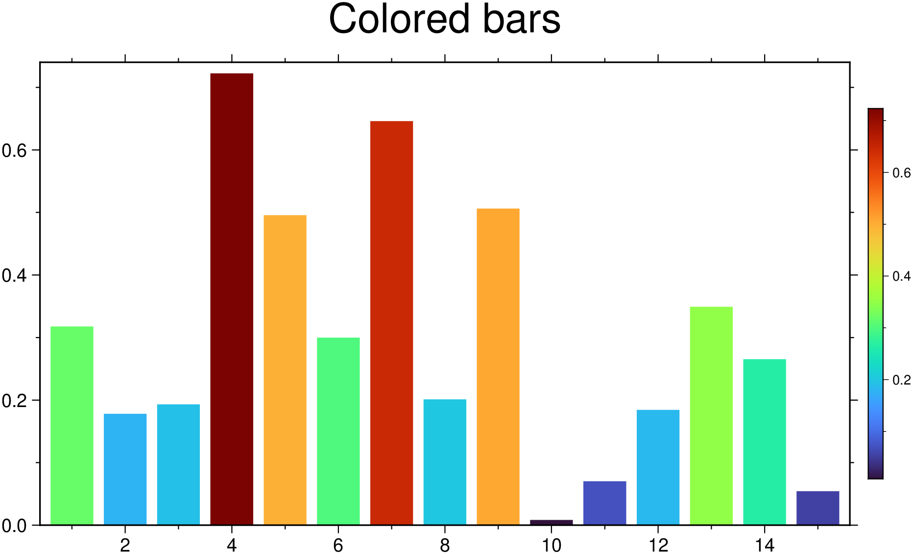
Example showing how to plot bar groups and at same time assign variable transparency to each of the group’s band usinf the fillalpha option. Here, each row on the input data represents a bar group that has as many bands as n_columns - 1. -1 because first column must hold the xx coordinates of each group. The colors come from the automatic cyclic scheme.
using GMT
bar([0. 1 2 3; 1 2 3 4], fillalpha=[0.3 0.5 0.7], show=true)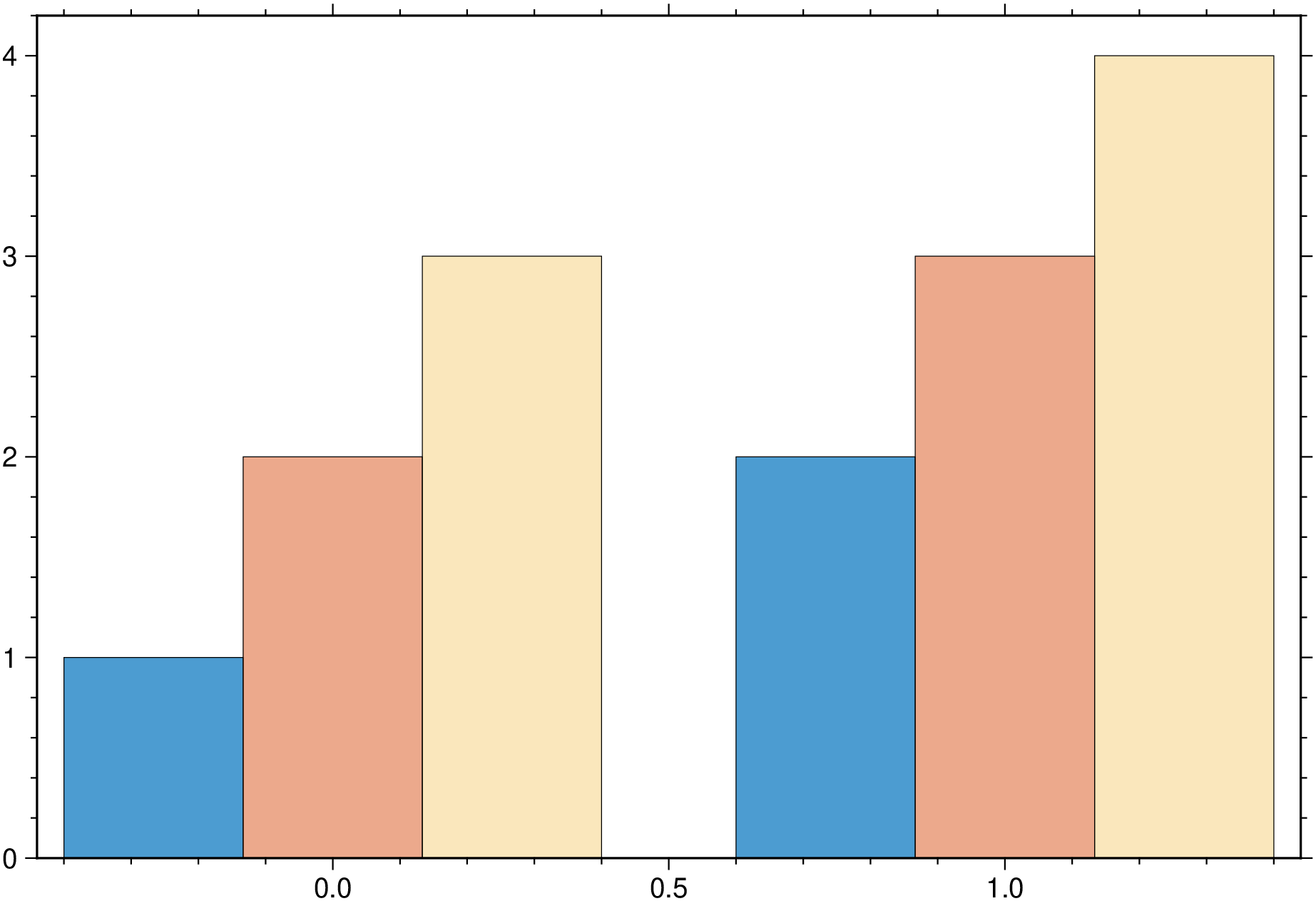
And we can also make plots with bar groups where each group has a variable number of bars. For that, pass NaN’s in place of the missing bars for a particular group. For example:
using GMT
bar([2 0.5 1 NaN 1; 4 NaN NaN 2 NaN; 1 3 4 3 2; NaN 3 NaN 1 2], fillalpha=[0.3 0.5 0.7],
    xticks=(:d1, :d2, :d3, :d4), show=true)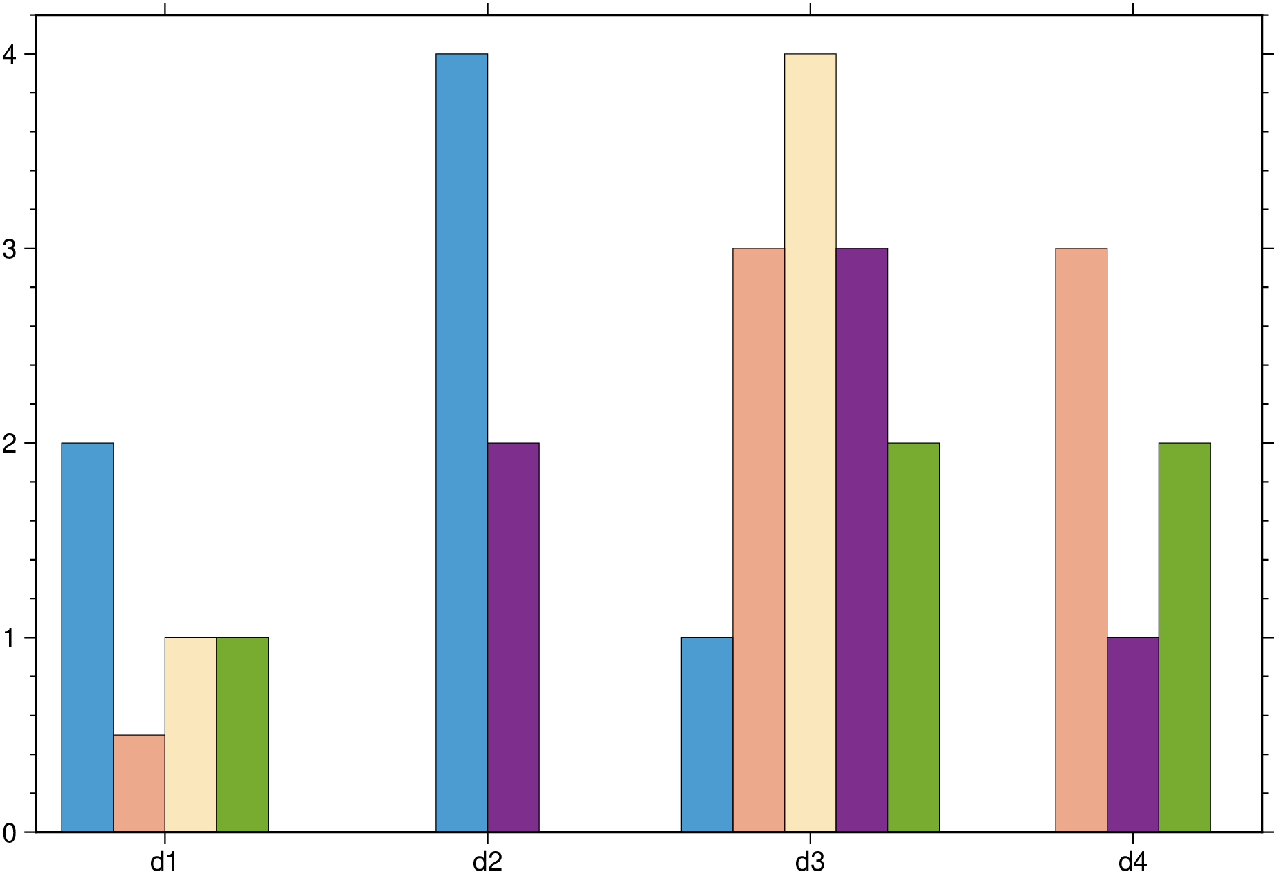
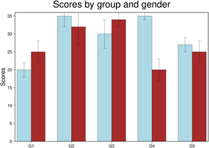
Next example shows how to plot error bars in a grouped bar. Similar to this mapplotlib’s example (labels will come later).
using GMT
bar(1:5, [20 25; 35 32; 30 34; 35 20; 27 25], width=0.7, fill=["lightblue", "brown"],
    error_bars=(y=[2 3; 3 5; 4 2; 1 3; 2 3],),
    xticks=(:G1, :G2, :G3, :G4, :G5), yaxis=(annot=5,label=:Scores),
    frame=(title="Scores by group and gender", axes=:WSrt), show=true)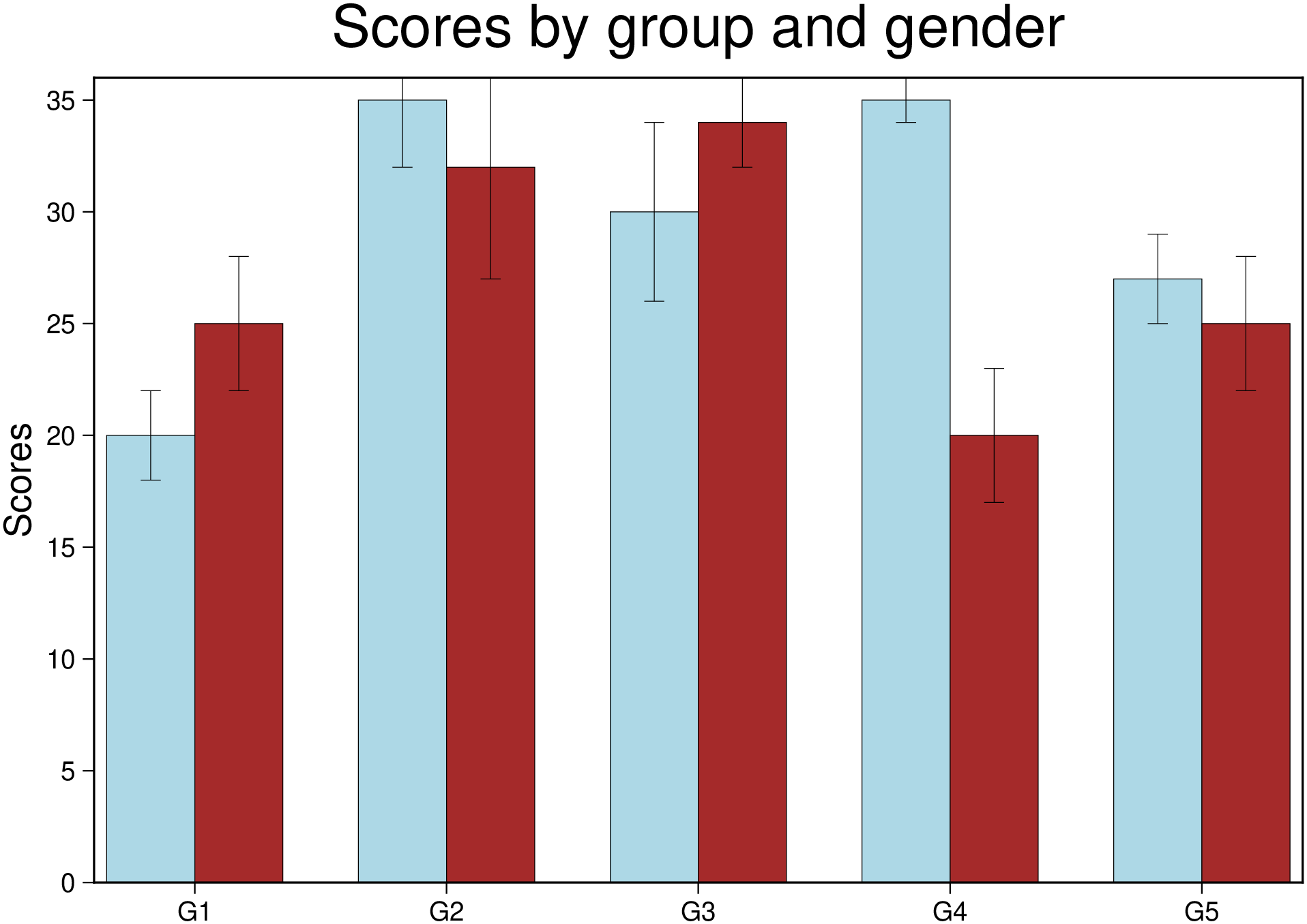
Example of a verticaly stacked bar plot. In this exampled we pass the xx coordinates as first argument and the individual bar heights in a matrix with smae number of rows as the number of elements in the x vector. To make it plot a stracked bar we used the option stacked=true.
using GMT
bar(1:3,[-5 -15 20; 17 10 21; 10 5 15], stacked=1, show=true)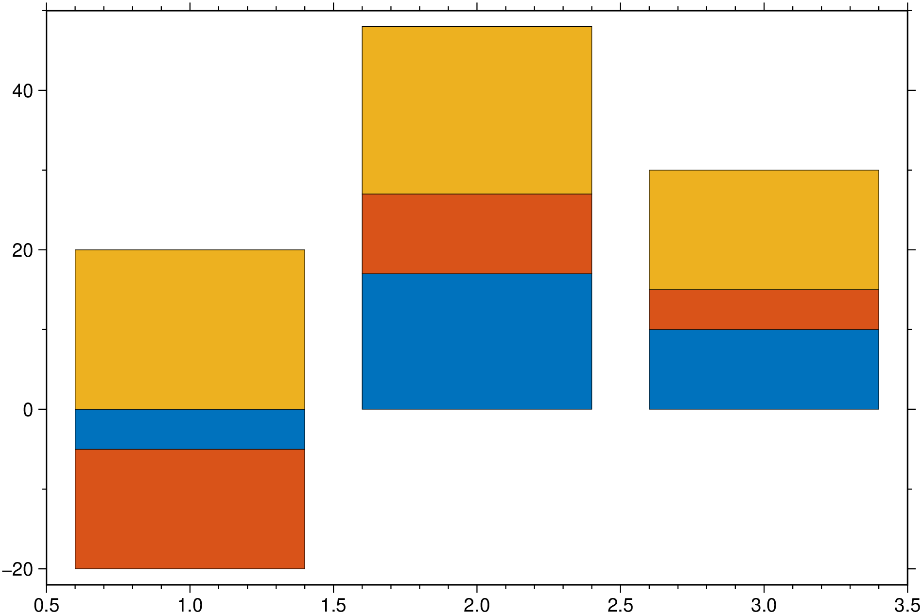
using GMT
bar([1 2 3 0 -1 -2 0], stacked=:water, connector=true, bargap=25,
    xticks=(:A, :B, :C, :Partial, :D, :E, :Total), show=true)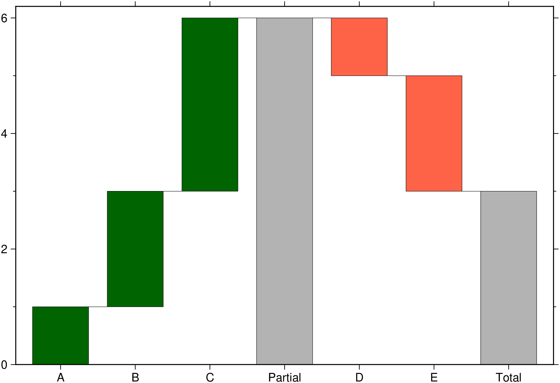
To create an horizontal bar plot we use the hbar=true option
using GMT
bar([0. 1 2 3; 1 2 3 4], hbar=true, show=true)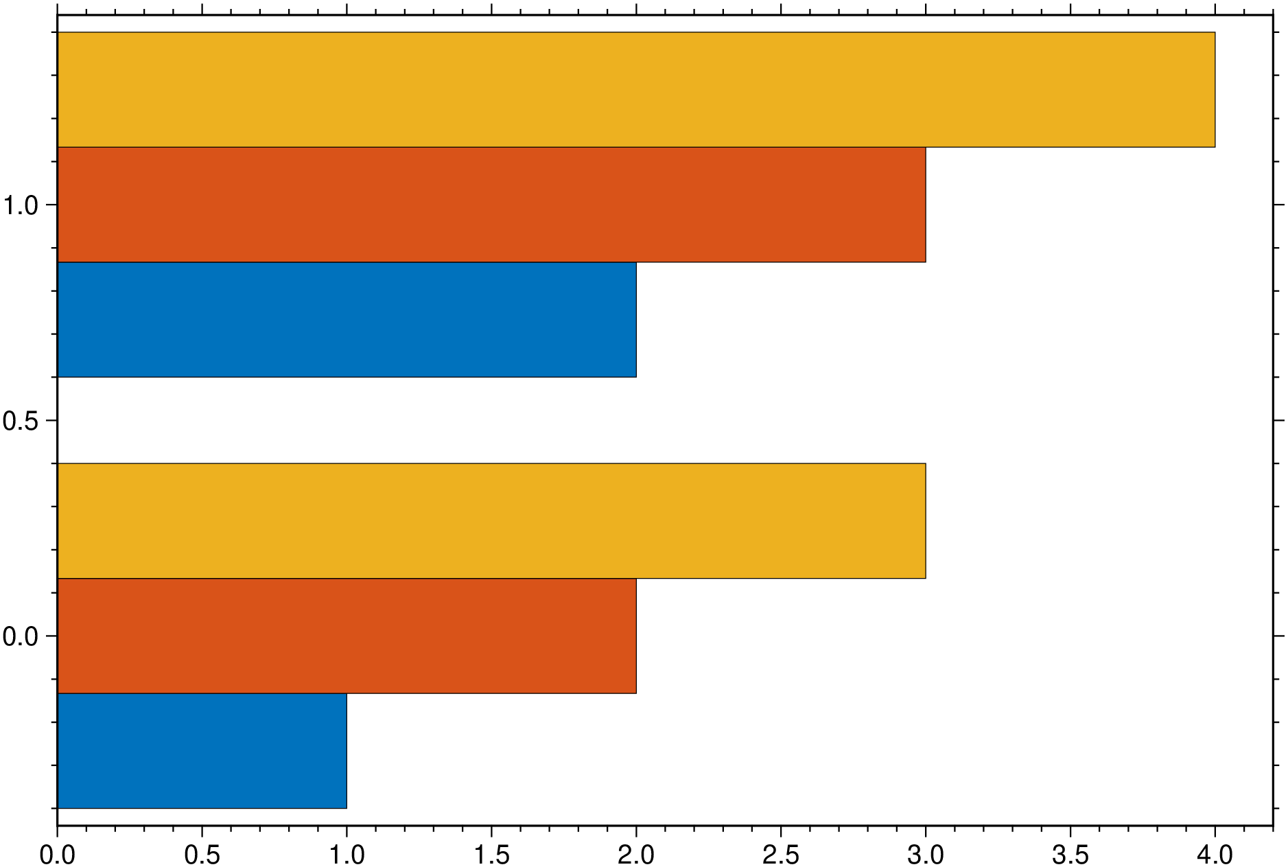
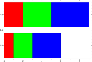
And one horizontally stacked but this time we pick the colors.
using GMT
bar([0. 1 2 3; 1 2 3 4], stack=true, hbar=true, fill=["red", "green", "blue"], show=true)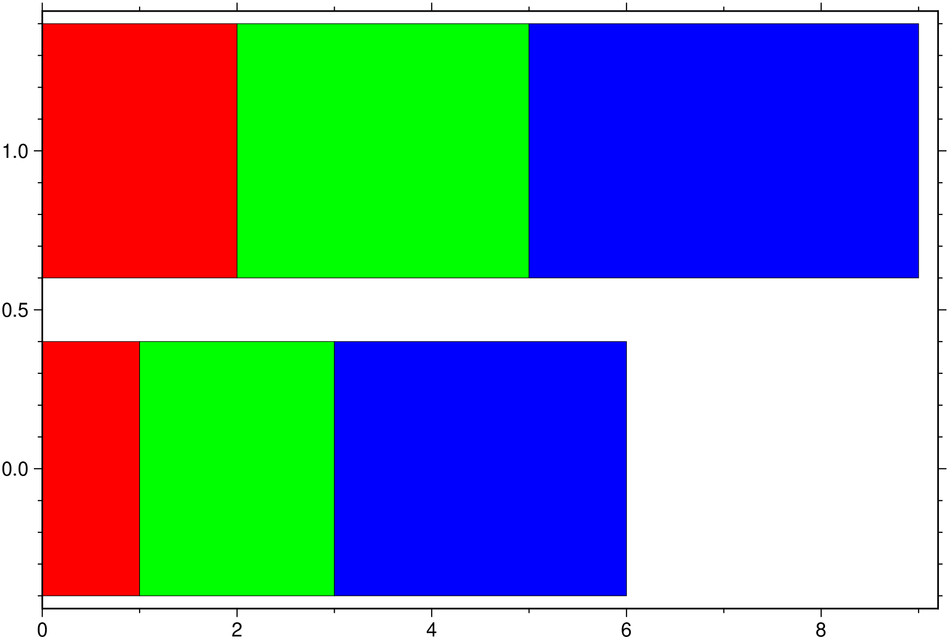
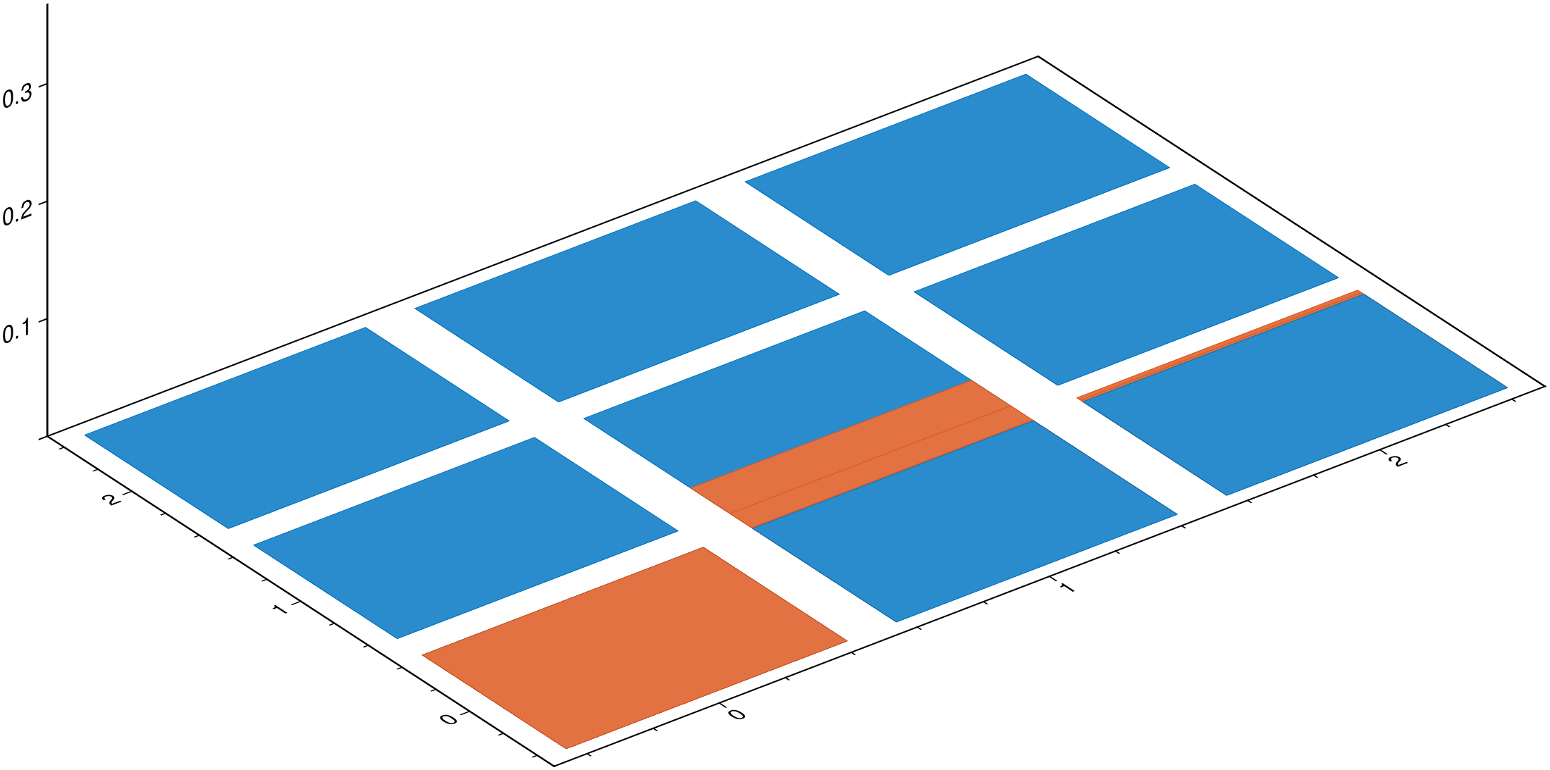
using GMT

#Create a 3x3 grid
G = gmt("grdmath -R0/2/0/2 -I1 X Y R2 NEG EXP X MUL =");

# Plot that grid as 3D prisms
bar3(G,                 # 'G' is the grid created above
     fill=[0,115,190],  # Fill prisms with this RGB color
     lw=:thinnest,      # Line thickness (0.25 pt)
     show=true)         # Display the figure.
┌ Warning: 'multile coluns' in 3D plots are not allowed. Ignoring. └ @ GMT C:\Users\j\.julia\dev\GMT\src\psxy.jl:521
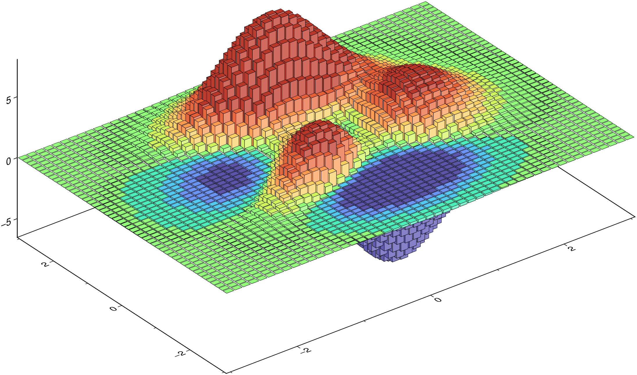
using GMT

G = GMT.peaks();      # Create a 'peaks' grid
cmap = grd2cpt(G);    # Colormap with the grid's data range

bar3(G,               # 'G' is the grid created above
     lw=:thinnest,    # Line thickness (0.25 pt)
     color=cmap,      # Paint the prisms with colormap computed from grid
     show=true)       # Display the figure.