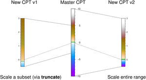
Color maps

Examples

Hinges

The CPTs distributed with GMT are dynamic. This means they have several special properties that modify the behavior of programs that use them. Dynamic CPTs comes in a few different flavors: Some CPTs were designed to behave differently across a hinge value (e.g., a CPT designed specifically for topographic relief may include a discontinuity in color across the coastline at z = 0), and when users select these CPTs they will be stretched to fit the user’s desired data range separately for each side of this hard hinge. Basically, a hard hinge CPT is the juxtaposition of two different CPTs joined at the hinge and these sections are stretched independently.

In the figure bellow the top color bar is a dynamic master CPT (here, globe) with a hard hinge at sea level and a natural range from -10,000 to +10,000 meters. However, our data range is asymmetrical, going from -8,000 meter depths up to +3,000 meter elevations. Because of the hinge, the two sides of the CPT will be stretched separately to honor the desired range while utilizing the full color range.

using GMT

C = makecpt(cmap=:globe, range=(-8000,3000));
colorbar(pos=(paper=true, anchor=(0,0), size=(11.5, 0.25), horizontal=true))
colorbar!(cmap=:globe, frame=:auto, yshift=1.3,
          pos=(paper=true, anchor=(0,0), size=(11.5, 0.25), horizontal=true))
plot!([5.75 0.25 90 0.5], region=(0,11.5,0,2.5), figscale=1, proj=:linear,
      symbol="v0.25+a80+b", frame=:none, pen=1, fill=:black)
text!(text_record([5.7 0.9],["HINGE"]), font=12, justify=:CB, show=true)

Manipulating

There are many ways to turn a master CPT into a custom CPT that works for your particular data range. The tools makecpt and grd2cpt allow several types of transformations to take place:

Examples of two user CPTs for the range -0.5 to 3 created from the same master. One (left) extracted a subset of the master before scaling while the other (right) used the entire range.

using GMT
ls = [3	2.9;	# Coordinates of 6 line segments connecting example CPTs
 5	2.5;;;
 3	0.1;
 5	0.5;;;
 3	2.2;
 1	2.5;;;
 3	1.08;
 1	0.5;;;
 1	0.785;
 3	1.5;;;
 3	1.5;
 5	0.785];

D = mat2ds(reshape(ls, 2, 2, 6))            # Create a GMTdaset with the six line segments
D[5].header = D[6].header = " -W0.25p,-"    # Tell that last two segments are dashed lines 
lines(D, region=(0,6,0,3), figscale="1i", frame=:none, pen=0.25)
colorbar!(cmap=:globe, frame=:auto, pos=(paper=true, anchor=("3i","1.5i"),
          size=("2.8i","0.15i"), justify=:CM), W=0.001)
C = makecpt(cmap=:globe, range=(-500, 3000));
colorbar!(frame=:auto, pos=(paper=true, anchor=("5i","1.5i"),
          size=("2.0i","0.15i"), justify=:LM), W=0.001)
C = makecpt(cmap=:globe, truncate=(-3000,5000), range=(-500, 3000));
colorbar!(frame=:auto, pos=(paper=true, anchor=("1i","1.5i"),
          size=("2.0i","0.15i"), justify=:RM, move_annot=:a), W=0.001)

T = text_record([0 0; 6 0; 3 3.1; 1 3.1; 5 3.1],
                ["LB Scale a subset (via @%1%truncate@%%)"
                 "RB	Scale entire range";
                 "CB	Master CPT";
                 "CB	New CPT v1";
                 "CB	New CPT v2"]);

text!(T, noclip=true, font=14, justify=true, show=true)

Labeled

Things become a bit more complicated when we want to label the legend with names for certain intervals (like geological time periods in the example below). To accomplish that, one should currently do a hack and add the labels manually in the CGMTcpt fields label and key, and add the equal_size option to the colorbar command that draws the color legend. This option also makes all intervals in the legend of equal length, even it the numerical values are not equally spaced.

Normally, the name labels are plotted at the lower end of the intervals. But by adding a gap amount (even when zero) to the -L option, they are centered. The example below also shows how to annotate ranges using equal_size=(range=true,) (in which case no name labels should appear in the CPT), and how to switch the color bar around (by using a negative length).

using GMT

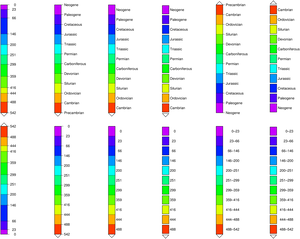
C = makecpt(cmap=((197,0,255),(81,0,255),(0,35,255),(0,151,255),(0,255,244),(0,255,127),(0,255,11),
                  (104,255,0),(220,255,0),(255,174,0),(255,58,0)),
            T=[0,23,66,146,200,251,299,359,416,444,488,542]);
# Add the labels for the periods 
C.label = ["Neogene", "Paleogene", "Cretaceous", "Jurassic", "Triassic", "Permian",
           "Carboniferous", "Devonian", "Silurian", "Ordovician", "Cambrian;Precambrian"];

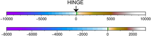
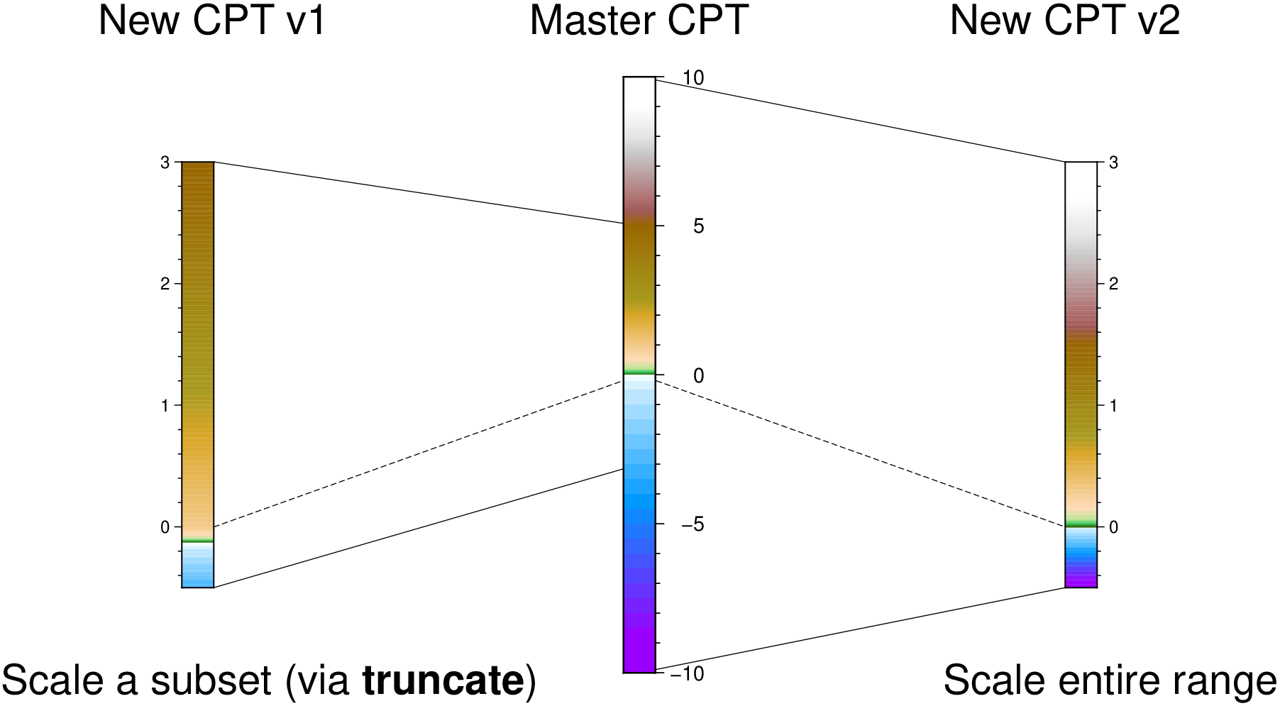
colorbar(pos=(paper=true,  anchor=(0,13),  size=(-8,0.5), justify=:ML, triangles=:f), B=:none)
colorbar!(pos=(paper=true, anchor=(4,13),  size=(-8,0.5), justify=:ML, triangles=:f),
          B=:none, equal_size=true)
colorbar!(pos=(paper=true, anchor=(8,13),  size=(-8,0.5), justify=:ML, triangles=:f),
          B=:none, equal_size=(gap=0,))
colorbar!(pos=(paper=true, anchor=(12,13), size=(-8,0.5), justify=:ML, triangles=:f),
          B=:none, equal_size=(gap=0.1,))
colorbar!(pos=(paper=true, anchor=(16,13), size=(08,0.5), justify=:ML, triangles=:f),
          B=:none, equal_size=true)
colorbar!(pos=(paper=true, anchor=(20,13), size=(08,0.5), justify=:ML, triangles=:f),
          B=:none, equal_size=(gap=0.1,))

# Remove the labels so that we can plot the ages
C.label = fill("", length(C.label));

colorbar!(pos=(paper=true, anchor=(0,4),  size=(08,0.5), justify=:ML, triangles=:f), B=:none)
colorbar!(pos=(paper=true, anchor=(4,4),  size=(-8,0.5), justify=:ML, triangles=:f),
          B=:none, equal_size=true)
colorbar!(pos=(paper=true, anchor=(8,4),  size=(-8,0.5), justify=:ML, triangles=:f),
          B=:none, equal_size=(gap=0,))
colorbar!(pos=(paper=true, anchor=(12,4), size=(-8,0.5), justify=:ML, triangles=:f),
          B=:none, equal_size=(gap=0.1,))
colorbar!(pos=(paper=true, anchor=(16,4), size=(-8,0.5), justify=:ML, triangles=:f),
          B=:none, equal_size=(range=true,))
colorbar!(pos=(paper=true, anchor=(20,4), size=(-8,0.5), justify=:ML, triangles=:f),
          B=:none, equal_size=(range=true, gap=0.1), show=true)