using GMT

piechart([0.2 0.4 0.1], show=true)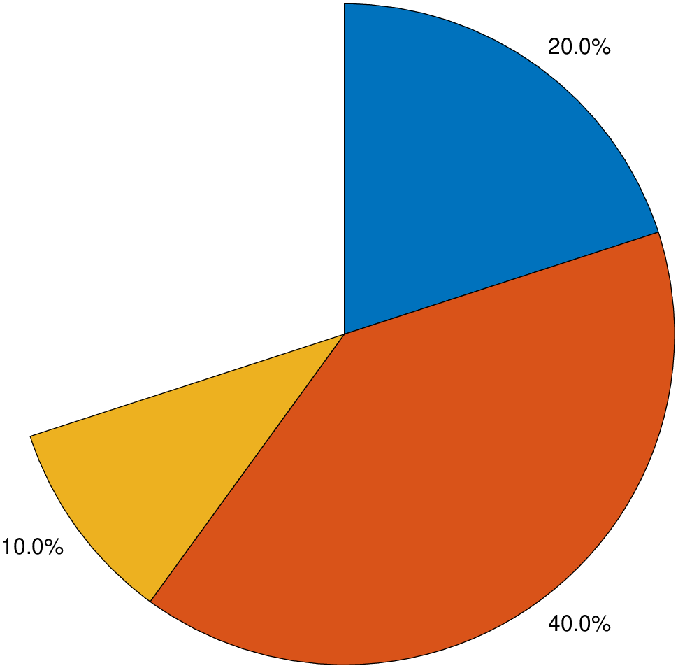
piechart(x::VecOrMat; kw...)Create a pie chart of the values in the vector data x.
Each slice has a label indicating its size as a percentage of the whole pie or a label provided by the user.
x: Slice data, specified as a vector of numeric values. The size of each slice is a percentage of the whole pie, depending on the sum of the elements of data:
colors: - A sequence of comma separated colors through which the pie chart will cycle. By default we use the cycle colors.
explode: - Offset slices, specified as a Int or logical vector. Slice numbers specified in this option are exploded with a shift of 4% of the pie diameter. Example: explode=2 will explode slice 2. explode=[2,4] will explode slices 2 and 4.
font: The fontsize used in labels. By default we compute onde from the pie size (see ms below), but user can specify a fontsize in points (and optionally a font name and color).
labels: - A string vector or a tuple with the labels of each slice.
labelstyle: - Label style, specified as one of the values in the next list.
"namepercent": - Display the labels and proportions values (as percentages) next to the corresponding slices."namedata": - Labels with the name and value of each slice."name": - Display the labels values next to the corresponding slices."data": - Display the Data values next to the corresponding slices."percent": - Display the proportions values (as percentages) next to the corresponding slices (the defaul when no labels are provided)."none": - Do not display any labels.ms or markersize: - The diameter of the pie in cm (Default is 8 cm).
figname or savefig or name : – figname=name.png
Save the figure with the figname=name.ext where ext chooses the figure image format.
This module is a subset of plot. So not all (fine) controlling parameters are not listed here. For the finest control, user should consult the plot module. |
| Examples |
A partial piechart
using GMT
piechart([0.2 0.4 0.1], show=true)
piechart([1 2 3 4], show=true)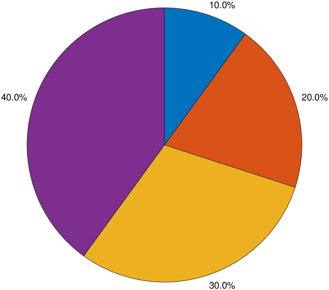
piechart([1,2,3,4], explode=2, labels=("A","B","C","D"), labelstyle="namepercent", show=true)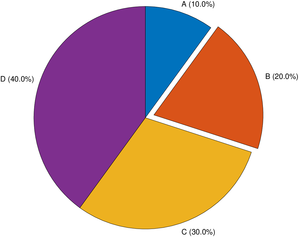
View the source code for this function.