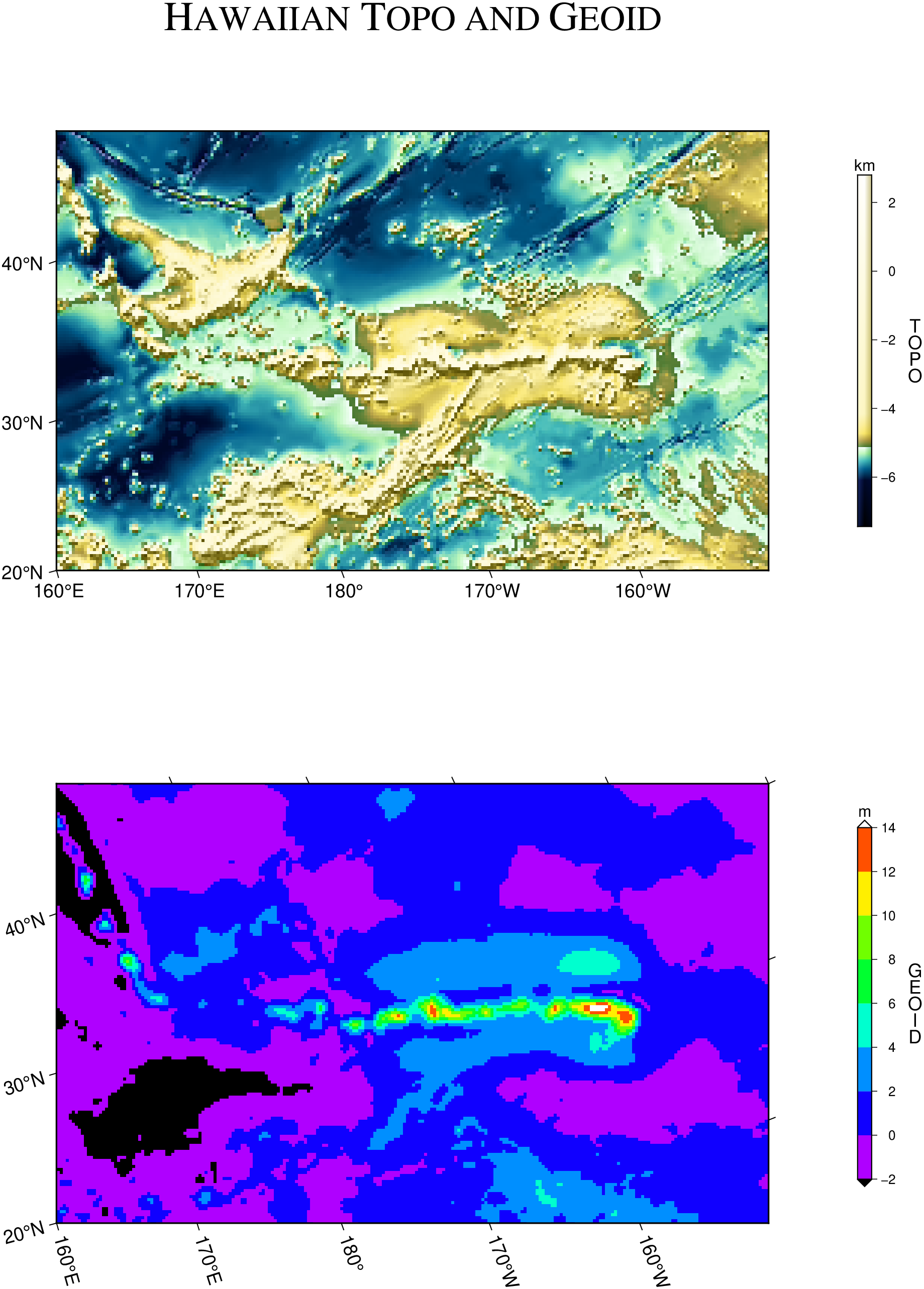
As our second example we will demonstrate how to make color images from gridded data sets (again, we will defer the actual making of grid files to later examples). We have prepared two 2-D grid files of bathymetry and Geosat geoid heights from global grids and will put the two images on the same page. The region of interest is the Hawaiian Islands, and due to the oblique trend of the island chain we prefer to rotate our geographical data sets using an oblique Mercator projection defined by the hotspot pole at (68W, 69N). We choose the point (190, 25.5) to be the center of our projection (e.g., the local origin), and we want to image a rectangular region defined by the longitudes and latitudes of the lower left and upper right corner of region. In our case we choose (160, 20) and (220, 30) as the corners. We twice use [grdimage] to make the illustration:
We again set up a 2 by 1 subplot layout and specify the actual region and map projection we wish to use for the two map panels. We use [makecpt] to generate a linear color palette file for the geoid and use [grd2cpt] to get a histogram-equalized CPT for the topography data. We run [grdimage] to create a color-coded image of the topography, and to emphasize the structures in the data we use the slopes in the north-south direction to modulate the color image via the shade option. Then, we place a color legend to the right of the image with [colorbar]. We repeat these steps for the Geosat geoid grid. Again, the labeling of the two plots with a) and b) is automatically done by [subplot].