using GMT
density(randn(200), fill=true, show=true)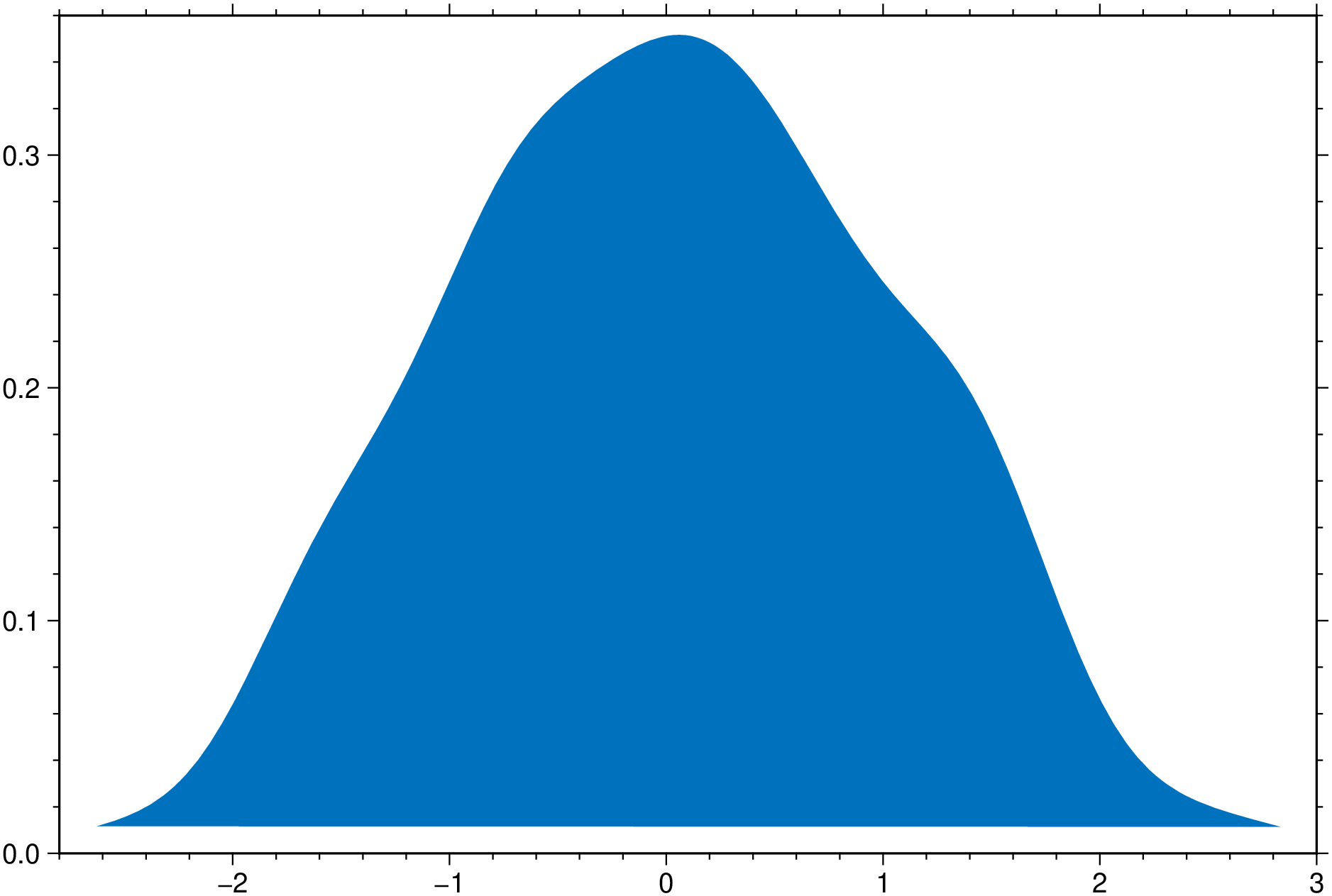
using GMT
density(randn(200), fill=true, show=true)
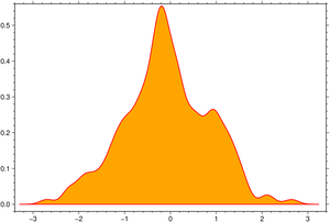
using GMT
density(randn(200), nbins=20, horizontal=true, fill=true, extend=2, show=true)
Expand the density profile with 4 x the set bandwidth, such that it decays to zero. By lowering the bandwidth we forcing the line to be less smoth.
using GMT
density(randn(200), fill=:orange, lc=:red, lw=1, bandwidth=0.15, extend=4, show=true)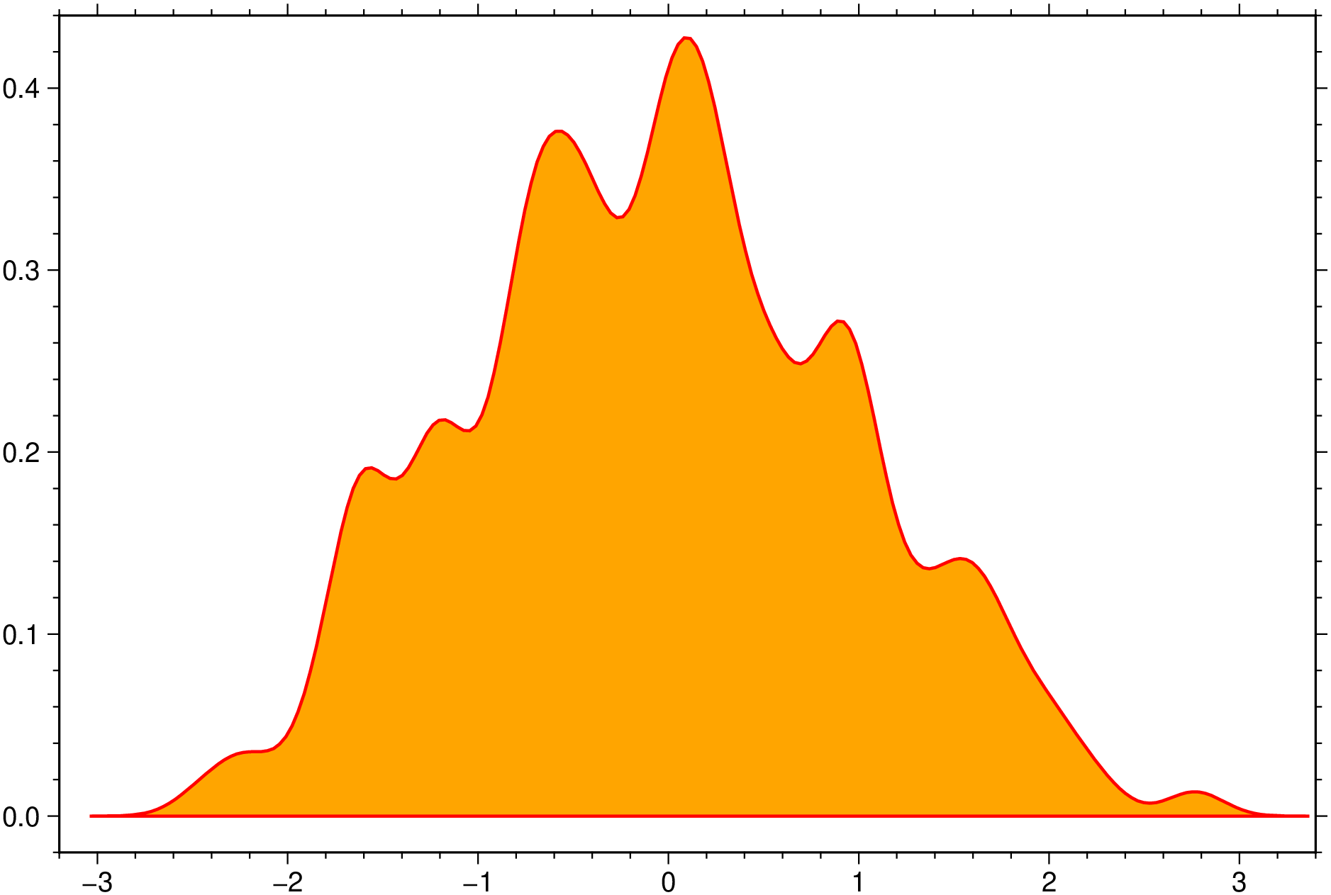
An horizontal boxplot with default colors, displaying outliers as 6p black stars. Noches are also shown but this requires GMT6.5.
using GMT
boxplot(randn(50,6), notch=true, fill=true, outliers=(size="6p",), hbar=true, show=1)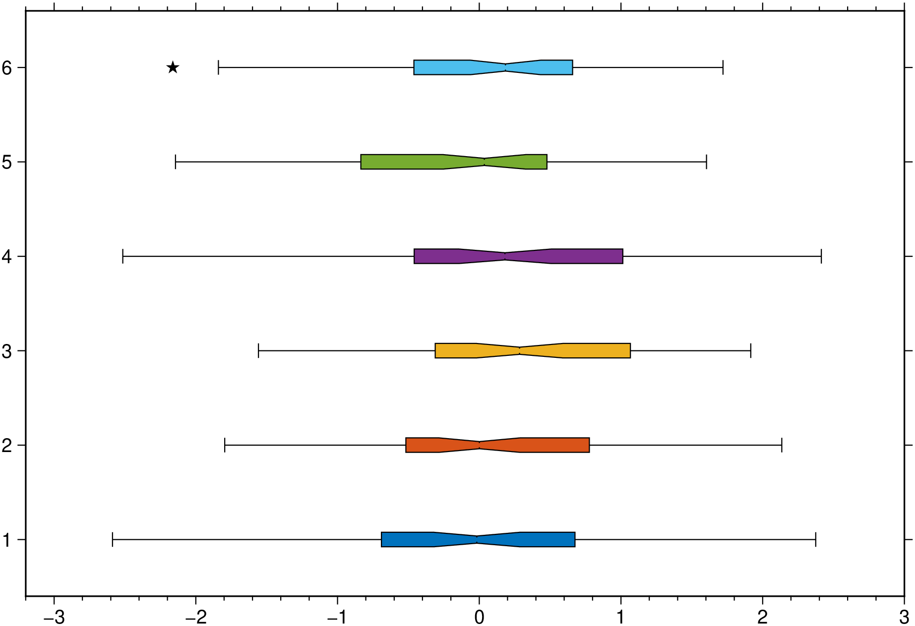
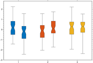
A plot of three groups of two elements each and where we assign the same color to the elements of each group.
using GMT
boxplot(randn(50,3,2), boxwidth="20p", notch=true, fill=true, ccolor=true, show=1)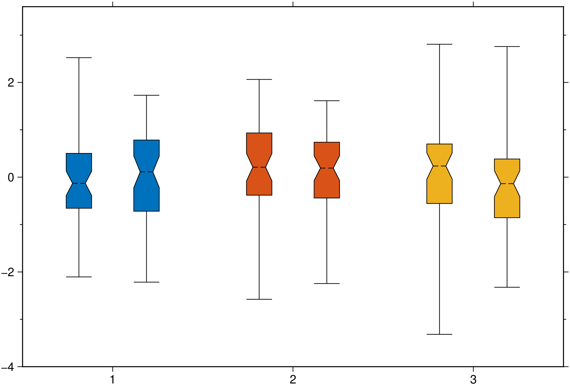
Create a plot with 8 violins colored with the default colors.
using GMT
violin(randn(100,8), fill=true, show=true)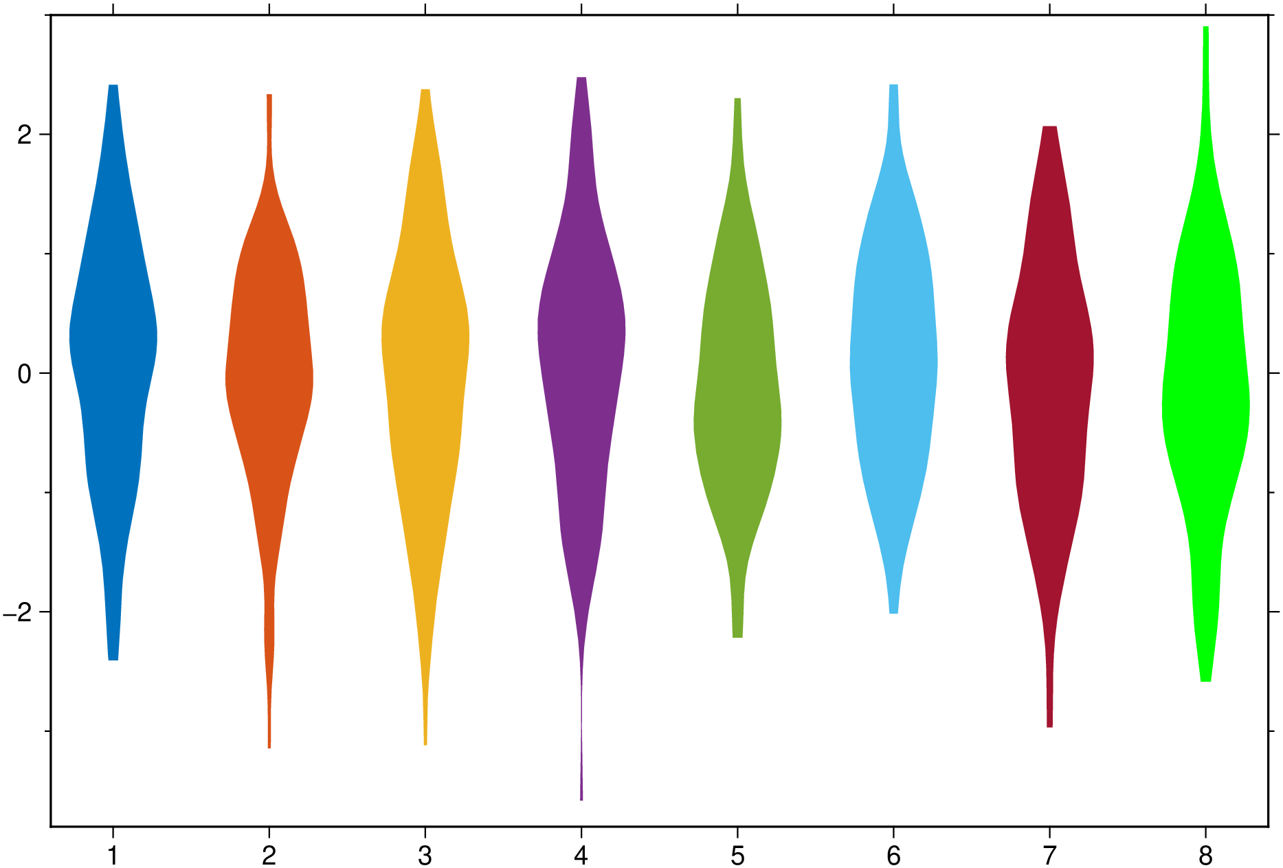
Now add boxplot, scatter and outliers to a plot similar to above. The outliers show as black stars with a fait gray outline.
using GMT
violin(randn(100,8), fill=true, boxplot=true, scatter=true, outliers=true, show=true)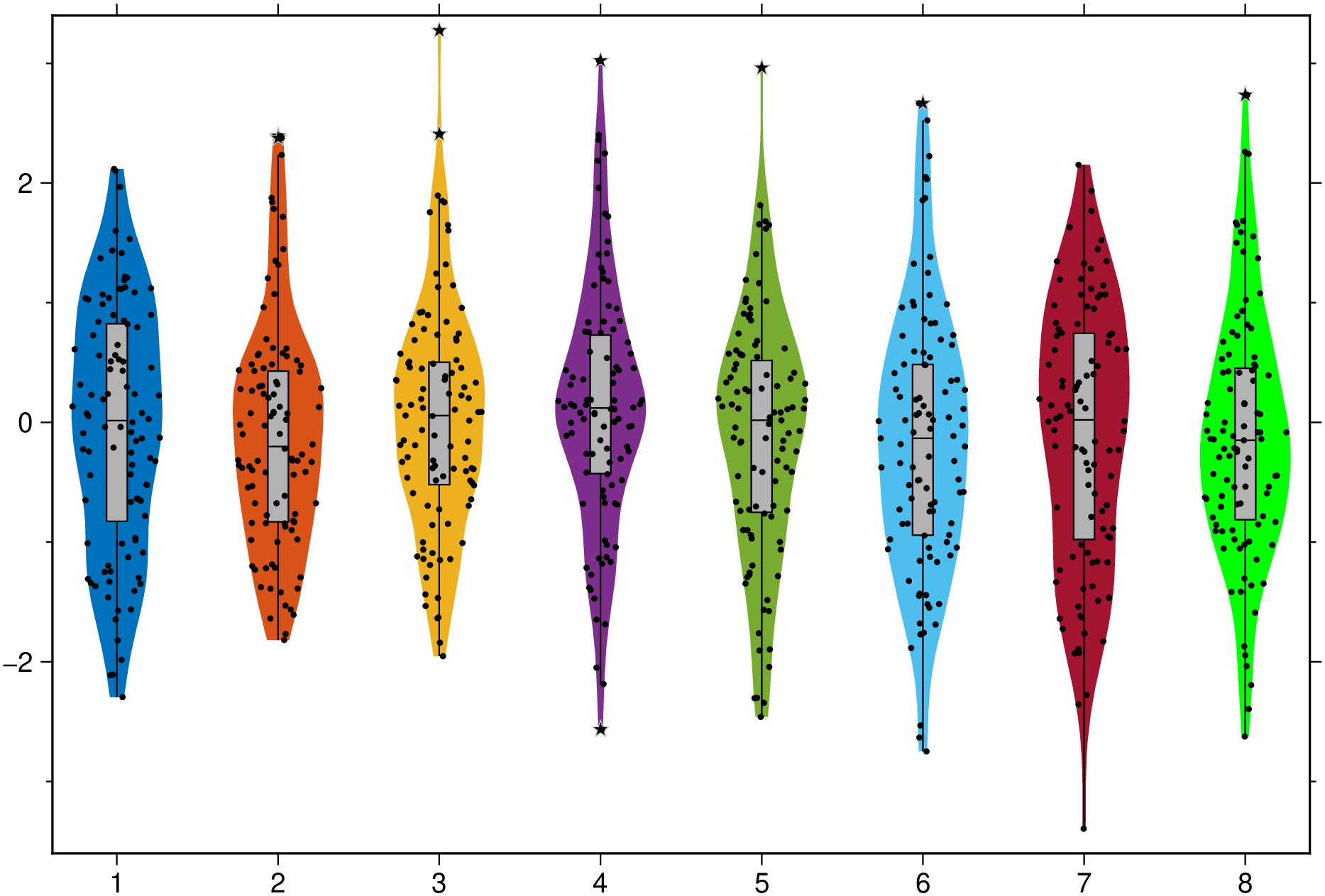
And a group example with red dashed separator lines and variable level of transparency for each element in the group. Note that this case uses input data as a Vector{Vector{Vector}}, which more representative of a real case as each violin is allowed to be made of a different number of observations.
using GMT
vvv = [[randn(50), randn(30)], [randn(40), randn(48), randn(45)], [randn(35), randn(43)]];
violin(vvv, fill=true, fillalpha=[0.5, 0.7, 0.85], boxplot=true, separator=(:red, :dash),
       scatter=true, outliers=true, show=true)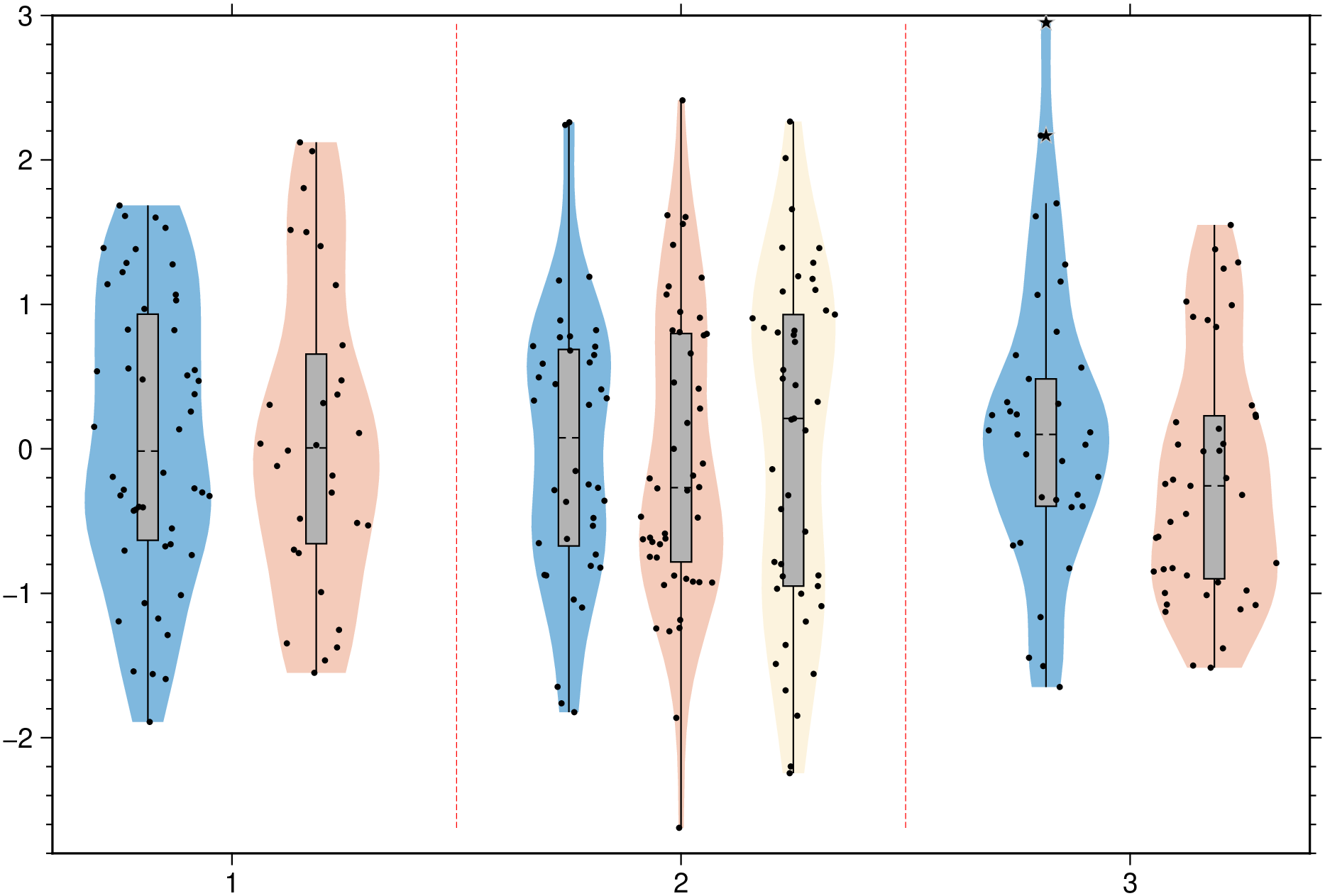
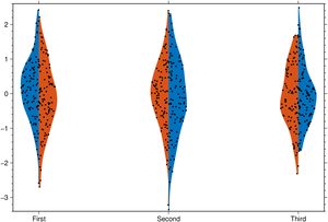
Join the left and right halves of each of the two element in the group.
using GMT
violin(randn(100,3,2), fill=true, scatter=true, split=true, xticks=["First","Second","Third"], show=true)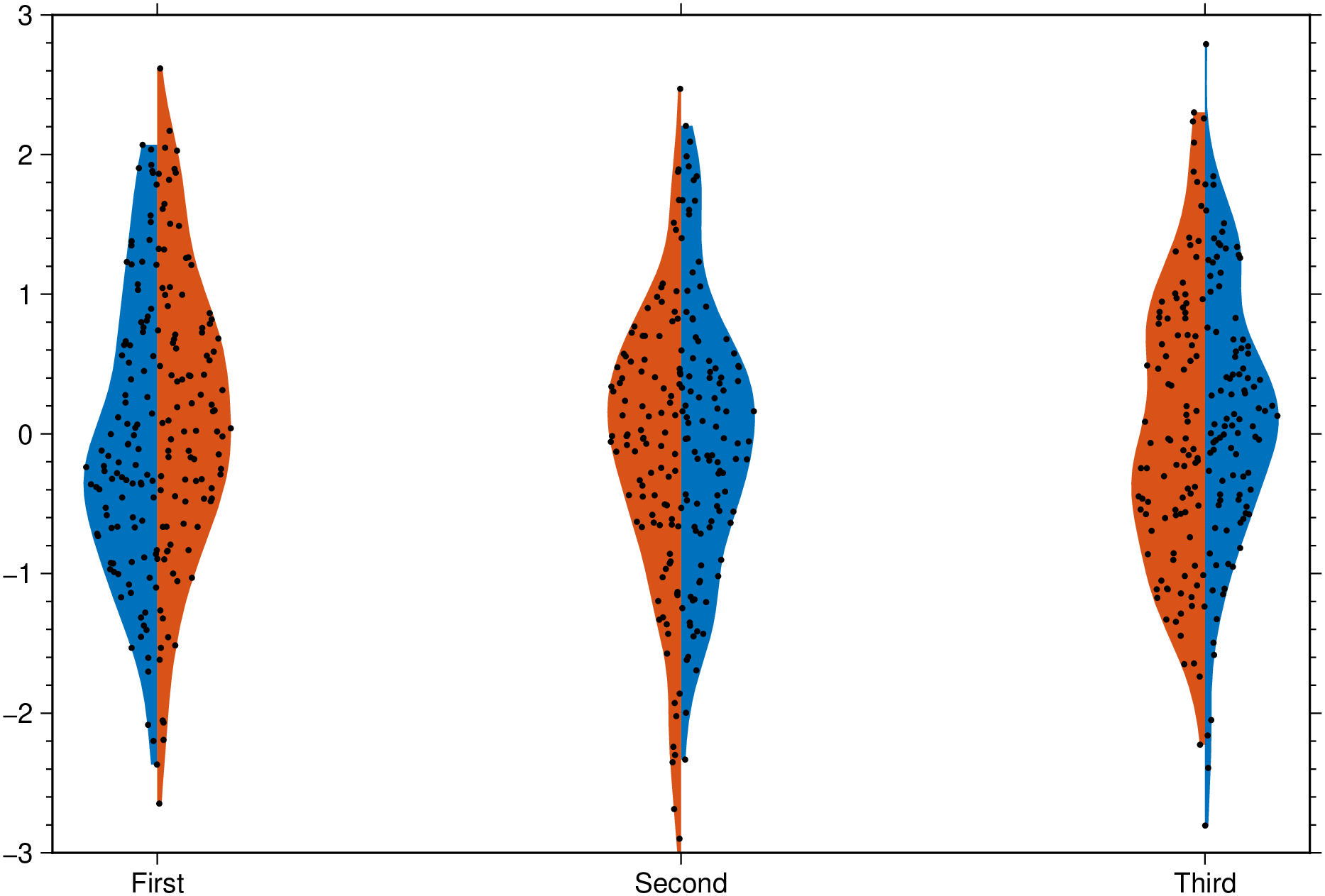
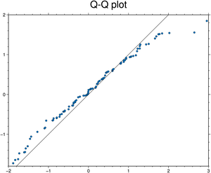
Test if x and y follow the same distribution.
using GMT
qqplot(randn(100), randn(100), qqline=:identity, title="Q-Q plot", show=true)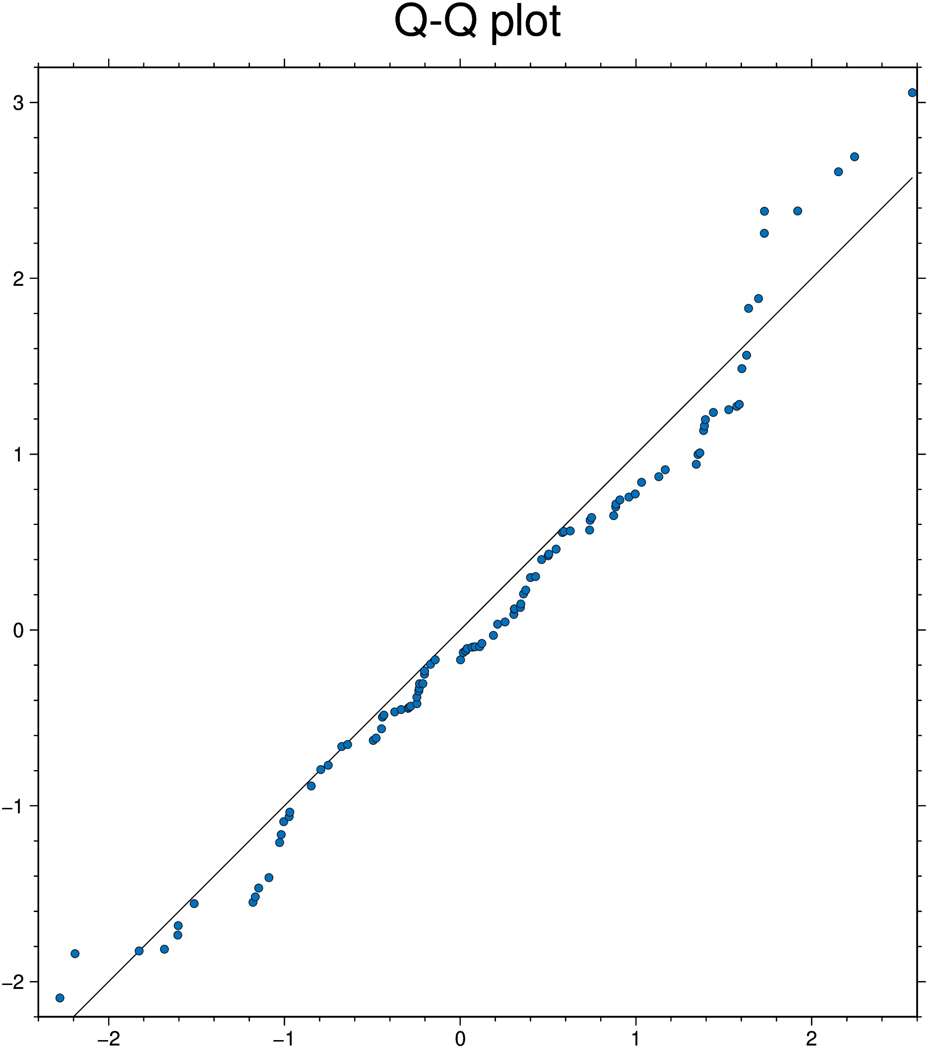
Test if x is normally distributed. the :fitrobust default line passes through the 1st and 3rd quartiles of the distribution
using GMT
qqnorm(randn(200), qqline=:fitrobust, show=true)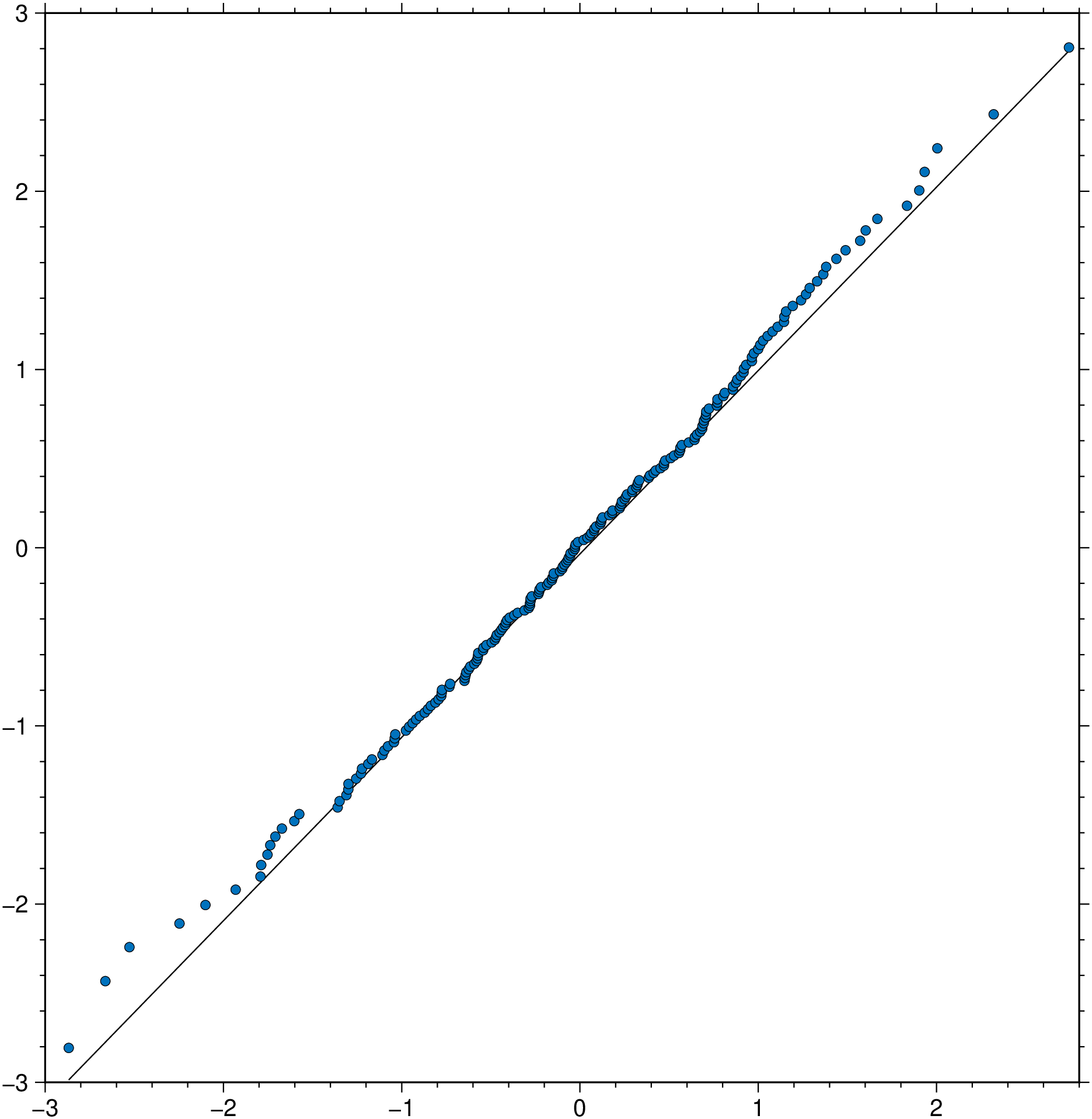
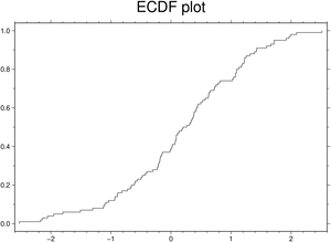
using GMT
ecdfplot(randn(100), title="ECDF plot", show=true)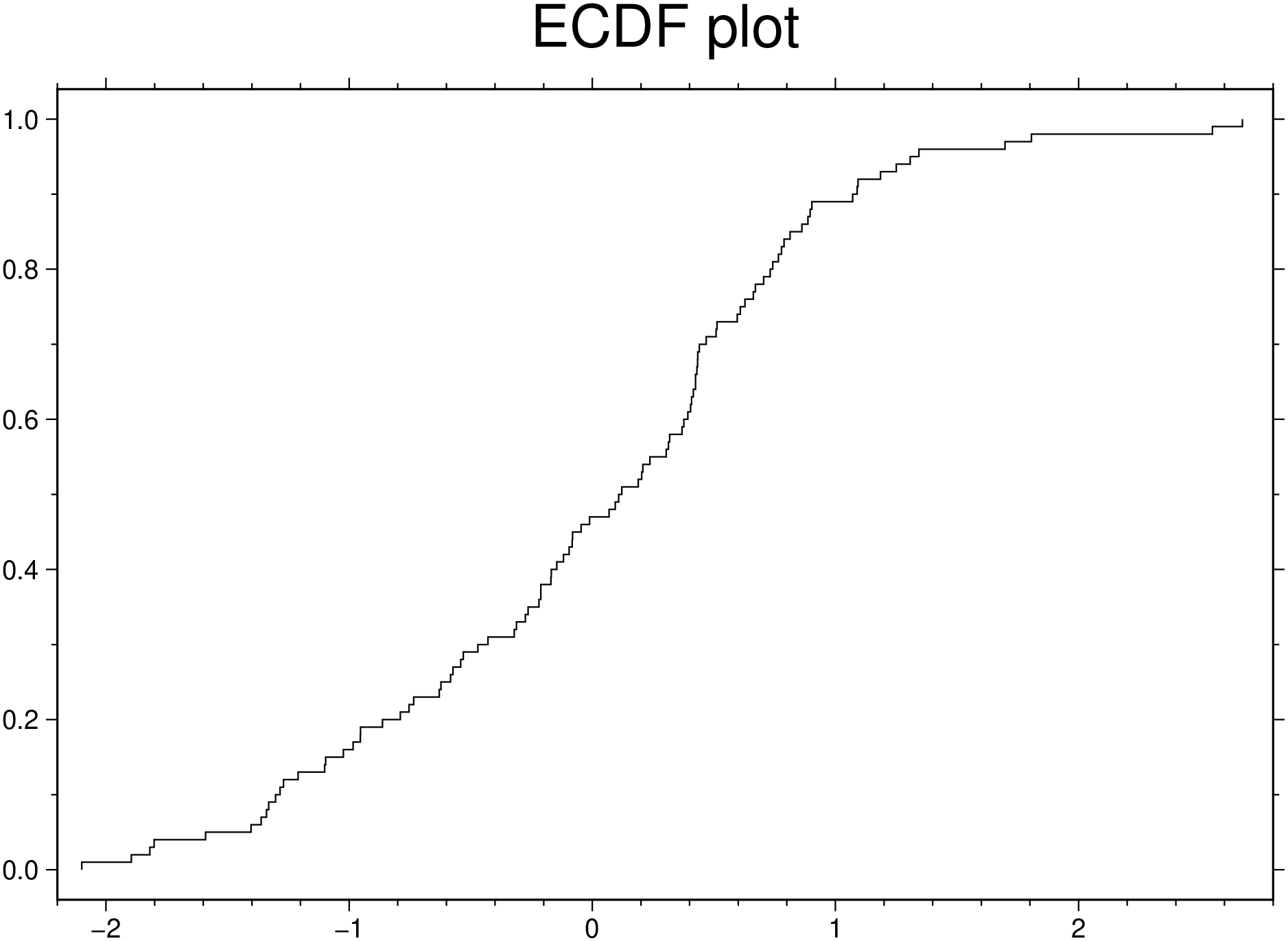
See docs in parallelplot
Create a parallel plot using the measurement data in iris.dat. Use a different color for each group as identified in species, and label the horizontal axis using the variable names.
using GMT
parallelplot(TESTSDIR * "assets/iris.dat", groupvar="text", normalize="none", legend=true,
             title="Parallel plot", show=true)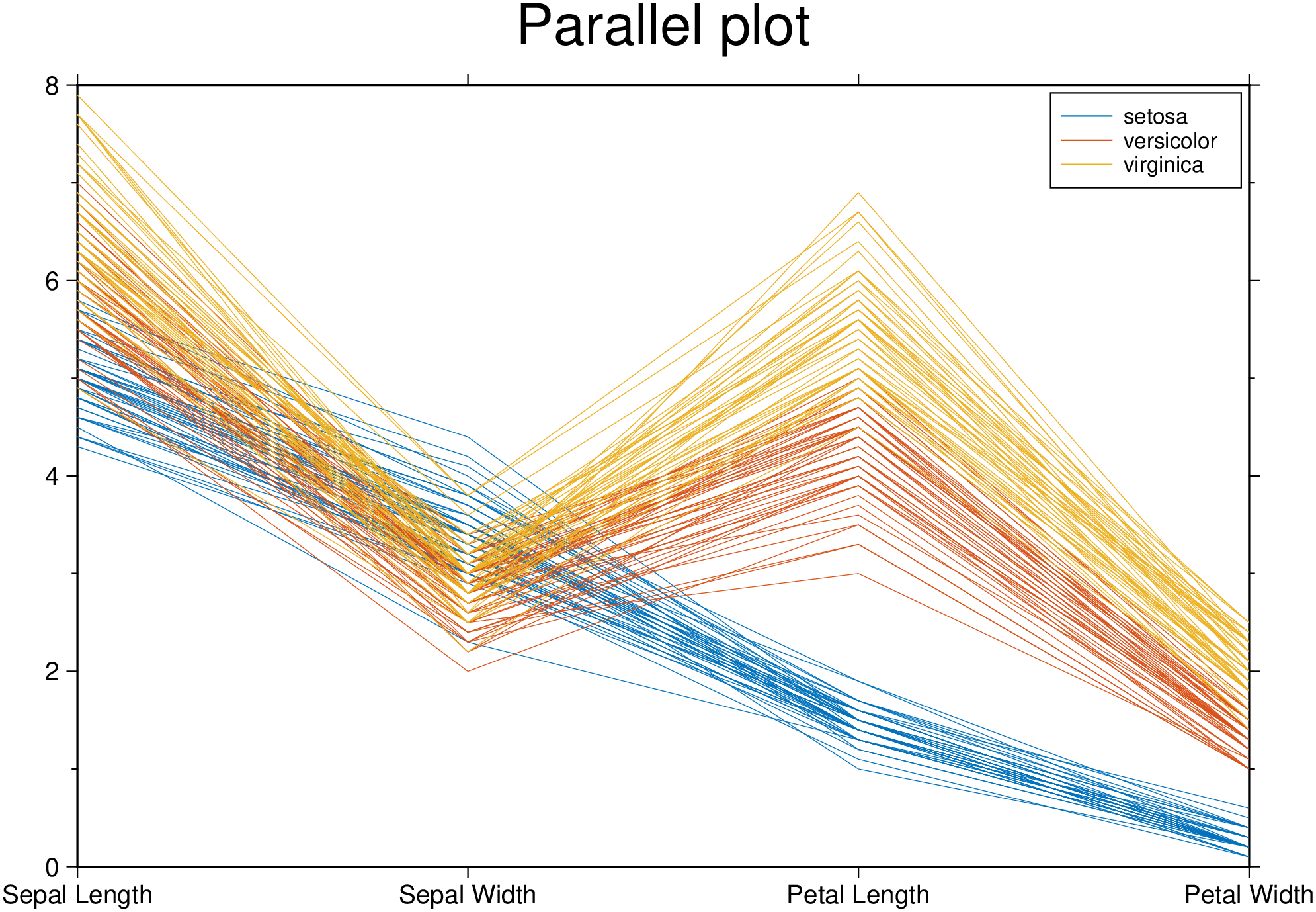
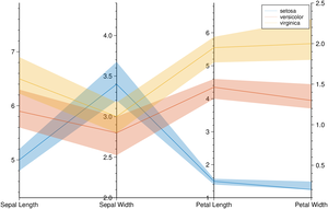
Plot only the median, 25 percent, and 75 percent quartile values for each group identified in species. Label the horizontal axis using the variable names.
using GMT
parallelplot(TESTSDIR * "assets/iris.dat", groupvar="text", quantile=0.25, legend=true, show=true)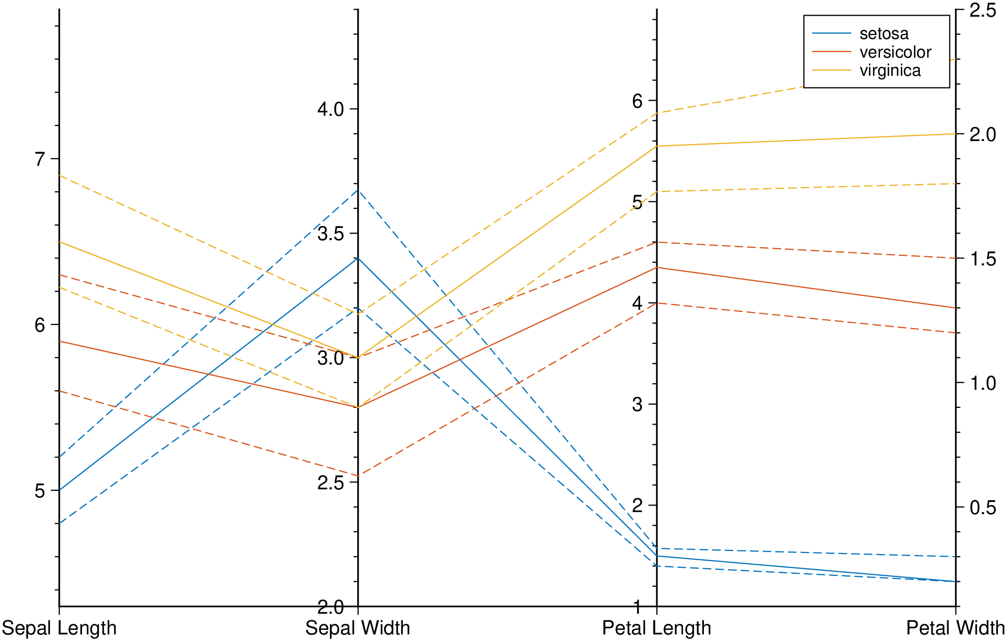
Plot bands enveloping the +- 25% percentil arround the median.
using GMT
parallelplot(TESTSDIR * "assets/iris.dat", groupvar="text", band=true, legend=true, show=true)
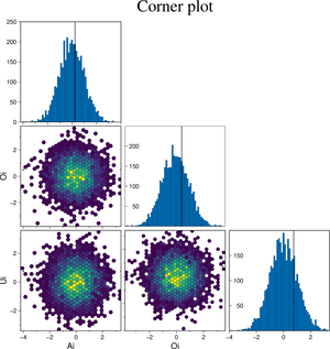
Create a cornerplot plot with hexagonal bins, setting the color map, the vriable names, plot truth and title.
using GMT
cornerplot(randn(4000,3), cmap=:viridis, truths=[0.25, 0.5, 0.75],
           varnames=["Ai", "Oi", "Ui"], title="Corner plot", show=true)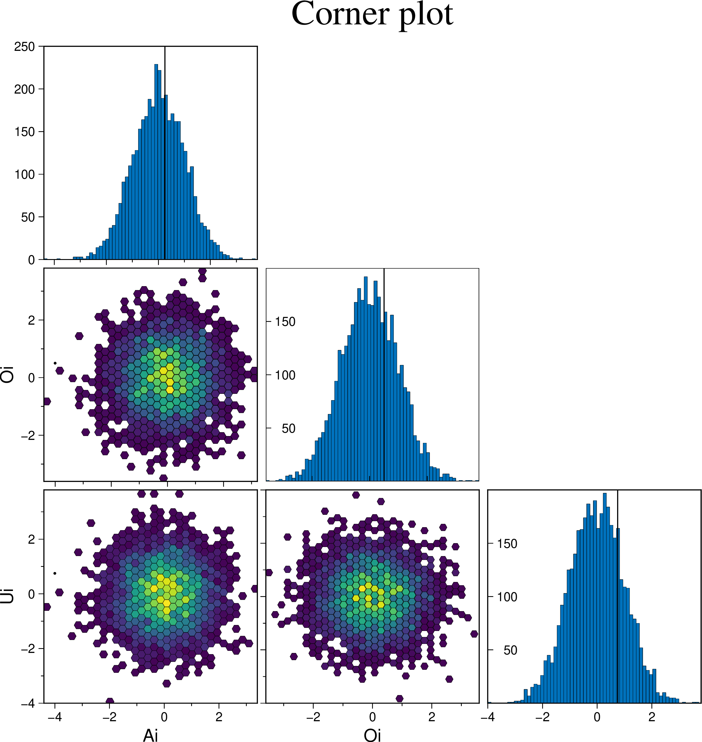
Example on how to control the symbol types, size and color.
using GMT
cornerplot(randn(1500,3), scatter=true, marker=:cross, mec=:red, ms="3p", show=true)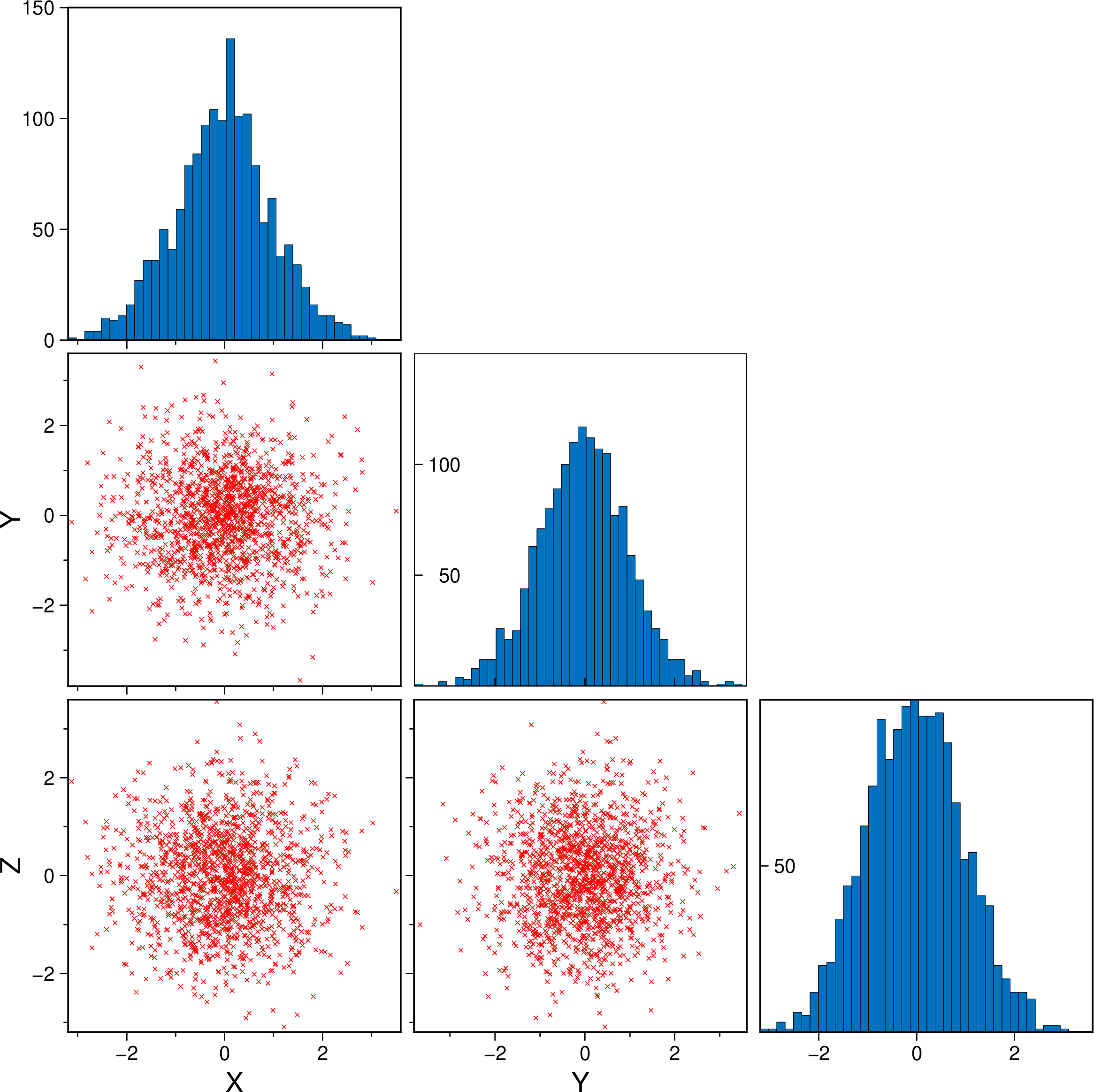
A scatter plot with histograms on the sides
using GMT
marginalhist(randn(2000,2), histkw=(frame="none",), show=true)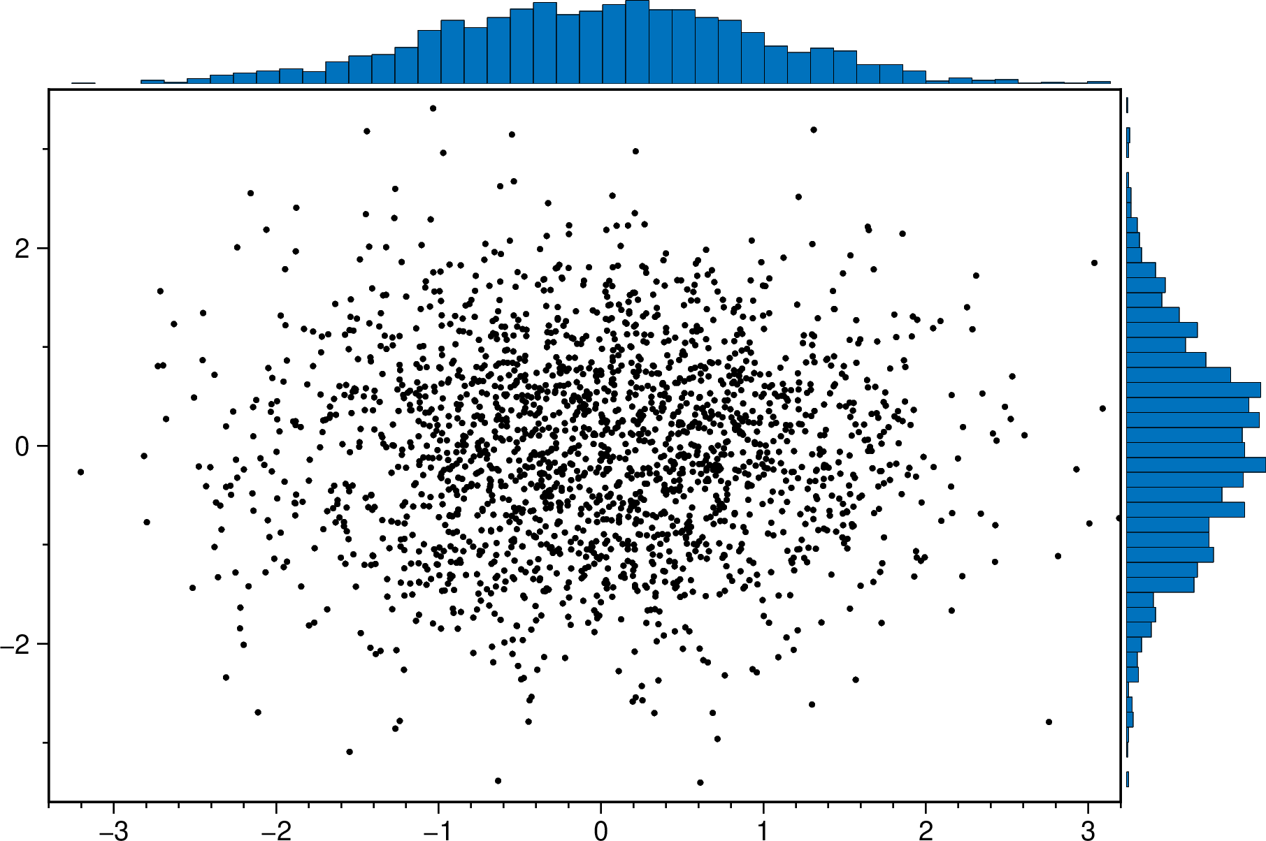
A scatter plot with density curves on the sides
using GMT
 marginalhist(randn(2000,2), histkw=(frame="none", fill="red@60"), density=true, show=true)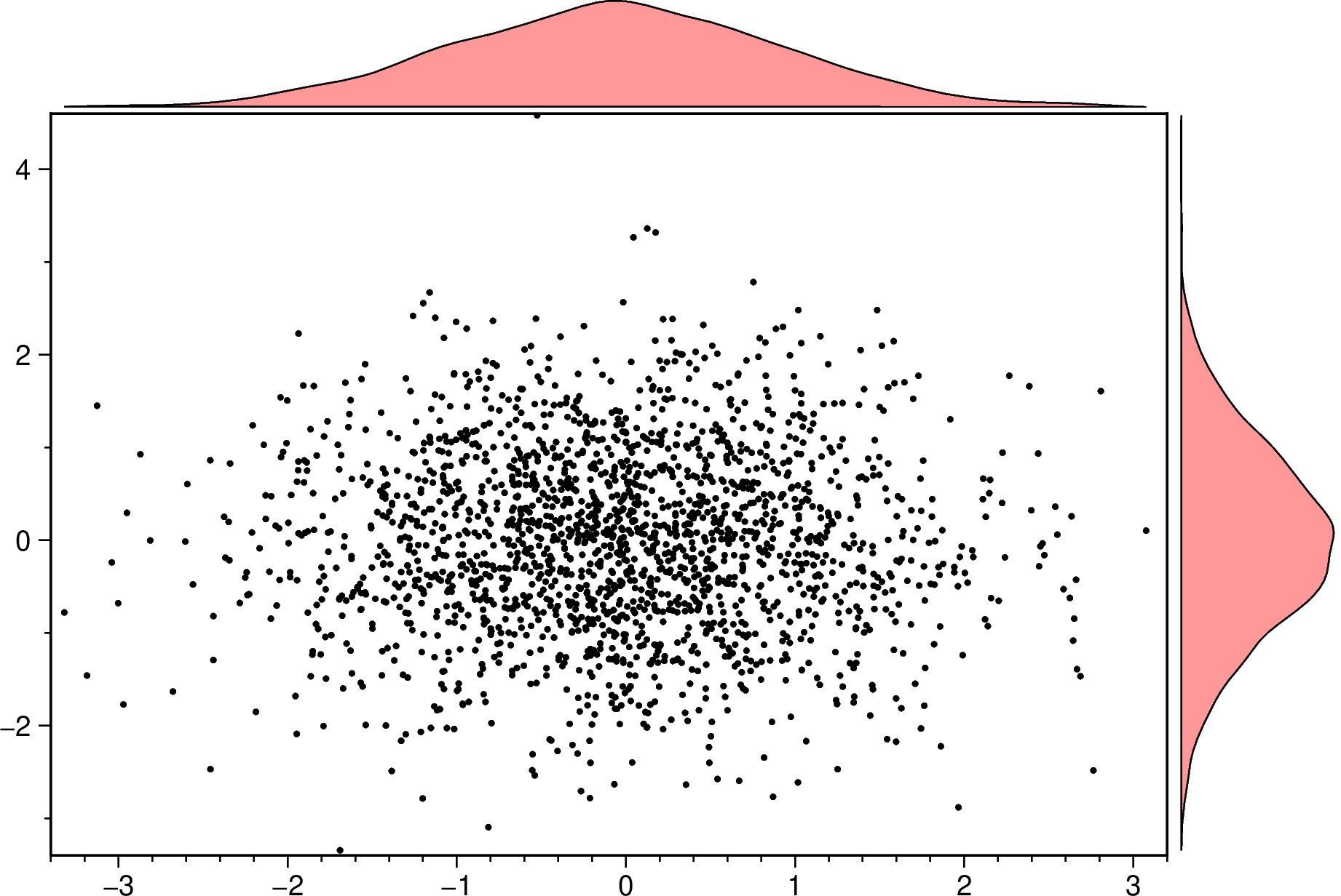
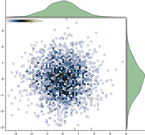
An hexbin scater plot with marginal density plots. Note that we must set aspect=:equal to have that hexbin plot.
using GMT
marginalhist(randn(2500,2), cmap=:lisbon, density=true, histkw=(fill="darkgreen@60",),
             aspect=:equal, show=true)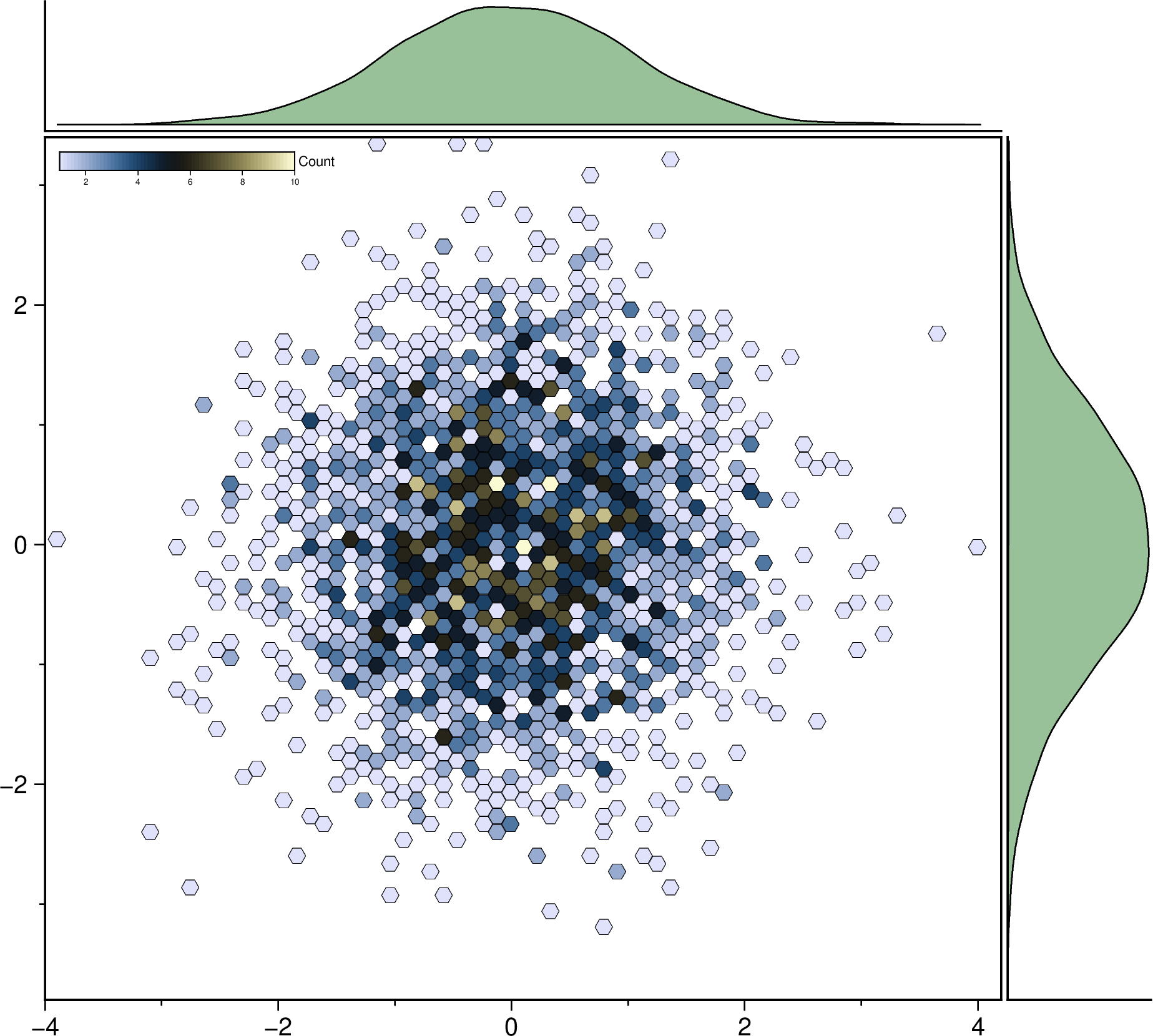
Plot a regression fit over a scatter plot (no errors in X nor in Y). Example0 in https://github.com/rafael-guerra-www/LinearFitXYerrors.jl/blob/master/examples/example0.jl
using GMT
D = linearfitxy([91., 104, 107, 107, 106, 100, 92, 92, 105, 108],
                [9.8, 7.4, 7.9, 8.3, 8.3, 9.0, 9.7, 8.8, 7.6, 6.9]);
plot(D, linefit=true, band_ab=true, band_ci=true, legend=true, show=true)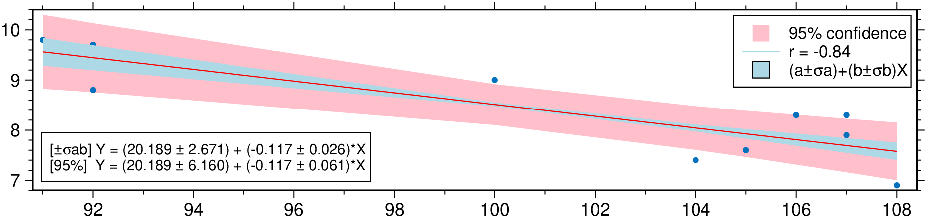
Non-correlated errors in X and in Y Example2 in https://github.com/rafael-guerra-www/LinearFitXYerrors.jl/blob/master/examples/example2.jl
using GMT
D = linearfitxy([0.0, 0.9, 1.8, 2.6, 3.3, 4.4, 5.2, 6.1, 6.5, 7.4],
                [5.9, 5.4, 4.4, 4.6, 3.5, 3.7, 2.8, 2.8, 2.4, 1.5],
                sx=1 ./ sqrt.([1000., 1000, 500, 800, 200, 80,  60, 20, 1.8, 1]),
                sy=1 ./ sqrt.([1., 1.8, 4, 8, 20, 20, 70, 70, 100, 500]));
plot(D, linefit=true, band_ab=true, band_ci=true, ellipses=true, legend=true, show=1)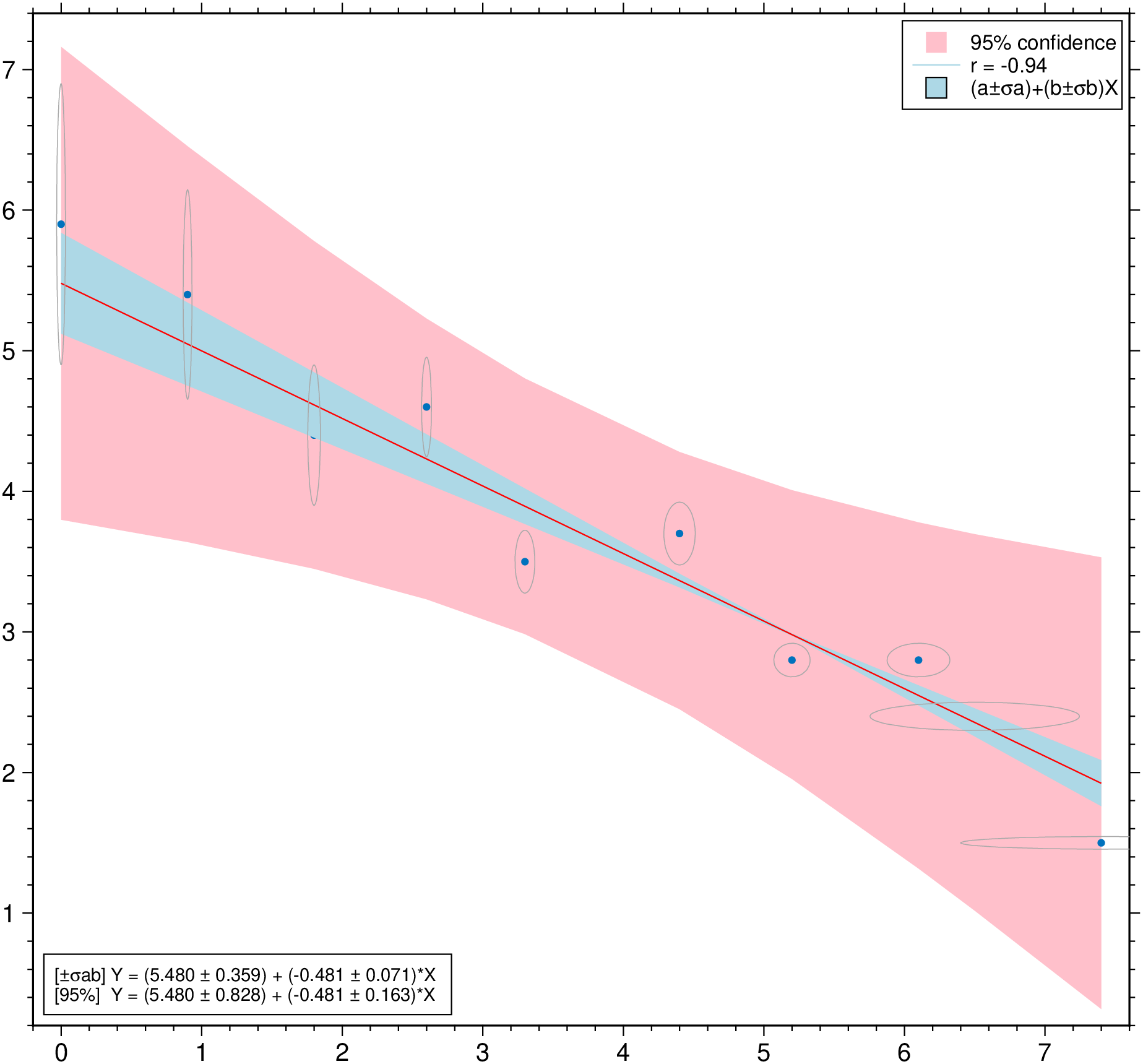
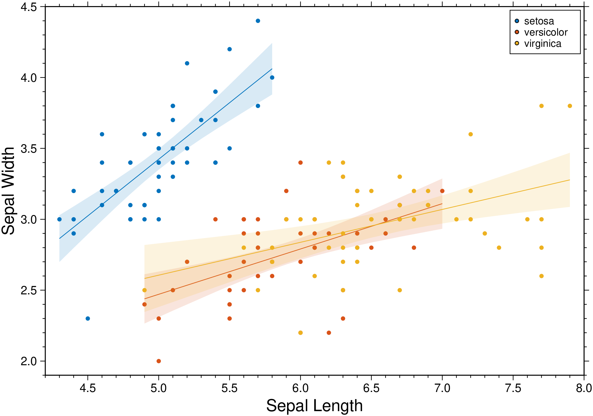
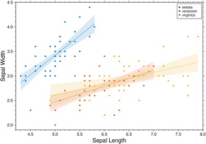
Condition the regression fit on another variable and represent it using color.
using GMT
D = gmtread(TESTSDIR * "assets/iris.dat");
plot(D, xvar=1, yvar=2, hue="Species", xlabel=:auto, ylabel=:auto, linefit=true,
     band_ci=true, legend=true, show=1)