Tutorial 4 - Geophysics (Seismology) 🌎🌏🌍#
In this tutorial we will learn how to
Prepare gridded data:
pygmt.xyz2grdCreate a contour map:
pygmt.Figure.grdcontourCreate a profile plot:
pygmt.projectandpygmt.grdtrack
Note
This tutorial is part of the AGU24 annual meeting GMT/PyGMT pre-conference workshop (PREWS9) Mastering Geospatial Visualizations with GMT/PyGMT
Website: https://www.generic-mapping-tools.org/agu24workshop
Conference: https://agu.confex.com/agu/agu24/meetingapp.cgi/Session/226736
History
Authors: Jing-Hui Tong and Yvonne Fröhlich
Created: November-December 2024
Recommended versions: PyGMT v0.13.0 with GMT 6.5.0
Fee free to play around with these code examples 🚀. In case you found any kind of error, just report it by opening an issue or provide a fix via a pull request. Please use the GMT forum to ask questions.
0️⃣ General stuff#
Import the required packages. Besides PyGMT we also use NumPy and pandas.
import numpy as np
import pandas as pd
import pygmt

# Use a resolution of only 150 dpi for the images within the Jupyter notebook, to keep the file small
img_dpi = 150
1️⃣ Prepare gridded data: pygmt.xyz2grd#
Sometimes, spatial (regional or global) data is provided as tabular data (.txt or .csv files) containing x, y, and z columns.
# Reading file
data = np.loadtxt("south_america_topography_05m.txt")

print(type(data))
data
<class 'numpy.ndarray'>
array([[  -90.        ,     0.        , -1033.5       ],
       [  -89.91666667,     0.        , -1132.5       ],
       [  -89.83333333,     0.        , -1298.        ],
       ...,
       [  -60.16666667,   -40.        ,   -50.        ],
       [  -60.08333333,   -40.        ,   -52.        ],
       [  -60.        ,   -40.        ,   -54.        ]])
We have to convert the numpy.ndarray to a GMT-ready grid via pygmt.xyz2grd. Therefore, you need to provide:
dataorx,y,z: Input text file. Importantly, if you usedata, the columns order must be longitude, latitude, and data. Otherwise, you should usex,y, andzto individually define the dataset.region: Specifies the grid’s geographical region in the form[lon_min, lon_max, lat_min, lat_max].spacing: Grid spacing for the output grid. In our case, the spacing of original dataset is5m(5 arc-minutes), we do not interpolate to better resolution, otherwise, it might cause data distortion.
region = [-90, -60, -40, 0]

grid = pygmt.xyz2grd(data=data, spacing="5m", region=region)
We can get some information about the grid using pygmt.grdinfo:
print(pygmt.grdinfo(grid))
: Title:
: Command:
: Remark:
: Gridline node registration used [Geographic grid]
: Grid file format: nf = GMT netCDF format (32-bit float), CF-1.7
: x_min: -90 x_max: -60 x_inc: 0.0833333333333 (5 min) name: x n_columns: 361
: y_min: -40 y_max: 0 y_inc: 0.0833333333333 (5 min) name: y n_rows: 481
: v_min: -7816.5 v_max: 5798.5 name: z
: scale_factor: 1 add_offset: 0
: format: classic
: Default CPT:
In PyGMT, the grid is stored in an xarray.DataArray:
grid
<xarray.DataArray 'z' (lat: 481, lon: 361)> Size: 1MB
array([[-3470.5, -3474. , -3455.5, ...,   -50. ,   -52. ,   -54. ],
       [-3447.5, -3438.5, -3436. , ...,   -46. ,   -50.5,   -51. ],
       [-3440.5, -3419.5, -3419. , ...,   -44.5,   -49. ,   -51. ],
       ...,
       [ -970. , -1083. , -1261.5, ...,   114. ,   126.5,   129. ],
       [ -959. , -1044. , -1204. , ...,   110.5,   124.5,   146. ],
       [-1033.5, -1132.5, -1298. , ...,   108. ,   117. ,   141. ]])
Coordinates:
  * lat      (lat) float64 4kB -40.0 -39.92 -39.83 ... -0.1667 -0.08333 0.0
  * lon      (lon) float64 3kB -90.0 -89.92 -89.83 ... -60.17 -60.08 -60.0
Attributes:
    Conventions:   CF-1.7
    title:
    history:       gmt xyz2grd @GMTAPI@-S-I-D-M-T-N-000000 -G@GMTAPI@-S-O-G-G...
    description:
    long_name:     z
actual_range: [nan nan]2️⃣ Create a contour map: pygmt.Figure.grdcontour#
To plot grids or images as contour lines you can use pygmt.Figure.grdcontour. You need to define:
grid: Access the remote datasets or provide your dataset as anxarray.DataArray.level: Specify the contour intervals to generate; for example, a value of 1000 means plotting contour lines at every 1000 m.annotation: Annotate contour levels.limit: Draw contours below low or above high, e.g., [-4000, 0] means drawing contour lines below sea level and above -4000 m.
Before we plot the grid as contour lines, we plot the grid with color-coding using pygmt.Figure.grdimage. Via the shading parameter, we can apply an illumination to the grid or image, which can help to create visually appealing maps. By passing the argument +a, we use an azimuth of -45 degrees. Run the next code cell twice, first without and second with illumination, to see the difference. For a more complicated illumination, please refer to pygmt.grdgradient, which was already introduced in Tutorial 3.
fig = pygmt.Figure()
fig.basemap(projection="M10c", region=region, frame="a10f5")

pygmt.makecpt(cmap="SCM/oleron", series=[-7000, 7000], transparency=25)
fig.colorbar(frame=["xa2000f1000+lElevation", "y+lm"])

fig.grdimage(grid=grid, cmap=True, transparency=25)
# Apply an illumination to the grid or image via the "shading" parameter
# fig.grdimage(grid=grid, cmap=True, transparency=25, shading="+a")

fig.grdcontour(
    grid=grid,
    annotation="1000+fgray20",
    levels=1000,
    limit=[-4000, 0],
    pen="0.5p,white",
)

fig.show(dpi=img_dpi)

3️⃣ Create a profile plot: pygmt.project and pygmt.grdtrack#
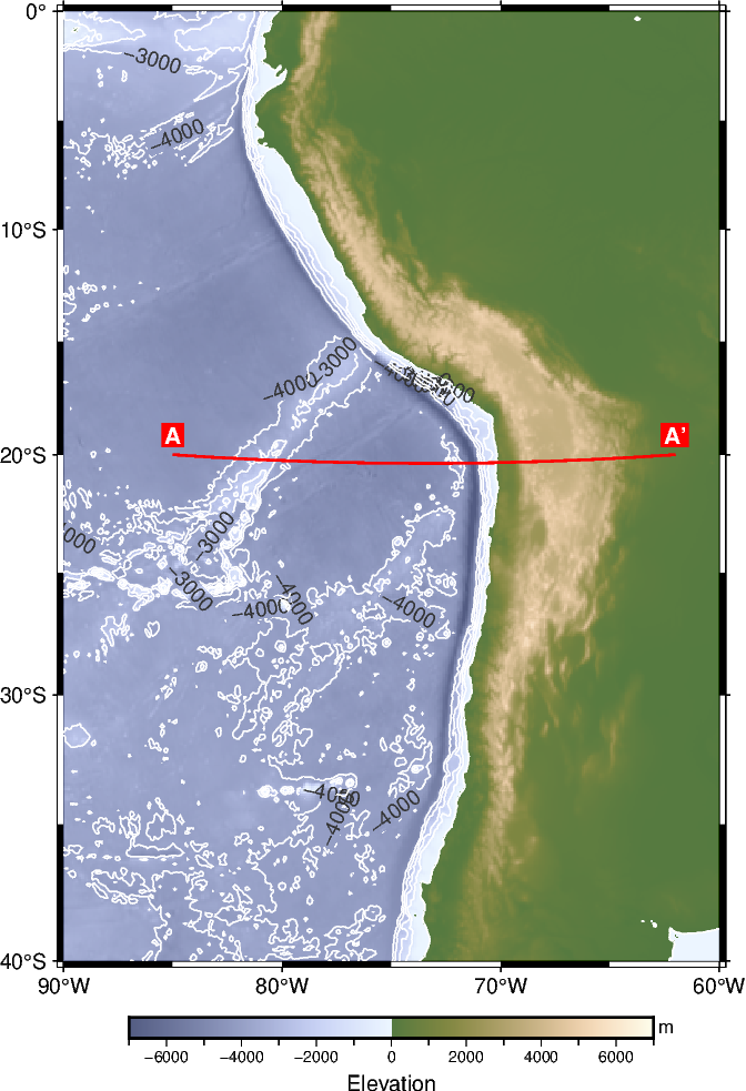
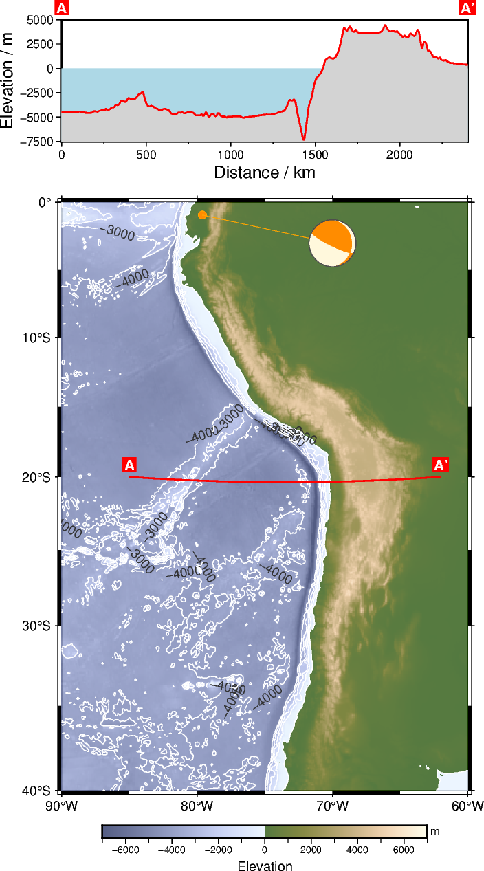
3.1 Choose a profile#
First, we choose a profile or survey line within our study area and plot it on top of our geographic map.
# Set start and end points of the survey line
start_x = -85  # Longitude in degrees East
start_y = -20  # Latitude in degrees North
end_x = -62
end_y = -20

# Plot the survey line
fig.plot(x=[start_x, end_x], y=[start_y, end_y], pen="1p,red")

# Mark start and end points with labels
fig.text(
    x=[start_x, end_x],
    y=[start_y, end_y],
    text=["A", "A'"],
    offset="0c/0.3c",
    font="10p,Helvetica-Bold,white",
    fill="red",
)

fig.show(dpi=img_dpi)
3.2 pygmt.project#
pygmt.project is designed to sample points along a great circle, a straight line, or across specified distance. In our case, we will create a profile point-to-point. Therefore, you need to define:
centerandendpoint: Specify the start and end coordinates of the profile.generate: Distance interval of each point, e.g.,10means points are generated every 10 degrees along the profile.unit(option): By default,unit=False, the distances of points along the profile are measured in degrees. Whenunit=Trueis used, it specifies that the distances are generated in kilometers.
track_df = pygmt.project(
    center=[start_x, start_y],
    endpoint=[end_x, end_y],
    # Output data in steps of 1 km with setting unit=True
    generate="1",
    unit=True,
)
track_df.head()
| r | s | p | |
|---|---|---|---|
| 0 | -85.000000 | -20.000000 | 0.0 |
| 1 | -84.990453 | -20.000624 | 1.0 |
| 2 | -84.980905 | -20.001248 | 2.0 |
| 3 | -84.971358 | -20.001871 | 3.0 |
| 4 | -84.961810 | -20.002493 | 4.0 |
Note: The output format is a pandas.DataFrame, and r and s together provide the geographic coordinates (longitude, latitude) of each point along the track, while p gives the cumulative distance along the profile up to each point.
3.3 pygmt.grdtrack#
Then, we use pygmt.grdtrack to sample topographic (or other grid-based data) values along a profile that you generated using pygmt.project. This allows you to retrieve data from a grid file along a specified path. Therefore, you need to provide:
grid: Specify the grid file (e.g., a topographic grid) from which data will be sampled.points: Provide the coordinates of the profile points.newcolname: Name for the new column with the sampled values.
# Extract the elevation at the generated points from the downloaded grid
# and add it as new column "elevation" to the pandas.DataFrame
track_df = pygmt.grdtrack(grid=grid, points=track_df, newcolname="elevation")
track_df.head()
| r | s | p | elevation | |
|---|---|---|---|---|
| 0 | -85.000000 | -20.000000 | 0.0 | -4440.500000 |
| 1 | -84.990453 | -20.000624 | 1.0 | -4445.130540 |
| 2 | -84.980905 | -20.001248 | 2.0 | -4450.944209 |
| 3 | -84.971358 | -20.001871 | 3.0 | -4457.558040 |
| 4 | -84.961810 | -20.002493 | 4.0 | -4464.581447 |
Note: The new column is elevation to indicate the elevation variation along the profile.
We can observe the minimum and maximum of this elevation data.
print(min(track_df["elevation"]), max(track_df["elevation"]))
-7319.553238186641 4422.575285314314
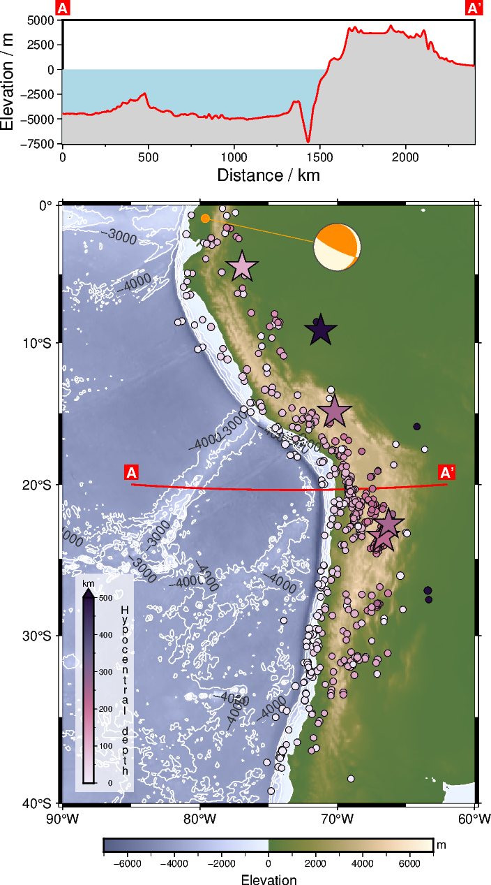
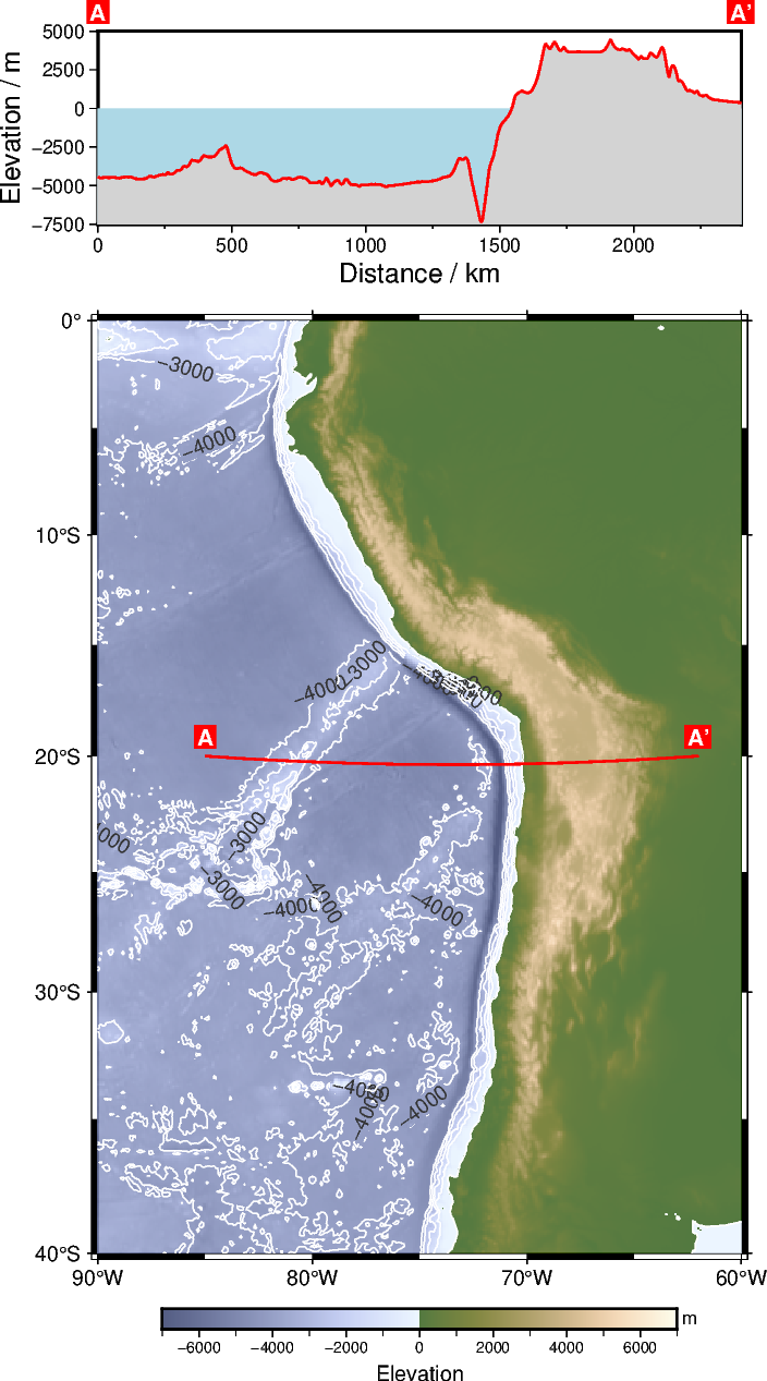
3.4 Create a Cartesian plot showing the elevation along the profile#
Now, we want to visualize the elevation along the profile in a Cartesian plot. Therefore, we add another panel to our figure. Use Figure.shift_origin to shift the plotting origin to the top of the geographic map and create a new basemap via Figure.basemap.
# Shift the plotting origin by the height (+h) of the geographic map plus 1.5 centimeters to the top
fig.shift_origin(yshift="h+1.5c")

fig.basemap(
    region=[0, max(track_df["p"]), -7500, 5000],
    # Cartesian projection with a width of 10 centimeters and a height of 3 centimeters
    projection="X10c/3c",
    frame=["WSrt", "xa500f250+lDistance / km", "ya2500+lElevation / m"],
)

fig.text(
    x=[0, max(track_df["p"])],
    y=[5000, 5000],
    text=["A", "A'"],
    offset="0c/0.3c",
    no_clip=True,  # Do not clip text that fall outside the plot bounds
    font="10p,Helvetica-Bold,white",
    fill="red",
)

fig.show(dpi=img_dpi)
Plotting the elevation along the profile and coloring ocean and land in lightblue and lightgray, respectively:
# Plot water masses
fig.plot(
    x=[0, max(track_df["p"])],
    y=[0, 0],
    fill="lightblue",  # Fill the polygon in "lightblue"
    close="+y-7500",  # Force closed polygon
)

# Plot elevation along the profile and plot land masses
fig.plot(
    x=track_df["p"],
    y=track_df["elevation"],
    fill="lightgray",  # Fill the polygon in "lightgray"
    pen="1p,red,solid",  # Draw a 1-point thick, red, solid outline
    close="+y-7500",  # Force closed polygon
)

fig.show(dpi=img_dpi)
4️⃣ Add additional features#
Finally, you can add additional features on top of the geographic map. Feel free to include your own ideas here! Here are a few ideas what you can try:
Highlight a specific earthquake as beachball: See subsection 4.1
Plot the seismicity: See subsection 4.2
Mark the subduction zone: Use a so-called line front to indicate the fault, use the Gallery example Line fronts for an orientation
Include the plate motion: Use an arrow to indicate direction and speed; use the Gallery example Cartesian, circular, and geographic vectors for an orientation
# Move plotting origin back to the geographic map at the top
fig.shift_origin(yshift="-16c")  # Manually adjusted

# Use the same projection and region we have used at the beginning for the geographic map
fig.basemap(projection="M10c", region=region, frame="rltb")
4.1 Add a beachball#
A specific earthquake can be plotted as a beachballs to represent the focal mechanism. Here, we look at the Esmeraldas earthquake on 2022/03/27 at 04:28:12 (UTC) as an example. The data were retrieved from USGS.
First we, store the focal mechanism parameters in a dictionary based on the Aki & Richards convention:
focal_mechanism = {"strike": 116, "dip": 80, "rake": 74, "magnitude": 5.8}
Plot the focal mechanism of this earthquake as a beachball on top of the map. Therefore, we pass the focal mechanism data to the spec parameter of pygmt.Figure.meca. In addition, you have to provide scale, event location, and event depth.
fig.meca(
    spec=focal_mechanism,
    scale="1c",  # in centimeters
    longitude=-79.611,  # event location
    latitude=-0.904,
    depth=19,  # in kilometers
    # Fill compressive quadrants with color "darkorange" [Default is "black"]
    compressionfill="darkorange",
    # Fill extensive quadrants with color "cornsilk" [Default is "white"]
    extensionfill="cornsilk",
    # Draw a 0.5-points thick, darkgray ("gray30") solid outline via the pen parameter
    # [Default is "0.25p,black,solid"]
    pen="0.5p,gray30,solid",
    # Shift plotting location from event location
    plot_longitude=-70,
    plot_latitude=-3,
    # Add a connection line between the plotting and event locations
    offset="+p0.1p,orange+s0.2c",
)

fig.show(dpi=img_dpi)
4.2 Add the seismicity#
We provide data for the seismicity between 2022-01-01 and 2023-01-01 as a CSV file within this repository or tutorial. These data were retrieved via ObsPy using the client.get_events function:
t1 = UTCDateTime(“2022-01-01”); t2 = UTCDateTime(“2022-06-30”)
catalog = client.get_events(starttime=t1, endtime=t2, minmagnitude=4, minlatitude=-40, maxlatitude=0, minlongitude=-90, maxlongitude=-60)
First, we read the data into a pandas.DataFrame and have a look at the data.
df = pd.read_csv("seismicity_2022.csv")
df.head()
| time | lon | lat | depth | mag | |
|---|---|---|---|---|---|
| 0 | 2022-06-29T23:45:41.235000Z | -66.8673 | -24.1091 | 190.77 | 4.3 |
| 1 | 2022-06-29T20:20:29.480000Z | -71.1510 | -28.8356 | 62.45 | 4.3 |
| 2 | 2022-06-29T14:30:41.654000Z | -67.0522 | -23.5599 | 230.86 | 4.2 |
| 3 | 2022-06-29T13:53:02.602000Z | -79.7148 | -2.6731 | 10.00 | 4.5 |
| 4 | 2022-06-28T14:44:31.853000Z | -69.0212 | -31.5582 | 110.99 | 4.5 |
Explore the dataset. Get the value ranges of the hypocentral depth and magnitude.
# Your code (:
Now we split the dataset into two datasets based on the magnitude. Feel free to try different limits or build another subset!
lim_mag = 6

df_low_mag = df[df["mag"] < lim_mag]
df_high_mag = df[df["mag"] >= lim_mag]
Now you can plot the earthquakes of the two datasets on top of our map, e.g., using circles for the events with lower and stars for the events with higher magnitude. Additionally, you can add color- and size-coding to include epicentral distance and magnitude of the earthquakes. Take a look at what you have learned in Tutorial 2 🙂 and the PyGMT Tutorial Plotting data points as an orientation.
# Your code (:
5️⃣ Additional comments#
Some helpful and interesting aspects:
Use suitable colormaps for your data: Scientific colourmaps by Fabio Crameri, see also the publications Crameri et al. (2024) and Crameri et al. (2020)
6️⃣ Orientation / suggestion for “4.2 Add seismicity”#
Below you find a rough code shipset for plotting the subsets of the earthquake dataset in section 4.1. Note the logarithmic scaling of size of the symbols as the size is referring to the magnitude of the earthquakes.
pygmt.makecpt(cmap="SCM/acton", series=[0, 500], reverse=True)

fig.plot(
    x=df_low_mag["lon"],
    y=df_low_mag["lat"],
    style="cc",  # Plot circles (fist "c") in centimeters (second "c")
    size=np.log10(df_low_mag["mag"]) / 4,  # size varies based on magnitude
    fill=df_low_mag["depth"],
    cmap=True,
    pen="0.1p,black",
)

fig.plot(
    x=df_high_mag["lon"],
    y=df_high_mag["lat"],
    style="ac",  # Plot stars ("a") in centimeters ("c")
    size=np.log10(df_high_mag["mag"]),
    fill=df_high_mag["depth"],
    cmap=True,
    pen="0.5p,black",
)

fig.colorbar(
    position="x0.5c/0.5c+w4.5c/0.25c+v+mc+ef0.2c",
    frame=["a100f50+lHypocentral depth", "y+lkm"],
    box="+gwhite@30",
)

fig.show(dpi=img_dpi)