Tutorial 2 - scientific Python ecosystem 🐍: pandas and GeoPandas (tabular data 🗒️)#
In this tutorial we will learn using
pandas: tabular data stored in
pandas.DataFramesGeoPandas: spatial data (points, lines, polygons) stored in
geopandas.GeoDataFrames
within PyGMT to create histograms and different maps.
Note
This tutorial is part of the AGU24 annual meeting GMT/PyGMT pre-conference workshop (PREWS9) Mastering Geospatial Visualizations with GMT/PyGMT
Website: https://www.generic-mapping-tools.org/agu24workshop
Conference: https://agu.confex.com/agu/agu24/meetingapp.cgi/Session/226736
History
Author: Yvonne Fröhlich
Created: November-December 2024
Recommended versions: PyGMT v0.13.0 with GMT 6.5.0
Fee free to play around with these code examples 🚀. In case you found any kind of error, just report it by opening an issue or provide a fix via a pull request. Please use the GMT forum to ask questions.
0️⃣ General stuff#
Import the required packages, besides PyGMT itself, we use pandas and GeoPandas:
import geopandas as gpd
import pandas as pd
import pygmt

# Use a resolution of only 150 dpi for the images within the Jupyter notebook, to keep the file small
img_dpi = 150
1️⃣ pandas#
1.1 Tabular data - pandas.DataFrame#
Use an example dataset with tabular data provided by PyGMT and load it into a pandas.DataFrame. This dataset contains earthquakes in the area of Japan.
You can read your own dataset into a pandas.Dataframe using pandas.read_csv and use it in the same way to make the following plots; of course you have to adjust the column names accordantly.
df_jp_eqs = pygmt.datasets.load_sample_data(name="japan_quakes")
df_jp_eqs.head()

# df_your_dataset = pd.read_csv("your_dataset.csv")
| year | month | day | latitude | longitude | depth_km | magnitude | |
|---|---|---|---|---|---|---|---|
| 0 | 1987 | 1 | 4 | 49.77 | 149.29 | 489 | 4.1 |
| 1 | 1987 | 1 | 9 | 39.90 | 141.68 | 67 | 6.8 |
| 2 | 1987 | 1 | 9 | 39.82 | 141.64 | 84 | 4.0 |
| 3 | 1987 | 1 | 14 | 42.56 | 142.85 | 102 | 6.5 |
| 4 | 1987 | 1 | 16 | 42.79 | 145.10 | 54 | 5.1 |
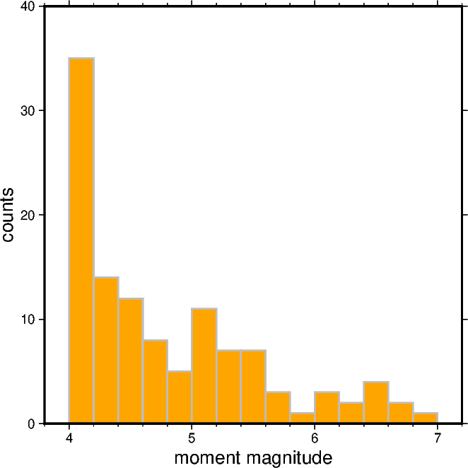
1.2 Create a Cartesian histogram#
First we create a Cartesian histogram for the moment magnitude distribution of all earthquakes in the dataset.
mag_min = df_jp_eqs["magnitude"].min()
print(mag_min)
mag_max = df_jp_eqs["magnitude"].max()
print(mag_max)
4.0
6.8
# Choose the bin width of the bars; feel free to play around with this value
step_histo = 0.2

fig = pygmt.Figure()

fig.histogram(
    data=df_jp_eqs["magnitude"],
    projection="X10c",
    # Determine y range automatically
    region=[mag_min - step_histo, mag_max + step_histo * 2, 0, 0],
    # Define the frame, add labels to the x-axis and y-axis
    frame=["WSne", "x+lmoment magnitude", "y+lcounts"],
    # Generate evenly spaced bins
    series=step_histo,
    # Fill bars with color "orange"
    fill="orange",
    # Draw gray outlines with a width of 1 point
    pen="1p,gray",
    # Choose histogram type 0, i.e., counts [Default]
    histtype=0,
)

fig.show(dpi=img_dpi)
Use code example above as orientation, and create a similar histogram showing the hypocentral depth distribution for all earthquakes in the dataset.
# Your code (:
For details on creating Cartesian histograms you may find the tutorial Cartesian histograms helpful.
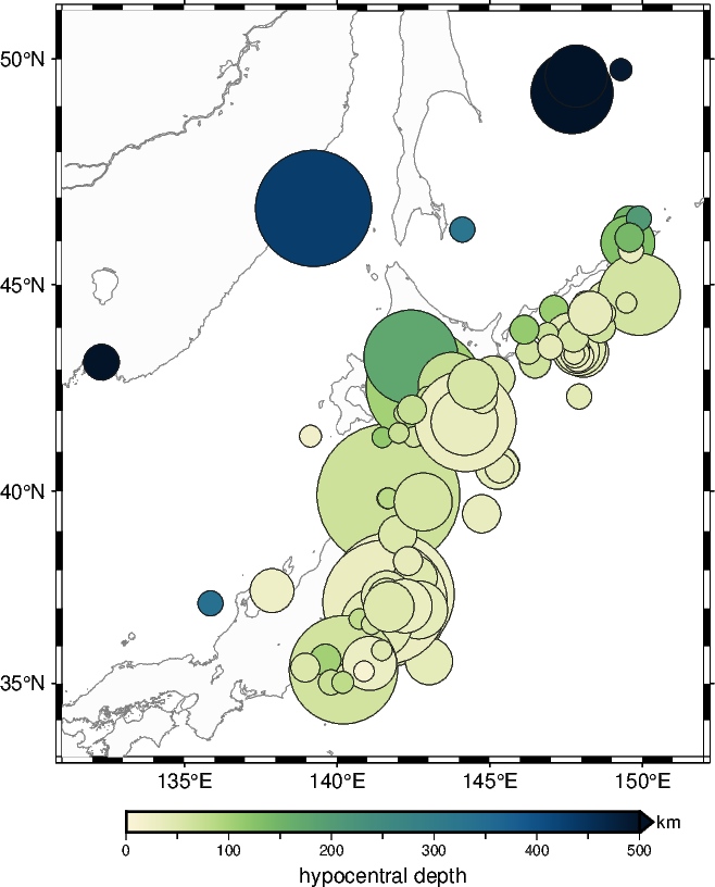
1.3 Create a geographical map showing the epicenters (scatter plot)#
Now it’s time to create a geographical map showing the earthquakes. You can start with using pygmt.Figure.basemap and pygmt.Figure.coast to set up the map. To create a scatter plot we can pass appropriate columns of a pandas.DataFrame to the x, y, size, and fill parameters of pygmt.Figure.plot. This allows us to plot the epicenters as size (moment magnitude) and color (hypocentral depth) coded circles on top of the map. For details you can have a look at Plotting data points.
fig = pygmt.Figure()
fig.basemap(region=[131, 152, 33, 51], projection="M10c", frame=True)
fig.coast(land="gray99", shorelines="gray50")

pygmt.makecpt(cmap="SCM/navia", series=[0, 500], reverse=True)
fig.colorbar(frame=["xa100f50+lhypocentral depth", "y+lkm"], position="+ef0.2c")

# Plot the epicenters as color- and size-coded circels based on depth or magnitude
fig.plot(
    x=df_jp_eqs.longitude,
    y=df_jp_eqs.latitude,
    size=0.02 * 2**df_jp_eqs.magnitude,  # Note the exponential scaling
    fill=df_jp_eqs.depth_km,
    cmap=True,
    style="cc",  # Use circles (fist "c") with diameter in centimeters (second "c")
    pen="gray10",
)

fig.show(dpi=img_dpi)
2️⃣ GeoPandas#
2.1 Line geometry#
Features which can be represented as a line geometry are for example rivers, roads, national boundaries, shorelines, and any kind of profiles.
2.1.1 Spatial Data - geopandas.GeoDataFrame with line geometry#
First we download some data into in a geopandas.GeoDataFrame. This dataset contains European rivers with their lengths and names.
In case you face issues with downloading these data:
Copy the URL “https://www.eea.europa.eu/data-and-maps/data/wise-large-rivers-and-large-lakes/zipped-shapefile-with-wise-large-rivers-vector-line/zipped-shapefile-with-wise-large-rivers-vector-line/at_download/file/wise_large_rivers.zip” into your browser.
Download the zip file and place it into
~/agu24workshop/book. Do not unpack the ZIP file.Replace the URL with the filename of the ZIP file “wise_large_rivers.zip” in
geopandas.read_file.
gdf_rivers_org = gpd.read_file(
    "https://www.eea.europa.eu/data-and-maps/data/wise-large-rivers-and-large-lakes/"
    + "zipped-shapefile-with-wise-large-rivers-vector-line/zipped-shapefile-with-wise-large-rivers-vector-line/"
    + "at_download/file/wise_large_rivers.zip"
)
# gdf_rivers_org = gpd.read_file("wise_large_rivers.zip")
Have a look at the data and especially at the values in the geometry column:
gdf_rivers_org.head()
| NAME | Shape_Leng | geometry | |
|---|---|---|---|
| 0 | Danube | 2.770357e+06 | MULTILINESTRING ((4185683.29 2775788.04, 41861... |
| 1 | Douro | 8.162452e+05 | MULTILINESTRING ((2764963.81 2199037.624, 2766... |
| 2 | Ebro | 8.269909e+05 | MULTILINESTRING ((3178371.814 2315100.781, 317... |
| 3 | Elbe | 1.087288e+06 | MULTILINESTRING ((4235352.373 3422319.986, 423... |
| 4 | Guadalquivir | 5.997583e+05 | MULTILINESTRING ((2859329.283 1682737.074, 286... |
The coordinates are currently not given in the geographic coordinate reference system (longitude/latitude):
gdf_rivers_org.crs
<Projected CRS: PROJCS["ETRS_1989_LAEA_52N_10E",GEOGCS["ETRS89",DA ...>
Name: ETRS_1989_LAEA_52N_10E
Axis Info [cartesian]:
- [east]: Easting (metre)
- [north]: Northing (metre)
Area of Use:
- undefined
Coordinate Operation:
- name: unnamed
- method: Lambert Azimuthal Equal Area
Datum: European Terrestrial Reference System 1989
- Ellipsoid: GRS 1980
- Prime Meridian: Greenwich
Thus, they have to be converted which can be done directly with GeoPandas.
gdf_rivers = gdf_rivers_org.to_crs("EPSG:4326")
Again have a look at the coordinate system and the data:
gdf_rivers.crs
<Geographic 2D CRS: EPSG:4326>
Name: WGS 84
Axis Info [ellipsoidal]:
- Lat[north]: Geodetic latitude (degree)
- Lon[east]: Geodetic longitude (degree)
Area of Use:
- name: World.
- bounds: (-180.0, -90.0, 180.0, 90.0)
Datum: World Geodetic System 1984 ensemble
- Ellipsoid: WGS 84
- Prime Meridian: Greenwich
gdf_rivers.head()
| NAME | Shape_Leng | geometry | |
|---|---|---|---|
| 0 | Danube | 2.770357e+06 | MULTILINESTRING ((8.1846 48.0807, 8.19049 48.0... |
| 1 | Douro | 8.162452e+05 | MULTILINESTRING ((-8.67141 41.14934, -8.64362 ... |
| 2 | Ebro | 8.269909e+05 | MULTILINESTRING ((-4.05971 42.97715, -4.06841 ... |
| 3 | Elbe | 1.087288e+06 | MULTILINESTRING ((8.69715 53.90109, 8.72716 53... |
| 4 | Guadalquivir | 5.997583e+05 | MULTILINESTRING ((-6.37899 36.80363, -6.34806 ... |
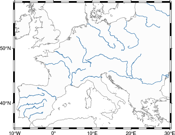
2.1.2 Create a geographical map of the rivers#
Let’s plot the rivers represented on top of a map. The geopandas.DataFrame can be directly passed to the data parameter of pygmt.Figure.plot. Use the pen parameter to adjust the lines. The string argument has the form “width,color,style”. Different line styles are explained in the Gallery example Line styles.
fig = pygmt.Figure()

fig.coast(
    projection="M10c",
    region=[-10, 30, 35, 57],
    land="gray99",
    shorelines="1/0.1p,gray50",
    frame=True,
)

fig.plot(data=gdf_rivers, pen="0.5p,steelblue,solid")

fig.show(dpi=img_dpi)
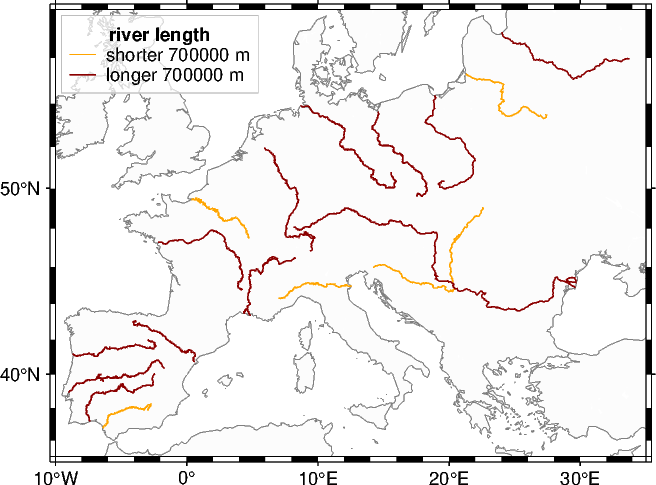
2.1.3 Plot subsets of the rivers differently#
Now we want to filter the dataset based on the river length and plot the subsets differently.
To indicate the different subsets adding a legend to the plot is helpful. Therefore, we specify the text for the legend entries via the label parameter of pygmt.Figure.plot. Note, that for the first plotted element, additionally the heading (+H) and the font size of the heading (+f) are specified. Placing the legend on the figure is done via the position parameter of pygmt.Figure.legend. A box can be added via the box parameter. For further explanation feel free to look at our gallery example Legend.
# Split the dataset into two subsets of shorter and longer rivers
# Feel free to play around with the limit
len_limit = 700000  # in meters
gdf_rivers_short = gdf_rivers[gdf_rivers["Shape_Leng"] < len_limit]
gdf_rivers_long = gdf_rivers[gdf_rivers["Shape_Leng"] > len_limit]


fig = pygmt.Figure()

fig.coast(
    projection="M10c",
    region=[-10, 35, 35, 58],
    land="gray99",
    shorelines="1/0.1p,gray50",
    frame=True,
)

# Plot the subsets differently and specify the text for the legend entries
fig.plot(
    data=gdf_rivers_short,
    pen="0.5p,orange",
    label=f"shorter {len_limit} m+Hriver length+f9p",
)
fig.plot(data=gdf_rivers_long, pen="0.5p,darkred", label=f"longer {len_limit} m")

# Place the legend at the Top Left corner with an offset of 0.1 centimeters from the map frame
# Add a box with semi-transparent (@30) white fill (+g) and a 0.1-points thick gray outline (+p)
fig.legend(position="jTL+o0.1c", box="+gwhite@30+p0.1p,gray")

fig.show(dpi=img_dpi)
2.1.4 Plot the rivers with color-coding for the river length#
Use the gallery example Line colors with a custom CPT to plot the rivers with color-coding for the river length.
# Your code (:
2.2 Polygon geometry#
Any kind of areas, like continents, countries, and states can be stored as polygon geometry.
2.2.1 Spatial Data - geopandas.GeoDataFrame with polygon geometry#
Again we download some data into in a geopandas.GeoDataFrame. This dataset contains information regarding airbnb rentals, socioeconomics, and crime in Chicago.
This time we are lucky and the data is directly provided in the geographic coordinate reference system (longitude/latitude) and no coordinate transformation is needed.
gdf_airbnb = gpd.read_file("https://geodacenter.github.io/data-and-lab/data/airbnb.zip")
gdf_airbnb.head()
| community | shape_area | shape_len | AREAID | response_r | accept_r | rev_rating | price_pp | room_type | num_spots | ... | crowded | dependency | without_hs | unemployed | income_pc | harship_in | num_crimes | num_theft | population | geometry | |
|---|---|---|---|---|---|---|---|---|---|---|---|---|---|---|---|---|---|---|---|---|---|
| 0 | DOUGLAS | 46004621.1581 | 31027.0545098 | 35 | 98.771429 | 94.514286 | 87.777778 | 78.157895 | 1.789474 | 38 | ... | 1.8 | 30.7 | 14.3 | 18.2 | 23791 | 47 | 5013 | 1241 | 18238 | POLYGON ((-87.60914 41.84469, -87.60915 41.844... |
| 1 | OAKLAND | 16913961.0408 | 19565.5061533 | 36 | 99.200000 | 90.105263 | 88.812500 | 53.775000 | 1.850000 | 20 | ... | 1.3 | 40.4 | 18.4 | 28.7 | 19252 | 78 | 1306 | 311 | 5918 | POLYGON ((-87.59215 41.81693, -87.59231 41.816... |
| 2 | FULLER PARK | 19916704.8692 | None | 37 | 68.000000 | NaN | 91.750000 | 84.000000 | 1.833333 | 6 | ... | 3.2 | 44.9 | 26.6 | 33.9 | 10432 | 97 | 1764 | 383 | 2876 | POLYGON ((-87.6288 41.80189, -87.62879 41.8017... |
| 3 | GRAND BOULEVARD | 48492503.1554 | 28196.8371573 | 38 | 94.037037 | 83.615385 | 92.750000 | 119.533333 | 1.533333 | 30 | ... | 3.3 | 39.5 | 15.9 | 24.3 | 23472 | 57 | 6416 | 1428 | 21929 | POLYGON ((-87.60671 41.81681, -87.6067 41.8165... |
| 4 | KENWOOD | 29071741.9283 | 23325.1679062 | 39 | 92.542857 | 88.142857 | 90.656250 | 77.991453 | 1.615385 | 39 | ... | 2.4 | 35.4 | 11.3 | 15.7 | 35911 | 26 | 2713 | 654 | 17841 | POLYGON ((-87.59215 41.81693, -87.59215 41.816... |
5 rows × 21 columns
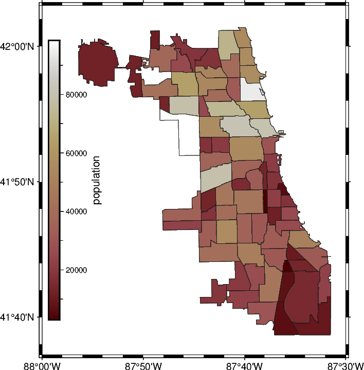
2.2.2 Create a choropleth map#
Here we are going to create a so-called choropleth map. Such a visualization is helpful to show a quantity which vary between subregions of a study area, e.g., countries or states. The dataset contains several columns, here we will focus on the column "population", but feel free to modify the code below and use another quantity for the color-coding!
popul_min = gdf_airbnb["population"].min()
print(popul_min)
popul_max = gdf_airbnb["population"].max()
print(popul_max)
2876
98514
fig = pygmt.Figure()

# frame=True adds a frame using the default settings
# Use "rltb" (right, left, top, bottom) to plot no frame at all which
# can be useful when inserting the figure within a document
fig.basemap(region=[-88, -87.5, 41.62, 42.05], projection="M10c", frame=True)

# Set up colormap
pygmt.makecpt(cmap="SCM/bilbao", series=[popul_min, popul_max, 10])
# Add vertical colorbar at left side
fig.colorbar(frame="x+lpopulation", position="jLM+v")

# Plot the polygons with color-coding for the population
fig.plot(
    data=gdf_airbnb,
    pen="0.2p,gray10",
    fill="+z",
    cmap=True,
    aspatial="Z=population",
)

fig.show(dpi=img_dpi)
3️⃣ Additional comments#
Some helpful and interesting aspects:
Use suitable colormaps for your data: Scientific colourmaps by Fabio Crameri, see also the publications Crameri et al. 2024 and Crameri et al. 2020
Datasets provided by
GeoPandas: Checkout the geodatasets libraryConvert other objects to
pandasorGeoPandasobjects to make them usable inPyGMT: For example, convert OSMnx’sMultiDiGraphto ageopandas.DataFrameCreate more complex geometries: Combine
GeoPandaswith shapely (i.e.,from shapely.geometry import Polygon)Support of OGR formats: Use
geopandas.read_fileto load data provided as shapefile (.shp), GeoJSON (.geojson), geopackage (.gpkg), etc.
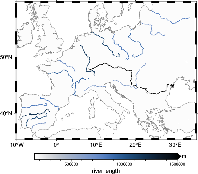
4️⃣ Orientation / suggestion for “2.1.4 Plot the rivers with color-coding for the river length”#
Below you find a rough code shipset for plotting the rives with color-coding in section 2.1.4.
fig = pygmt.Figure()

fig.coast(
    projection="M10c",
    region=[-10, 35, 35, 58],
    land="gray99",
    shorelines="1/0.1p,gray50",
    frame=True,
)

pygmt.makecpt(
    cmap="SCM/oslo", series=[gdf_rivers.Shape_Leng.min(), 1500000], reverse=True
)
fig.colorbar(frame=["x+lriver length", "y+lm"], position="+ef0.2c")

for i_river in range(len(gdf_rivers)):
    fig.plot(
        data=gdf_rivers[gdf_rivers.index == i_river],
        zvalue=gdf_rivers.loc[i_river, "Shape_Leng"],
        pen="0.5p",
        cmap=True,
    )

fig.show(dpi=img_dpi)