Anatomy of a PyGMT figure
Contents
Anatomy of a PyGMT figure
This tutorial will cover the fundamental concepts behind making figures with PyGMT: importing the package, creating a blank figure, drawing coastlines, drawing a map frame, choosing a projection, and adding some data to the map.
Let’s get started!
Importing
First thing to do is load PyGMT (import) so that we can access its functionality. PyGMT has a flat package layout, meaning that you can access everything in it with a single import.
import pygmt
Tip
In Jupyter, you can find out what PyGMT has to offer by typing into a code cell pygmt. and hitting the TAB key. This will give you a menu of all our functions.
Creating a figure
All plotting is handled by the pygmt.Figure class. Here is a good analogy for it:
pygmt.Figureis a blank canvas onto which you can lay down plot elements in order.
Here is how you can create a figure:
fig = pygmt.Figure()
Now that we have a blank canvas in the fig variable, we can start laying down plot elements that we want to show. We’ll start by putting down some coast lines around Japan.
Drawing coastlines
Before we can actually include anything in our figure, we need to specify the geographic bounding box that contains the data/features we want to plot. This bounding box is referenced throughout PyGMT as the region of a figure and it has the format of a list containing the West, East, South, and North (WESN) coordinates of the bounding box.
region = [125, 155, 30, 55]
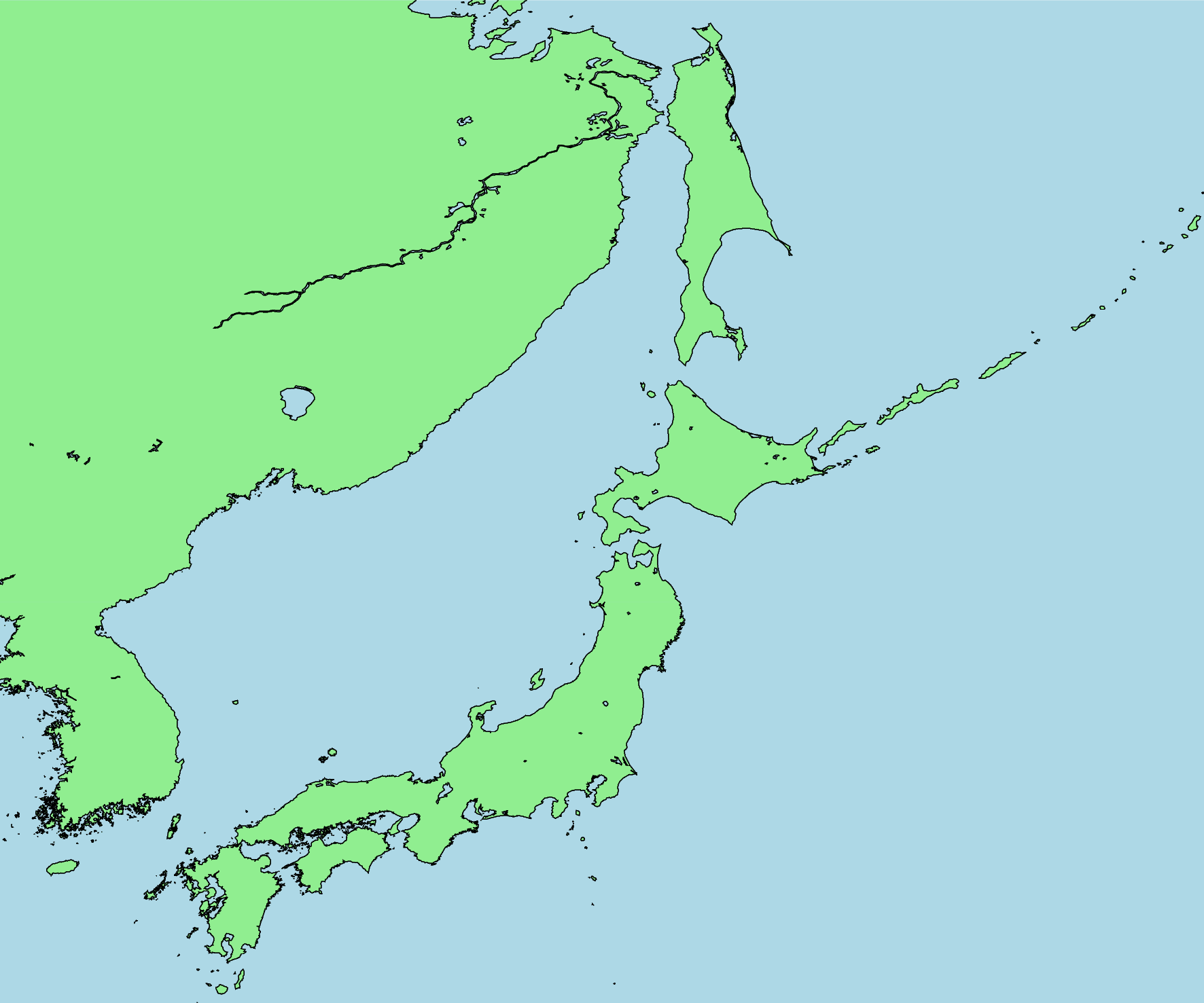
Now that our region is defined, we can lay down the coastlines for this region using the coast method of pygmt.Figure.
fig.coast(region=region, shorelines=True)
And to see what the figure looks like, we call the show method of pygmt.Figure.
fig.show()
See also
On Jupyter, show will embed a PNG of the figure directly into the notebook. But it can also open a PDF in an external viewer, which is probably what you want if you’re using a plain Python script. See the documentation for pygmt.Figure.show for more information.
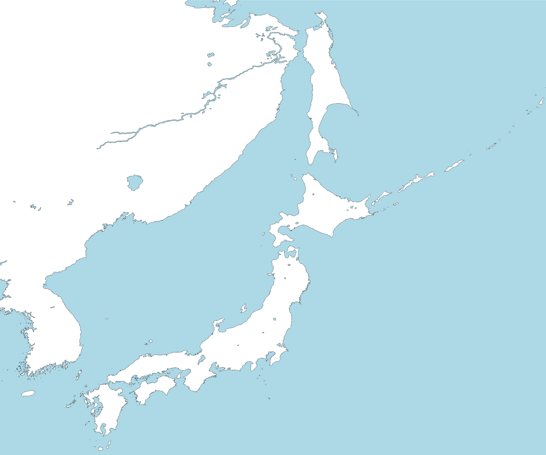
Beyond the outlines, we can also color the land and water regions to make them stand out. Lets start with the water.
fig.coast(water="lightblue")
fig.show()
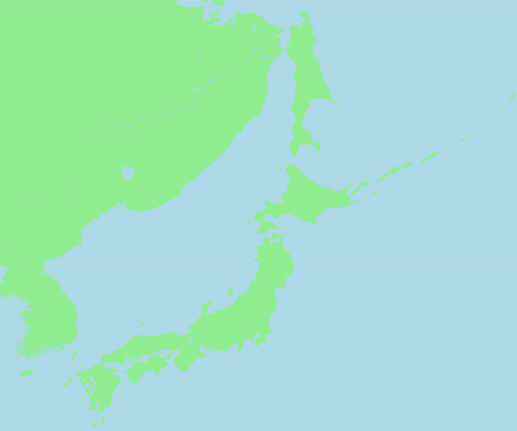
And now add the land in a light green color.
fig.coast(land="lightgreen")
fig.show()
A few things to note here:
We added the colored land and water on top of what was already on our canvas (the shorelines), which means that they are still there but we don’t see them because they are below the solid colors.
We didn’t need to provide a
regionthis time around because PyGMT remembers the last region that was provided. But you could provide one if you want to use a different value.
If we want to have a figure with the shorelines laid out on top of the solid colors, we can make a new figure and add them in the correct order.
fig = pygmt.Figure()
# First draw the solid colors
fig.coast(region=region, land="lightgreen", water="lightblue")  # Pass region to the first plot element
# Then lay down the shorelines on top
fig.coast(shorelines=True)
fig.show()
Since these are both part of the same method (coast) we can actually combine both into the same call and PyGMT will know that it needs to plot the shorelines on top.
fig = pygmt.Figure()
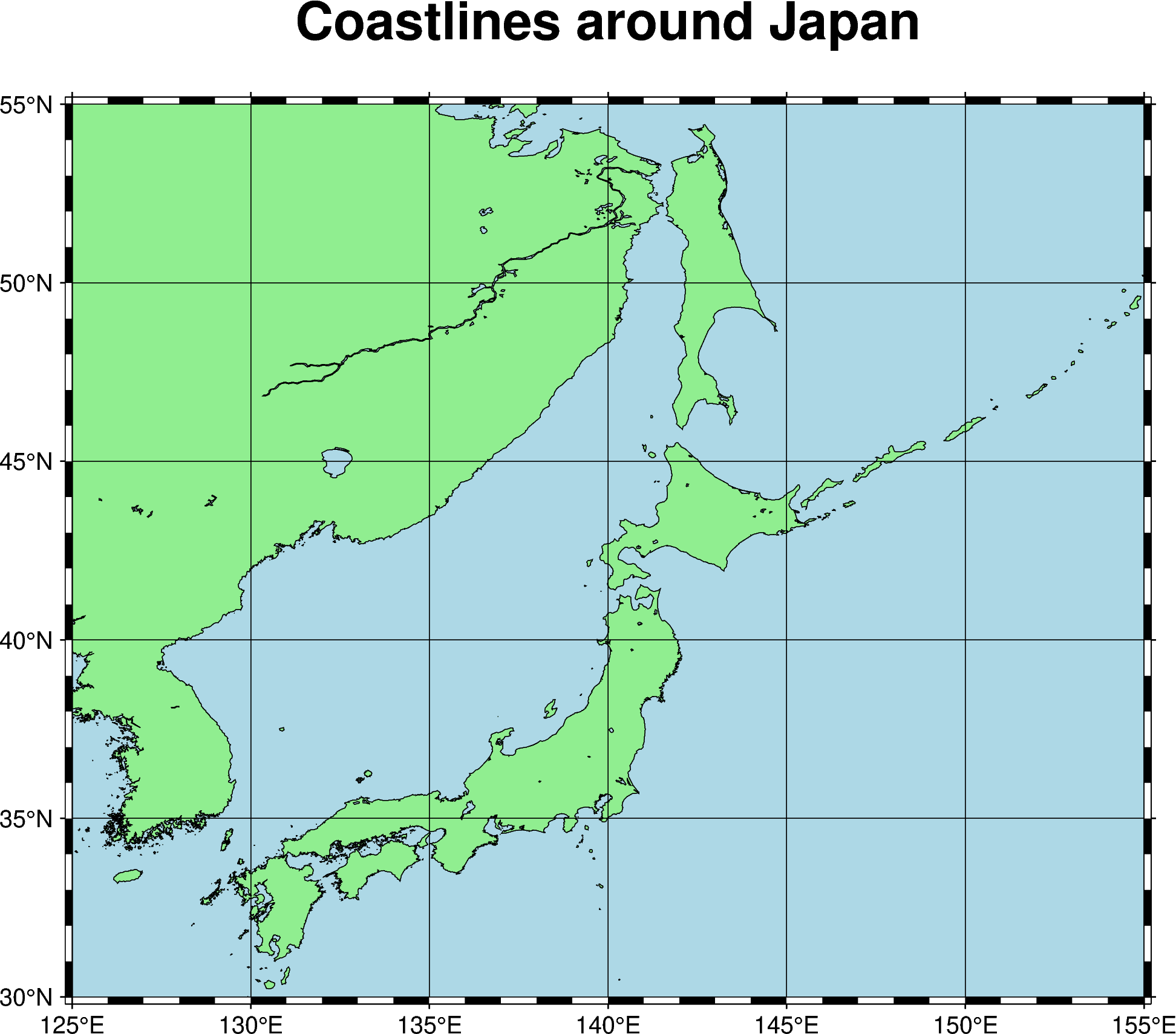
fig.coast(region=region, shorelines=True, land="lightgreen", water="lightblue")
fig.show()

Alright, now we have a lovely figure with colored land and water plus some shorelines. But what are the coordinates associated with this map? Lets add a map frame to find out.
Drawing a map frame
Adding a nice frame with coordinates, ticks, and labels is one of the jobs of the basemap method of pygmt.Figure. Here, we’ll use it to add automatic annotations ("a") around the figure we just made above. It will be the last item we lay on our figure canvas to guarantee that it sits above any other plot elements.
fig = pygmt.Figure()
fig.coast(region=region, shorelines=True, land="lightgreen", water="lightblue")
fig.basemap(frame="a")
fig.show()
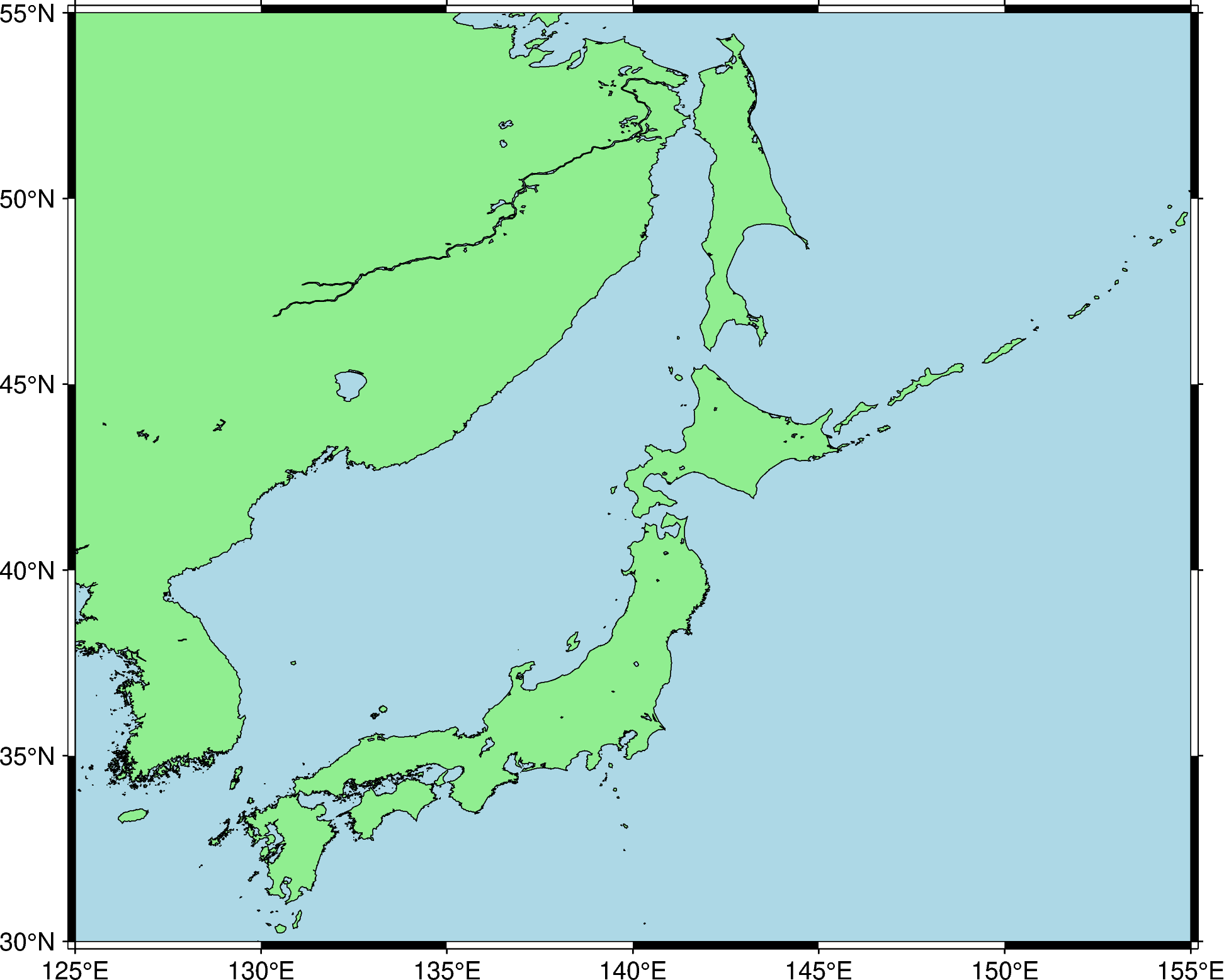
Notice that the coordinates are automatically recognized as longitude and latitude and the tick spacing is chosen sensibly as well.
There are many different ways in which we can customize the frame, from the ticks to the interval to the labels. Here we’ll only cover a few of the most common things you’d want to do. Starting with…
Adding minor ticks
The ticks with annotations are known as “major ticks” (controlled by the "a") value. You can also add automatic “minor ticks” which have a smaller interval and won’t have annotations by adding "f" to the frame argument.
fig = pygmt.Figure()
fig.coast(region=region, shorelines=True, land="lightgreen", water="lightblue")
fig.basemap(frame="af")
fig.show()
The frame is now set to have both annotations and minor ticks, both of which are optional (so frame="f" would mean only having minor un-annotated ticks). Try it out!
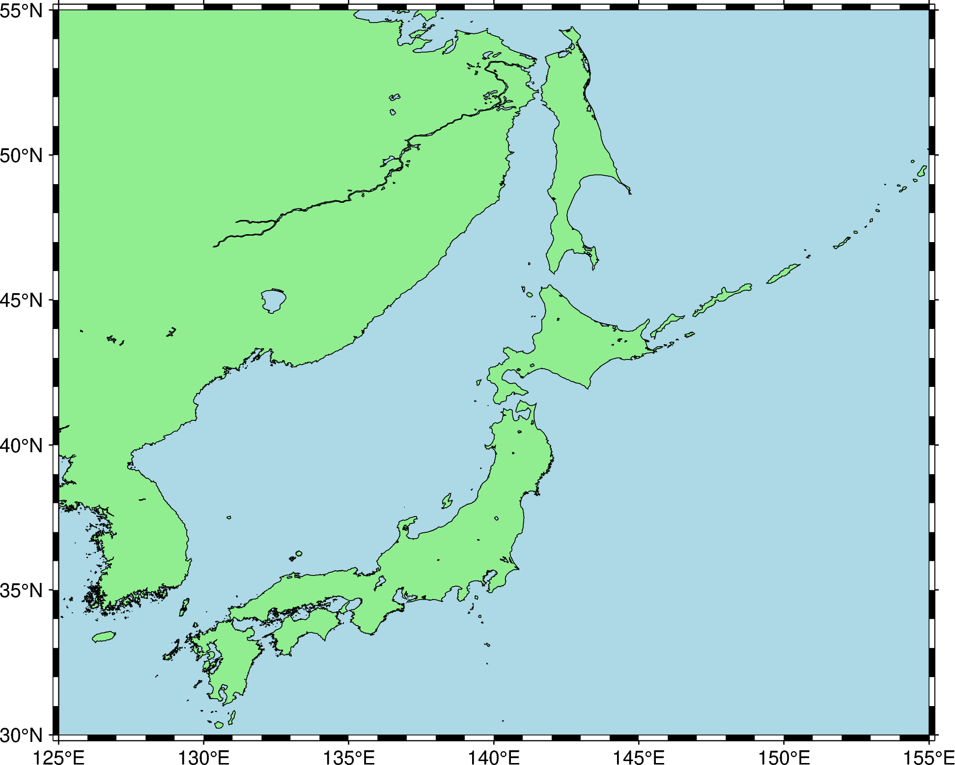
Adding grid lines
Grid lines are enabled by adding "g" to frame, just like we did for minor ticks. Again you can mix and match the three arguments "a", "f", and "g".
fig = pygmt.Figure()
fig.coast(region=region, shorelines=True, land="lightgreen", water="lightblue")
fig.basemap(frame="afg")
fig.show()
By default the spacing of the grid lines is the same as the annotated major ticks.
Note
Adding a frame with grid lines before you plot the colored land and water or an image will hide the grid lines beneath the subsequent plot. Make sure you put the call to basemap last to avoid this.
Adding a title
To add a title to the figure, we need to pass in more than one argument to frame. We can do this by passing it a list instead of a single string. The extra argument for adding a title is a string with the format "+tMy title goes here".
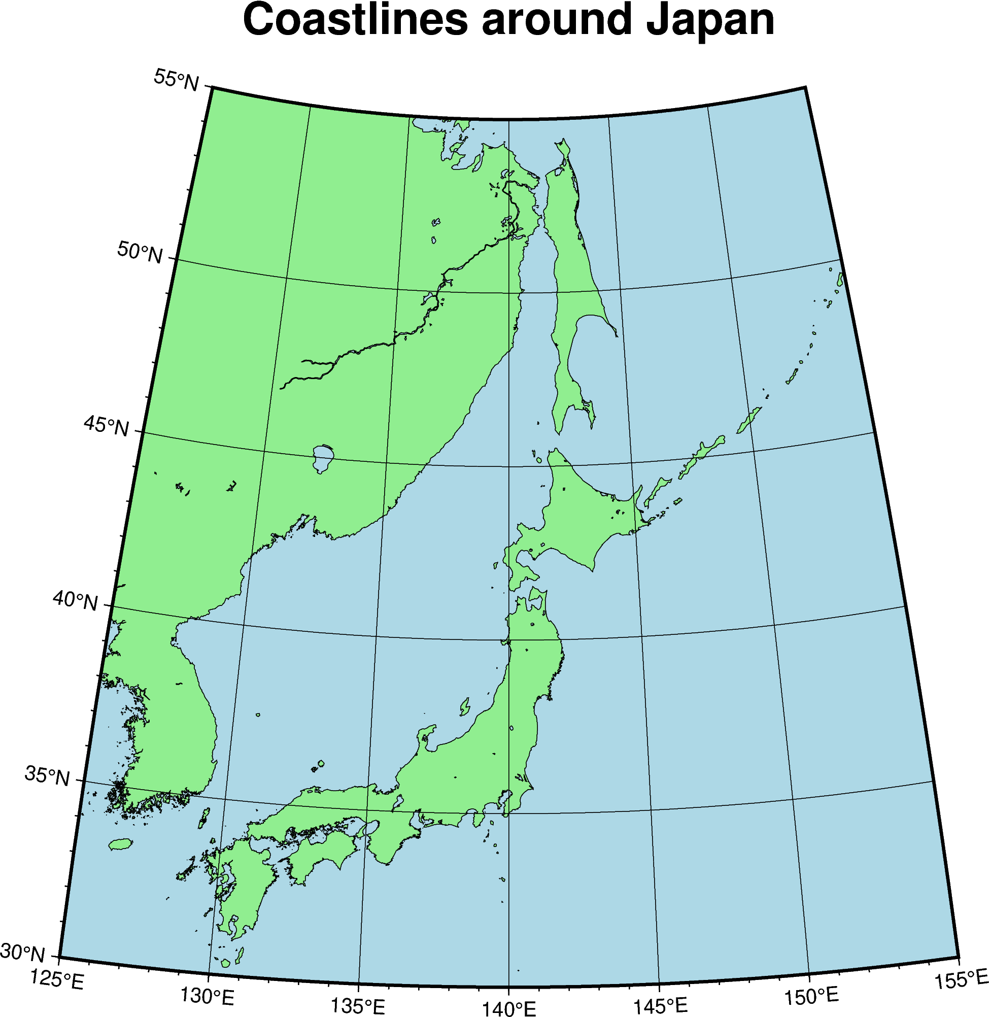
fig = pygmt.Figure()
fig.coast(region=region, shorelines=True, land="lightgreen", water="lightblue")
fig.basemap(frame=["afg", "+tCoastlines around Japan"])
fig.show()
Choosing a projection
By default, PyGMT will use an equidistant cylindrical projection if the region seems to be geographic longitude and latitude. Many other projections are also supported, which may often be better suited for your plots (particularly around the polar regions or for larger global maps).
For our case, let’s go with a Cassini projection. To specify this, we need to pass the projection argument to the first plot method we call. The projection specification is a string starting with a 1-letter code for the projection followed by the projection arguments (particular to each projection) and finishing off with the physical width of the figure (in centimeters or inches, usually). For the Cassini projection, this is what it would look like: projection="C142.5/40/15c" in which C is for Cassini projection, 142.5 is the central longitude of the projection set to the center of our region, 40 is the same for the central latitude, and 15c means the plot will be 15 centimeters wide on the page (this influences the relative size of fonts and tick labels).
fig = pygmt.Figure()
fig.coast(
    projection="C140/40/15c",
    region=region,
    land="lightgreen",
    water="lightblue",
    shorelines=True,
)
fig.basemap(frame=["afg", "+tCoastlines around Japan"])
fig.show()
See also
The Projections Gallery has examples of each projection along with a description of their parameters, properties, and use cases.
Adding some data to the map
Finally, we have a great base map onto which we can plot some data. PyGMT offers a variety of example datasets that we can easily fetch to try things out. Since we’re looking at Japan, we can use the japan-quakes data to get a table of earthquake hypocenters and magnitudes around this area. The data are returned in a pandas.DataFrame to make it easier to handle.
data = pygmt.datasets.load_sample_data(name="japan_quakes")
data
| year | month | day | latitude | longitude | depth_km | magnitude | |
|---|---|---|---|---|---|---|---|
| 0 | 1987 | 1 | 4 | 49.77 | 149.29 | 489 | 4.1 |
| 1 | 1987 | 1 | 9 | 39.90 | 141.68 | 67 | 6.8 |
| 2 | 1987 | 1 | 9 | 39.82 | 141.64 | 84 | 4.0 |
| 3 | 1987 | 1 | 14 | 42.56 | 142.85 | 102 | 6.5 |
| 4 | 1987 | 1 | 16 | 42.79 | 145.10 | 54 | 5.1 |
| ... | ... | ... | ... | ... | ... | ... | ... |
| 110 | 1988 | 11 | 10 | 35.32 | 140.88 | 10 | 4.0 |
| 111 | 1988 | 11 | 29 | 35.88 | 141.47 | 46 | 4.0 |
| 112 | 1988 | 12 | 3 | 43.53 | 146.98 | 39 | 4.3 |
| 113 | 1988 | 12 | 20 | 43.94 | 146.13 | 114 | 4.5 |
| 114 | 1988 | 12 | 21 | 42.02 | 142.45 | 73 | 4.5 |
115 rows × 7 columns
See also
Use function pygmt.datasets.list_sample_data to get a list of all datasets available.
To add point and line data to a figure, use the plot method of pygmt.Figure. Lets start by plotting the earthquake epicenters. To do this, we’ll pass the data longitude and latitude coordinates as the x and y arguments to plot.
fig = pygmt.Figure()
fig.coast(
projection="C140/40/15c",
region=region,
land="lightgreen",
water="lightblue",
shorelines=True,
)
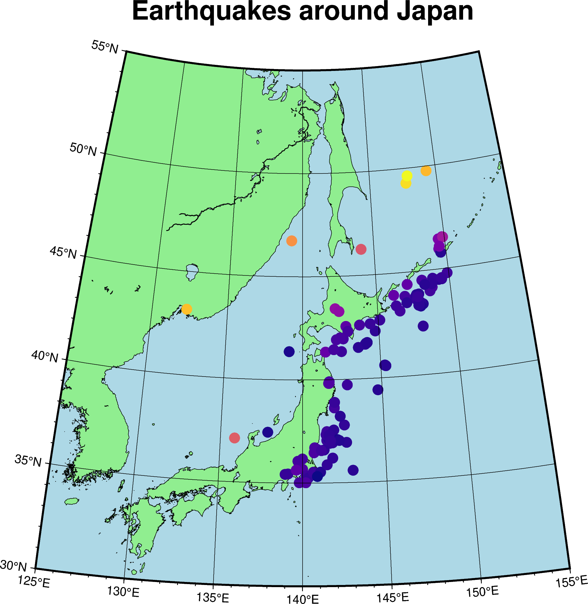
fig.plot(x=data.longitude, y=data.latitude)
fig.basemap(frame=["afg", "+tEarthquakes around Japan"])
fig.show()
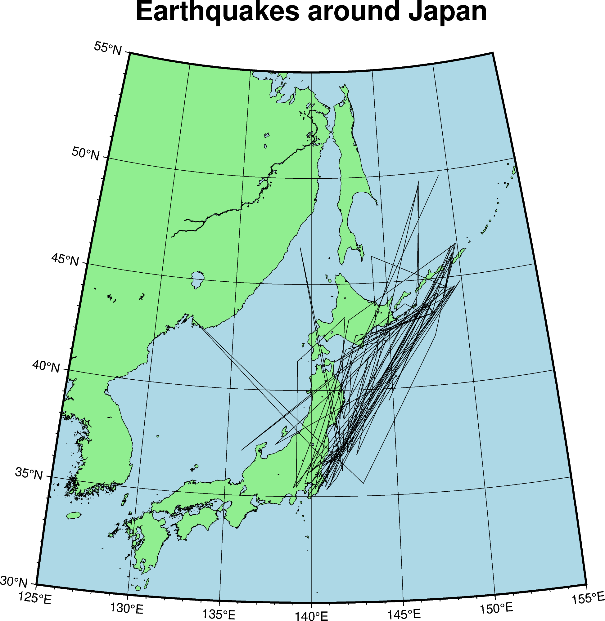
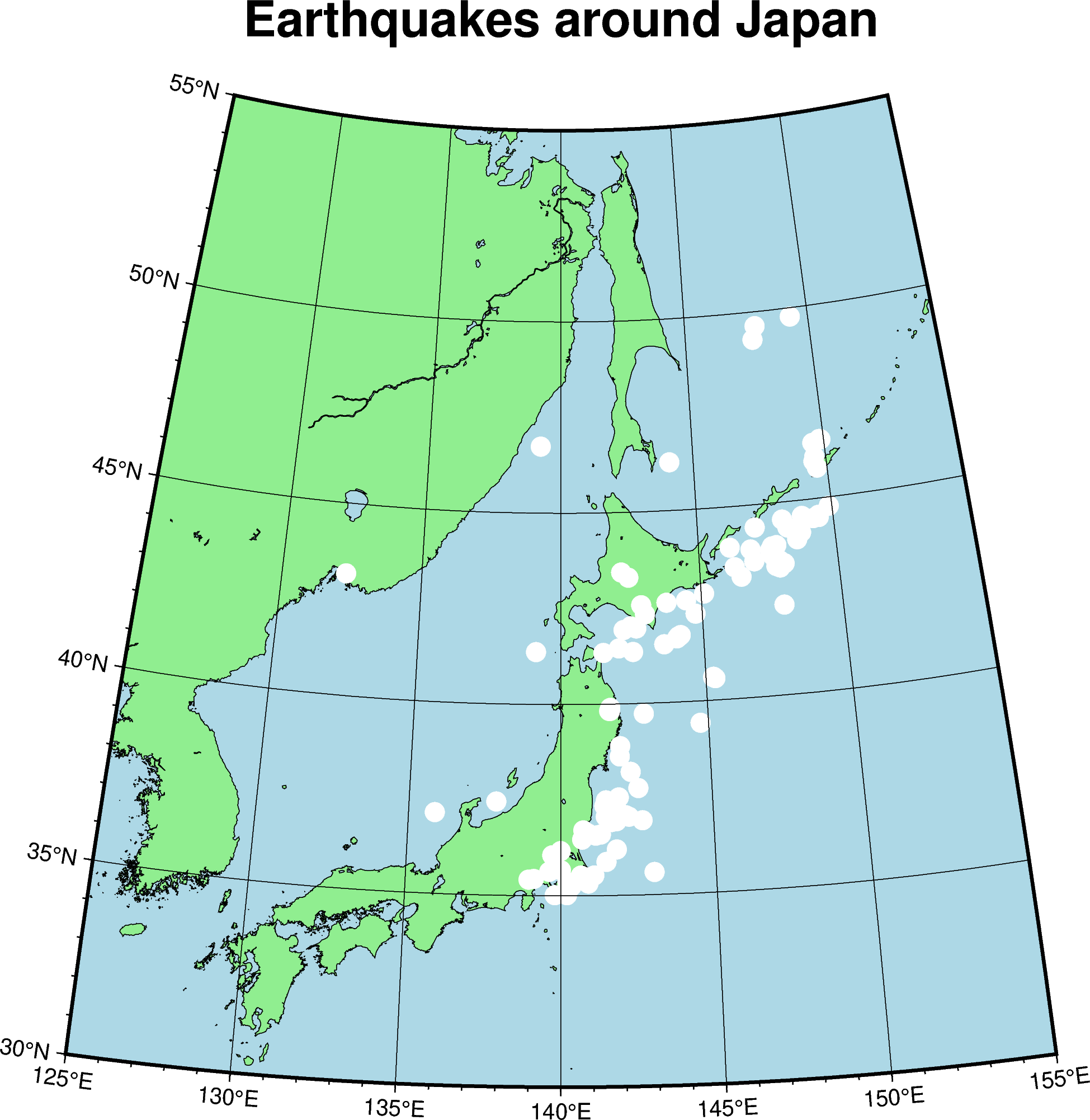
By default, PyGMT will plot lines connecting each of the points in our data. This is probably not what we want to do given that our data are epicenters. Instead, lets plot using circles. This requires passing in the style argument to plot, which should be a string like c0.3c with the first c specifying a circle and 0.3c specifying that circles should be 0.3 centimeters in size. We’ll also pass in color to make the circles opaque with a given color (otherwise they would be just the outlines by default).
fig = pygmt.Figure()
fig.coast(
    projection="C140/40/15c",
    region=region,
    land="lightgreen",
    water="lightblue",
    shorelines=True,
)
fig.plot(x=data.longitude, y=data.latitude, style="c0.3c", color="white")
fig.basemap(frame=["afg", "+tEarthquakes around Japan"])
fig.show()
Tip
Pass pen to plot to control how the outline of the circles are drawn. For example, pen="black" will draw a black outline.
It would be great to also represent the depth of the earthquakes somehow. We can do this by encoding the depth information as the color of the circles. We need to make 2 changes to the code above to achieve this:
Configure a “color palette table (CPT)” that maps colors to data values. In matplotlib, this is known as a colormap or
cmap.Tell
plotto use the depth values and the CPT/cmap created to pain the circles.
Step 1 is done using pygmt.makecpt, which takes a colormap name through the cmap argument and the min/max values of the data through the series argument.
Step 2 is done by passing in the data.depth_km values to color and cmap=True, telling PyGMT to use the current CPT created through makecpt.
fig = pygmt.Figure()
fig.coast(
    projection="C140/40/15c",
    region=region,
    land="lightgreen",
    water="lightblue",
    shorelines=True,
)
pygmt.makecpt(cmap="plasma", series=[data.depth_km.min(), data.depth_km.max()])
fig.plot(x=data.longitude, y=data.latitude, style="c0.3c", color=data.depth_km, cmap=True)
fig.basemap(frame=["afg", "+tEarthquakes around Japan"])
fig.show()
See also
The GMT documentation has a list of all available colormaps/CPTs. There are many to choose from!
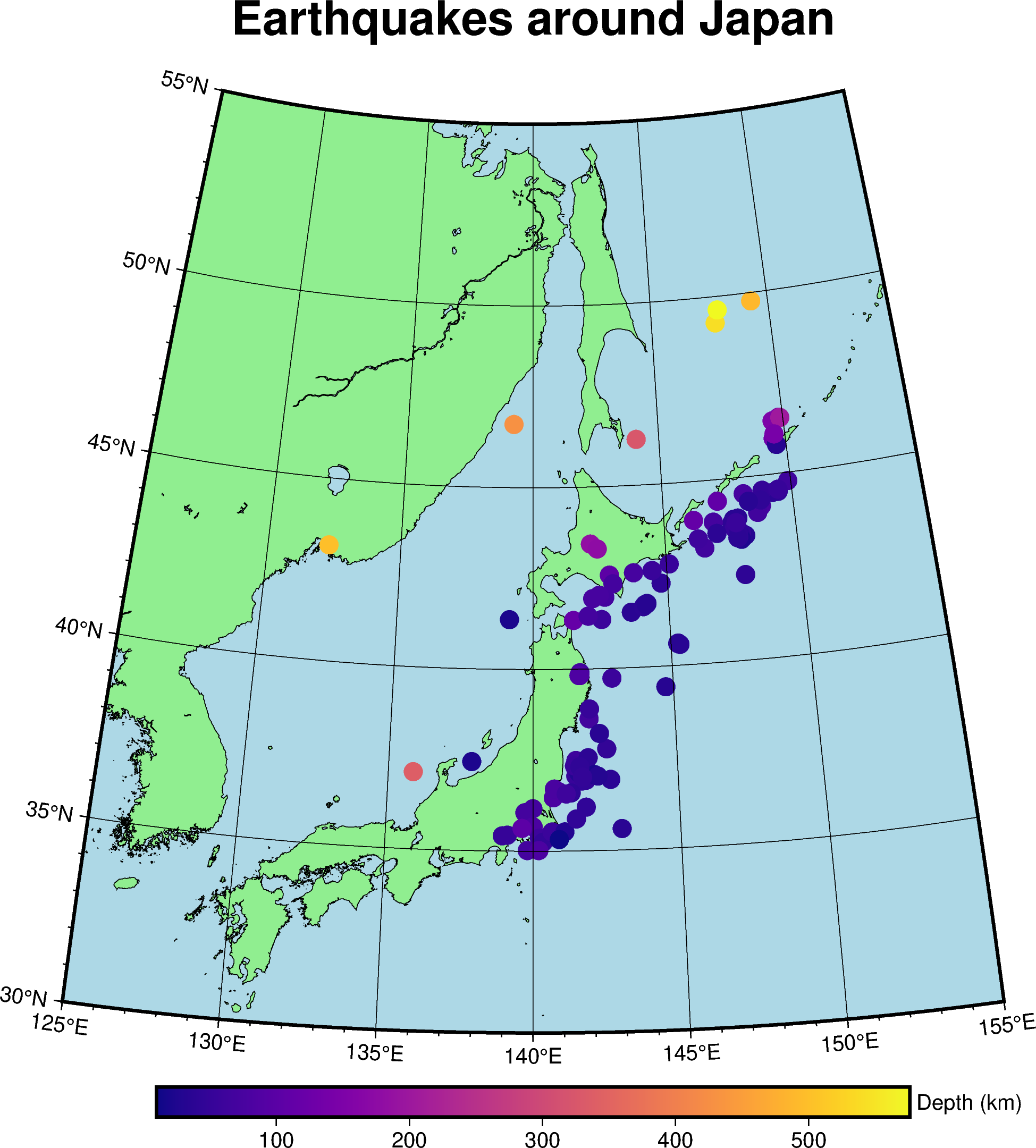
As a final step, we need to add a colorbar to the figure so we know what value each color represents. This is done using the colorbar method of pygmt.Figure, which takes a frame argument much like the one we use to set the map frame. Only this time, it sets the frame of the colorbar. To make our colorbar look nice, we’ll set the frame to have automatically annotated major ticks and a label on the y-axis specifying the variable and units.
fig = pygmt.Figure()
fig.coast(
    projection="C140/40/15c",
    region=region,
    land="lightgreen",
    water="lightblue",
    shorelines=True,
)
pygmt.makecpt(cmap="plasma", series=[data.depth_km.min(), data.depth_km.max()])
fig.plot(x=data.longitude, y=data.latitude, style="c0.3c", color=data.depth_km, cmap=True)
fig.basemap(frame=["afg", "+tEarthquakes around Japan"])
fig.colorbar(frame=["a", "y+lDepth (km)"])
fig.show()