Integration with the scientific Python ecosystem 🐍
Contents
Integration with the scientific Python ecosystem 🐍
In this tutorial, we’ll try out the integration between PyGMT and other common packages in the scientific Python ecosystem.
Besides pygmt, we’ll also be using:
GeoPandas for managing geospatial tabular data
Panel for interactive visualizations
Xarray for managing n-dimensional labelled arrays
Plotting geospatial vector data with GeoPandas and PyGMT
We’ll extend the GeoPandas Mapping and Plotting Tools Examples to show how to create choropleth maps using PyGMT.
References:
GeoPandas User Guide - https://geopandas.org/en/stable/docs/user_guide/
import pygmt
import geopandas as gpd
We’ll load sample data provided through the GeoPandas package and inspect the GeoDataFrame.
world = gpd.read_file(gpd.datasets.get_path('naturalearth_lowres'))
world.head()
| pop_est | continent | name | iso_a3 | gdp_md_est | geometry | |
|---|---|---|---|---|---|---|
| 0 | 920938 | Oceania | Fiji | FJI | 8374.0 | MULTIPOLYGON (((180.00000 -16.06713, 180.00000... |
| 1 | 53950935 | Africa | Tanzania | TZA | 150600.0 | POLYGON ((33.90371 -0.95000, 34.07262 -1.05982... |
| 2 | 603253 | Africa | W. Sahara | ESH | 906.5 | POLYGON ((-8.66559 27.65643, -8.66512 27.58948... |
| 3 | 35623680 | North America | Canada | CAN | 1674000.0 | MULTIPOLYGON (((-122.84000 49.00000, -122.9742... |
| 4 | 326625791 | North America | United States of America | USA | 18560000.0 | MULTIPOLYGON (((-122.84000 49.00000, -120.0000... |
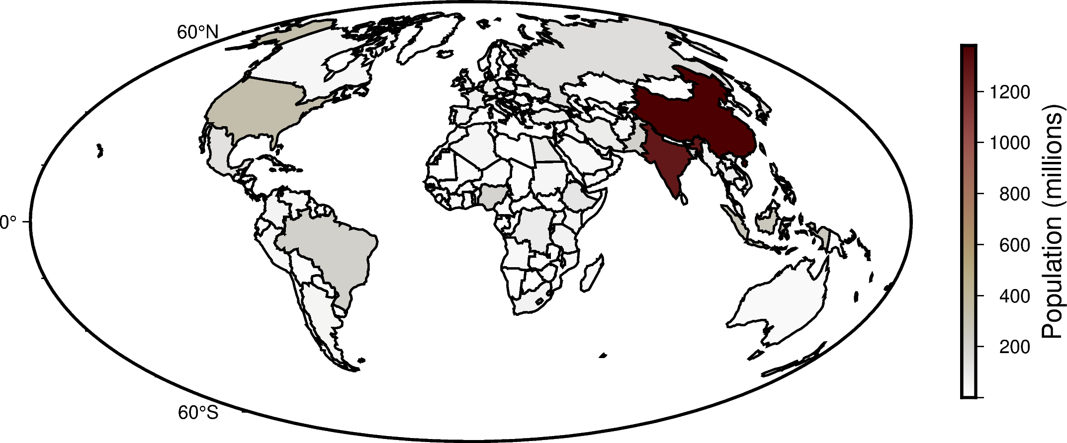
Following the GeoPandas example, we’ll create a Choropleth map showing world population estimates, but will use PyGMT to plot the data using the Hammer projection.
# Calculate the populations in millions per capita
world = world[(world.pop_est>0) & (world.name!="Antarctica")]
world['pop_est'] = world.pop_est * 1e-6

# Find the range of data values for creating a colormap
cmap_bounds = pygmt.info(data=world['pop_est'], per_column=True)
cmap_bounds
array([1.40000000e-04, 1.37930277e+03])
Now, we’ll plot the data on a PyGMT figure, by creating a figure instance, laying down a basemap, plotting the GeoDataFrame, and adding a colorbar!
# Create an instance of the pygmt.Figure class
fig = pygmt.Figure()
# Create a colormap for the figure
pygmt.makecpt(cmap="bilbao", series=cmap_bounds)
# Create a basemap
fig.basemap(region="d", projection="H15c", frame=True)
# Plot the GeoDataFrame
# - Use `close=True` to specify that the polygons should be forced closed
# - Plot the polygon outlines with a 1 point, black pen
# - Set that the color should be based on the `pop_est` using the `color, `cmap`, and `aspatial` parameters
fig.plot(data=world, pen="1p,black", close=True, color="+z", cmap=True, aspatial="Z=pop_est")
# Add a colorbar
fig.colorbar(position="JMR", frame='a200+lPopulation (millions)')
# Display the output
fig.show()
/home/runner/micromamba/envs/egu22pygmt/lib/python3.9/site-packages/geopandas/io/file.py:362: FutureWarning: pandas.Int64Index is deprecated and will be removed from pandas in a future version. Use pandas.Index with the appropriate dtype instead.
  pd.Int64Index,
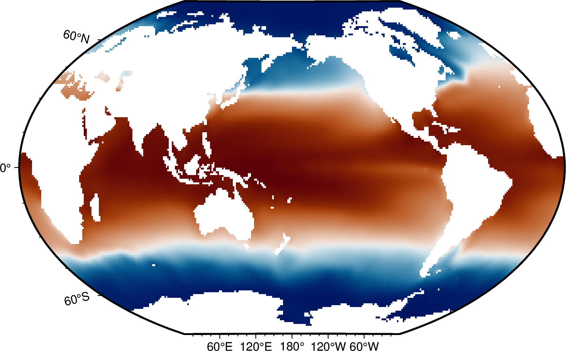
Interactive data visualization with Xarray, Panel, and PyGMT
In this section, we’ll create some interactive visualizations of oceanographic data!
We’ll use Panel, which is a Python library for connecting interactive widgets with plots! We’ll use Panel with PyGMT and xarray to visualize the objectively interpolated mean field for in-situ temperature from the World Ocean Atlas.
References:
Temperature visualization based on https://rabernat.github.io/intro_to_physical_oceanography/02-c_ocean_temperature_salinity_stratification.html
Interactive setup based on https://github.com/weiji14/30DayMapChallenge2021/blob/main/day25_interactive.py
Data from the NOAA World Ocean Atlas, stored on the IRI Data Library at http://iridl.ldeo.columbia.edu/SOURCES/.NOAA/.NODC/.WOA09/.
import panel as pn
import xarray as xr
import pygmt
pn.extension()
# Download the dataset from the IRI Data Library
url = 'https://iridl.ldeo.columbia.edu/SOURCES/.NOAA/.NODC/.WOA09/.Grid-1x1/.Annual/.temperature/.t_an/data.nc'
netcdf_file = pygmt.which(fname=url, download=True)
woa_temp = xr.open_dataset(netcdf_file).isel(time=0)
woa_temp
<xarray.Dataset>
Dimensions:  (depth: 33, lat: 180, lon: 360)
Coordinates:
  * depth    (depth) float32 0.0 10.0 20.0 30.0 ... 4e+03 4.5e+03 5e+03 5.5e+03
  * lat      (lat) float32 -89.5 -88.5 -87.5 -86.5 -85.5 ... 86.5 87.5 88.5 89.5
  * lon      (lon) float32 0.5 1.5 2.5 3.5 4.5 ... 355.5 356.5 357.5 358.5 359.5
    time     datetime64[ns] 2008-01-01
Data variables:
t_an (depth, lat, lon) float32 ...# Make a static plot of sea surface temperature
fig = pygmt.Figure()
fig.grdimage(grid=woa_temp.t_an.sel(depth=0), cmap="vik", projection="R15c", frame=True)
fig.show()
grdinfo [WARNING]: Detected a data cube (/home/runner/work/egu22pygmt/egu22pygmt/book/data.nc) but -Q not set - skipping
# Make a panel widget for controlling the depth plotted
depth_slider = pn.widgets.DiscreteSlider(name='Depth (m)', options=woa_temp.depth.values.astype(int).tolist(), value=0)
# Make a function for plotting the depth slice with PyGMT

@pn.depends(depth=depth_slider)
def view(depth: int):
    fig = pygmt.Figure()
    pygmt.makecpt(cmap="vik", series=[-2,30])
    fig.grdimage(grid=woa_temp.t_an.sel(depth=depth), cmap=True, projection="R15c", frame=True)
    fig.colorbar(frame="a5")
    return fig
Make the interactive dashboard!
Now to put everything together! The ‘dashboard’ will be very simple.
The ‘depth’ slider is placed next to the map using panel.Column.
Selecting different depths will update the data plotted! Find out more at
https://panel.holoviz.org/getting_started/index.html#using-panel.
Note: This is meant to run in a Jupyter lab/notebook environment. The grdinfo warning can be ignored.
pn.Column(depth_slider, view)
grdinfo [WARNING]: Detected a data cube (/home/runner/work/egu22pygmt/egu22pygmt/book/data.nc) but -Q not set - skipping